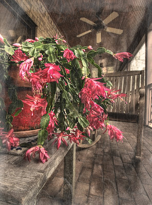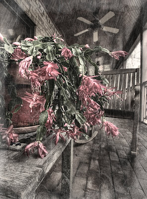
After I made my post yesterday, JD was looking at the image and decided that she would use it for something that she was doing, but it need an “antique-look.” Not sure exactly what that meant, I went to onOne Frame to look around. After playing around a little I settled on the following different effects:
Texture>Scratched Film #4 at 70% opacity
Texture>Paper #5 at 55% opacity
Boarder>Tooth Brush #4 at 40%
I thought the addition of these textures and boarder did the trick, but . . .
JD liked the overall look but did not want the colors to be so vibrant. So, back to the drawing board! I started with the above image and used nik Silver Efex Pro to add a black and white layer at 40% opacity. This seemed to tone-down the colors the way that JD wanted.

I am always amazed at how you can take the same photograph and make it look so many different ways by just adding various textures and boarders. It is something that I fail to do try doing much of the time. I guess it is my old film/slide days coming out again.
Hope you enjoy JD’s interruption of my photograph.
Great variations Patrick!
ReplyDeleteI think my favorite is the first one (with more color).
I guess the number of different "looks" you can achieve with any photo by using Photoshop and all the Photoshop plugins is pretty much infinite!
Variety is the spice of life I guess! :-)
Cheers!
Barry
I like the one with very little color. It has an old time look to it that fits with the subject matter.
ReplyDeleteDebbie
Very different looks. The one with little color seems to be a little creepy. I like the original one.
ReplyDeletePati
For some reason the extra color version didn't appeal to me. I like the creepy version Larry. It just seems to fit better. Make sure your wife knows I agreed with her version, ha, ha.
ReplyDeleteDHaass
I like the one with the extra color. Not so much for the plant color as for the tones in the background. Both good of course.
ReplyDelete