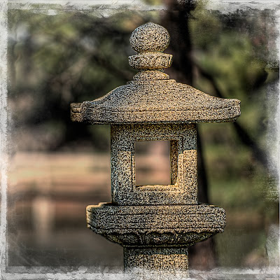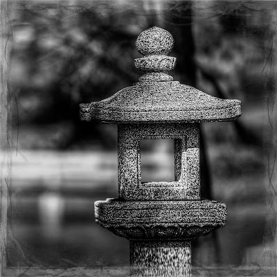
Last week while taking some photographs at the Japanese Garden, I saw this statue. The lighting on it was very interesting, so I decided that it would make a good image. When I downloaded the file to my computer, I was very disappointed. It was not what I had anticipated. The colors were somewhat flat and muted. It had no real point of focus. It really did not have any interest.
Now here is where I heard the devil say: "You can fix it in Photoshop." So, I started down the path of no return. I tried this and then I tried that. Finally, I converted it to black and white (I knew that would do it). But, alas, nothing could really make this into much more than an average photograph.
This brings us to the lesson of the day, Little Cricket: "You can waste a lot of time trying to make an average photograph into a great photograph by using Photoshop." I must admit, I get some grief from some of my photo pals over my "search out and destroy" policy after I download. My general philosophy is: "with average images, you will either spend tons of time trying to make them into good ones, or, you will never look at them again; so, why not get rid of them immediately."
I will not give you anything camera settings or what I tried in Photoshop--it will just depress you knowing that I wasted that much time.

Well...the edge treatment is nice! :-)
ReplyDeleteActually I like more than the edge treatment but I couldn't resist my comment above.
ReplyDeleteIt is interesting to me because of the continuation of the out of focus background into the center of the statue. I'm sure that the "hole" in the center has a deep meaning to the Japanese that us Westeners don't understand but I do find it pleasing.
Cheers!
Barry
I guess I will partially agree with Barry. The out of focus area inside the hole would be okay if the rest of the background was not there. It's distracting to me and pulls my eye to the wrong place in the photo. The tree behind it distracts me too.
ReplyDeleteI think it would work in a vertical and more tightly cropped photo. Eliminating the distracting background on the left by cloning and pulling the out of focus greenery in tight to the statue would help.
This comment comes across as harsh and I don't mean it to be that way. In reality Larry, you have the answer in your own description of the shot to us, re-shoot it.
DHaass