September 30, 2009

Another Thing I Just Don’t Understand

No, I am not going to list all the things that I do not understand—the list would be too long, and too boring. But, I must admit I truly do not understand why a person with “thinning hair” would ever have a bull’s eye painted on the top of his head.

I wanted this photo to be about the bull’s eye. I tried to limit my depth of field to the bear minimum so I chose a wide open aperture and an angle that would move the background as far away from the bull’s eye as I could move it.

Enjoy.

Camera settings: Nikon D3, Nikon 105mm f/2.8 at 105mm, shot at ISO 200, f/2.8 and 1/125th of a second.

Post Processing:

Lightroom—Set white and black points, added mid-tone contrast, and increased clarity and vibrance.

Photoshop—dodged and burned parts of the photo using a screen and multiple layers.

September 29, 2009

A Real Man—Maybe?

You can tell a man by his clothes, or in this case, the lack of clothes.

I was out doing a little street photography when I looked over and saw this unusual outfit. I knew that I had to have a photograph, but the question was of what.

After studying my subject for a while, I decided a body only shot was in order. I wanted the photo to about what drew me to the subject to begin with—the truly unique clothing

Enjoy.

Camera settings: Nikon D3, Nikon 70-200mm f/2.8 at 135mm, shot at ISO 200, f/8 and 1/125th of a second.

Post Processing:

Lightroom—Set white and black points, added mid-tone contrast, and increased clarity and vibrance.

Photoshop—used Topaz Adjust to bring out details and then added black and white layer at 45% opacity produced nik Silver Efex Pro.

September 28, 2009

Posted Photos Revisited—Taking Your Comments to Heart

I decided to try something new. On Mondays, I intend to republish photographs that I have previously presented on this blog, but I want to include changes that viewers’ have suggested. I must admit, I may not agree with the posters’ comment, but I do think their suggestion warrants consideration.

This photo was presented on August 17, 2009.
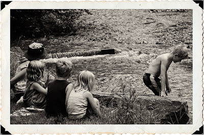
On that post, DHaass said: I'll make note of the cut off arm to the left and the boys head so close to the edge of the frame. If the little girl had that arm in her lap would it be better? Yes, but it's not a deal breaker. The boy is looking down more than out of the frame so I'm okay with that too.”

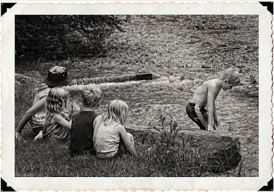
When I looked at the scene, I thought that this was a scene that could have occurred anytime during the past 100 years. I really did not think about the little details in the composition. If I had, I would have posted the photo more like this. There was a post just outside the girls hand on the left side, so I did exclude it from my original composition.

Out of laziness, I had slapped the frame on it. In the revised photo, I increased canvass sufficient to allow for the girls hands to be shown and also included more room to the right of the boy’s head. The photo presented here is more the one that I took except that I did clone-out the flip-flops—which did not seem to go with the scene.

The reason, I selected this photo as my first to revisit is simple, I think it raises an interesting question: “When does bothersome details really distract from the essence of the photograph?"

I do not have an answer to the question, and would welcome your comments.

Enjoy.

September 25, 2009

Photo of an Artist

I ran across this artist sketching tombstones in a local cemetery. She is very talented. Her sketches had a tremendous amount of details. In fact many of them looked more like engineering drawings than art—sketches from all angles.

I really like the way her eyes darted from the subject to her sketchpad and then back to the subject. I asked her if she would mind if I took her photo. She just looked at me blankly for a few seconds and then asked why I wanted to take a photo of her rather than all the great tombstones in the cemetery.

Enjoy.

Camera settings: Nikon D3, Nikon 70-200mm f/2.8 at 200mm shot at ISO 200, f/5.6 and 1/250th of a second.

Post Processing:

Lightroom—Set white and black points, added mid-tone contrast, and added clarity and vibrance.

September 24, 2009

Shooting into the Sun

For a landscape photographer, I do not think there is anything more discouraging than getting up before sunrise on a cold morning, slugging through the dark to plant your tripod at the ideal spot and then to find the sunrise just isn’t that interesting. That’s what happened to me on this morning. I had scouted the location the evening before and had carefully selected this spot. I thought that the tree had a great shape and I thought that the sun would rise directly over it.

I wanted the photo to show the sun rising from a cloud filled sky with the tree in the foreground. Yet, the morning greeted me with very few clouds.

This is the best I could come up with.

Enjoy.

Camera settings: Nikon D3, Nikon 28-70mm f/2.8 at 40mm with a graduated 4-stop neutral density filter attached, shot at ISO 200, f/11 and 1/125th of a second on a tripod with a Nikon SB-800 pointed at the top of the tree to provide some fill light and overcome the effects of the neutral density filter.

Post Processing:

Lightroom—Set white and black points, added mid-tone contrast, and clarity.

Photoshop—used nik Silver Efex Pro tonal contrast filter to add contrast to highlights, mid-tones and shadows of water, beach and tree.

September 23, 2009

A Little Light in the Fog

I think the Giant Sequoia trees are the most breath-taking sights in the world. I also believe they are among the hardest things to photograph. How do you photograph something that stands 300 feet tall and is 50 feet around? I really do not have an answer to that question.

In this photo, I wanted to capture the slight fog in the air, the red of the trees’ bark and the green of the leaves. I thought that the contrasting colors of red and green provided great contrast and the fog and light slipping through the trees also added to that contrast. Unfortunately, nothing in the photograph shows how massive the trees are.

Enjoy.

Camera settings: Nikon D3, Nikon 17-35mm f/2.8 at 20mm, shot at ISO 200, f/4 and 1/10th of a second on a tripod.

Post Processing:

Lightroom—Set white and black points, added mid-tone contrast, and increased clarity and vibrance.

Photoshop—used nik Color Efex Pro tonal contrast to increase the contrast in the highlights, mid tones and shadows.

September 22, 2009

A Landscape Photo for All Photographers

It is required. All landscape photographers must have a photo of Yosemite Valley from about the same place that Ansel Adams took many of his photos. I think everyone needs to follow a master so that you can put a little reality back into yourself. Yes, I know this is not as good as his, but, who’s is? I will just live with that!

I took this photo earlier this year and just have not done much with it. I finally decided to convert it to black and white—I think that I have a death wish or something.

Enjoy.

Camera settings: Nikon D700, Nikon 28-70mm f/2.8 at 35mm, shot at ISO 200, f/13 and 1/125th of a second.

Post Processing:

Lightroom—Set white and black points, added mid-tone contrast and added clarity.

Photoshop—used nik Silver Efex Pro to convert photo to black and white.

September 21, 2009

Determination

Sometimes you do not need many words to describe what you saw as you were taking a photo. This photo is one of those times—RGB (red, green and blue) colors and the young man’s can do attitude.

Enjoy.

Camera settings: Nikon F3, Nikon 70-300mm f/4.5-5.6 at 300mm, shot at ISO 200, f/11 and 1/180th of a second.

Post Processing:

Lightroom—Set white and black points, added mid-tone contrast, clarity.

Photoshop—used Topaz adjust to bring out details and saturate the colors in the boy’s clothing and the stroller.

September 18, 2009

Another Landscape Shot

Yep, another landscape shot—just a different type of landscape. You cannot go to Sin City with a camera and not come back with a few night shots of the lights along the Strip.

This photo is totally about the colors.

Enjoy.

Camera settings: Nikon D700, Nikon 17-35mm f/2.8 at 17mm, shot at ISO 200, f/5.6 and 1/15th of a second.

Post Processing:

Lightroom—Set white and black points, added mid-tone contrast, clarity.

Photoshop—used Topaz adjust to bring out details and saturate the colors.

September 17, 2009

I Came, I Saw, I Shot

Not much to tell about this photo. I saw the barn one evening outside the Badlands National Park, but the lighting was not very good. I decided that morning light would be much better, so I returned the next day and took the shot.

I like the simple scene and the simple primary colors of red, yellow and blue. I thought that the road leading to the barn provided a nice leading line to the barn and the few clouds broke-up the sky just enough to add a little interest to it.

Enjoy.

Camera settings: Nikon D3, Nikon 28-70mm f/2.8 at 70mm, shot at ISO 200, f/22 and 1/125th of a second.

Post Processing:

Lightroom—Set white and black points, added mid-tone contrast, clarity.

Photoshop—used screen and multiple layers to dodge and burn various parts of photo.

September 16, 2009

Doe at Dawn

A friend of mine has a small ranch a little south of Alvin, Texas. The ranch has an old windmill that is quite striking at sunrise. I got up long before the sun and headed down to his ranch to get the shot. The windmill is about a half-mile walk from his house. So, there I was walking along a small path in the dark. I was determined to get my windmill shot.

What did I get? Totally overcast skies that provide zero amount of sunrise.

As I was walking back to his house (looking forward to the big, country breakfast that he always fixes), I saw about six deer on the edge of the tree line. I moved closer and set-up my tripod and waited for the deer to move closer. They cooperated. I got several good shots, but this one was my favorite—mainly because of the way the soft, dark background sets the doe off.

Enjoy.

Camera settings: Nikon D3, Nikon 70-200mm f/2.8 at 200mm, shot at ISO 200, f/2.8 and 1/6,000th of a second.

Post Processing:

Lightroom—Set white and black points, added mid-tone contrast, clarity.

Photoshop—used nik Color Efext Pro tonal contrast filter on the doe to increase contrast of highlights, mid-tones and shadows.

September 15, 2009

Old Door of an Adobe Building

Adobe is not used much in Houston. Yet, a few months ago, I ran across a series of building in northeast Houston that looked like they belonged in New Mexico rather than Houston, Texas.

This building is a very simple building with a single door and window in the front. But, for some reason, I thought it was interesting. I tried photographing it with various crops and finally settled on this one. I know that many people will not like the way I cropped most of the window out of the frame, but, this cropped seemed the most natural crop for the building.

Enjoy.

Camera settings: Nikon D3, Nikon 28-70mm f/2.8 at 56mm, shot at ISO 200, f/5.6 and 1/90th of a second.

Post Processing:

Lightroom—Set white and black points, added mid-tone contrast, clarity.

September 14, 2009

Old Stairs

No theme this week. Just thought that I would show a few photos that have been hanging around my “Possible Blog Photos” collection in Lightroom.

I had seen these stairs on an old building in the Heights many times, but never really taken the time to photograph them. I was very early to a photo shoot one day and decided to really see if I could get a good photo out of them. I tried various angles and framing and finally settled on this one. I wanted this photo to be as much about the textures and colors as the architecture of the stairs and the buildings.

Enjoy.

Camera settings: Nikon D3, Nikon 28-70mm f/2.8 at 32mm, shot at ISO 200, f/9.5 and 1/60th of a second.

Post Processing:

Lightroom—Set white and black points, added mid-tone contrast, clarity and increased saturation of red, blue and cyan.

Photoshop—used nik Color Efex Pro tonal contrast to add contrast to highlights, mid-tones and shadows and added a slight vignette using a multiple layer.

September 11, 2009

Evolution of a Photograph—Part 5: Settling on How to Present

My final step in post-processing is settling on how to present the photo. What do I mean by that? Well, do I want to present it in color or black & white, include a boarder or not, add a vignette or not, etc. Presentation is totally about two things: your vision for the photograph and personal taste.

For this photo, black & white with a sepia tone seemed to be the ideal presentation because the black & white would emphasize the contours and the textures within the photograph and the sepia tone would fit with the age of the old rusty truck. I used nik Silver Efex Pro to convert my photo to the sepia toned black & white. I believe that Silver Efex does a really fine job converting RGB images to black & white, and does it very easily.

All the work done on this photo took about 16 minutes. So, not a lot of time was spent to arrive at the final photo. I can hear some of you say: Da, and it looks it! Of course, this image did not require any complicated or detailed selections and the cloning was pretty straight-forward.

The post-processing of all photos is dependent upon your starting photo and what you want to do with the photo. The better starting point, the easier it will be for you to develop the image that you want. I hope my posting help you understand my approach to photo post-processing.

Enjoy.

September 10, 2009

Evolution of a Photograph—Part 4: Dodging, Burning and Sharpening

A few years ago, I was in Chicago and visited one of the museums that was presenting a collection of Ansel Adam’s photographs. The collection included several images that Ansel had printed four or five different times over a twenty or thirty year period. As you looked at the various photos in a series, you quickly noted differences in the dodging and burning that Ansel had done. I studied the different photos within a series and then between the different series (trying to line-up the printings by when they were printed). Ansel took different directions with each of the series, but, after spending a lot of time studying the photos, I came to two conclusions about Ansel’s dodging and burning: it was an evolutionary process and the last print was almost always my favorite of the series.

I do some dodging and burning on almost every photograph that I print. In Photoshop, there are a number of ways to do dodging and burning: (1) use curves or levels adjusting layer with mask for areas to be affected; (2) use a blank layer in the soft light mode and paint in white to dodge and black to burn; or, (3) use copies with a mask for areas to be affected of the final image in screen mode to dodge and multiple mode too burn.

I generally use a screen and multiple-layer to do my dodging and burning. I find that this method seems to more evenly lighten or darken the area without shifting the colors. For this photo, I dodged the clouds and tops of plants in middle of photo and burned the edges of the frame, the dirt by the truck and parts of the near hills.

Enjoy and don’t forget to ask any questions you might have along the way. I will do my best to revise my next posting to accommodate the questions this week.

Post Processing in Photoshop—used a screen layer and a multiple layer of the final image to dodge and burn various parts of the photograph by using mask and then used high pass filter to slightly sharpen entire image.

September 9, 2009

Evolution of a Photograph—Part 3: Removing Distractions and Adding Detail


I often see photographs that I think are really good, except there is this or that distracting element in it. Since I am not a photojournalist, I try to remove distracting elements before I take the photograph, either by changing my camera angle or position or just physically removing the item. But sometimes that approach is just not possible.

In my crop, I wanted to keep the curvature of the truck cab and the truck’s back window, so I was forced also to keep the tank in the left corner and the piece of wire basket behind the truck cab. To me, both are distracting elements within the photo and, therefore, must be surgical removed. If the elements to be removed are small, I will use Lightroom’s clone or healing tool; but, in this case the items are large so I will use the cloning tools in Photoshop to remove them.

When I clone is Photoshop, I clone my changes onto a new layer. I usually use a new layer for each area that I am cloning so that if I make a mistake, it will not destroy any of the work I have already done. When you clone onto a new layer, you do need to make sure that you use “sample current & below layers”.

As I mentioned on Monday, I remembered a lot more detail in the scene. Details can be added a number of ways in Photoshop—sharpening, adding contrast, etc. Since I am lazy, I use two Photoshop plug-ins to accomplish this task—nik Color Efex Pro (tonal contrast or pro contrast filters) or Topaz Adjust. Barry Armer has been using Topaz Adjust for a long time and I have been impressed with the results that he has gotten using it. I recently purchased it and to date, I like it very much. Because the filters are very quick to run, I will usually run both of them on different layers and then select the result I like best.

For this image, I think the Topaz adjust did the better job so I used it.

In my layers pallet, you will notice layers titled “Composite.” These are layers that are combination of all the layers below it. In Photoshop, you can make composite layers by holding the ALT key down and then going to Layers>Merge Visible.

Enjoy and don’t forget to ask any questions you might have along the way. I will do my best to revise my next posting to accommodate the questions this week.

Post Processing in Photoshop—Cloned a few distracting elements and used nik Silver Efex Pro Tonal Contrast filter and Topaz Adjust to add contrast to highlights, mid-tones and shadows

September 8, 2009

Evolution of a Photograph—Part 2: Setting White Balance and White & Black Points


I believe that getting the white balance to reflect the color tone in the image that you want and setting a good white and black point (assuming the image has either or both) are the two most critical steps in post processing of a photo.

As you look at the tabs in Lightroom, they are the same as Camera RAW, except that Lightroom has a separate tab for Vignette whereas Camera RAW includes the vignette functions under the camera calibration tab.

I start by setting my white balance. Why? Because as you change the white balance, the white/mid-range/black points will shift somewhat. How do I select the white balance I want? Well, I usually look at the subject or a dominate aspect of the photo and move the Temp and Tint sliders until I think the color tone is correct. In this image, I used the sky to set my color tone.

In Vincent Versace’s Welcome to Oz, he prescribes at setting the white point to where the first pixel becomes white and the black point to where you start to “see meaningful black” or an area in which we actually see something that is important. How do you do that in Lightroom or Camera RAW? If you hold the ALT key while moving the exposure slider, any pixel that is not white at that exposure will turn black; then, as you move the slider to the right or left more or less pixels will become white. The black slider works the same (except the background turns white).

Although the histogram shows that I have clipped some shadows by using a black setting of 8, if you look at the screen shot of what is actually clipped (using the above described method), you can see that what was clipped is details that are not really needed—maingly shadows in the back bumper and in the wheel well. I could have pushed the slighter even further without losing any details that were essential to the photo.

Yesterday, I got a few questions about cropping that I answered on the blog. However, I got a question regarding a slight color shift between the two photos presented. Yes, I also noticed it. I think it has to do with how the photos were converted to JPEGs. The uncropped RAW photo was exported from Lightroom as JPEG to my blog folder while the cropped photo was saved from Photoshop as a JPEG to my blog folder. It goes to show you how different JPEGs can look.

Enjoy and don't forget to ask any questions you might have along the way. I will do my best to revise my next posting or answer the question in the current post to answer the question or comment.

Post Processing in Lightroom—Set white balance and white and black points, added mid-tone contrast, vibrance and clarity.