January 30, 2009

Not What I Wanted


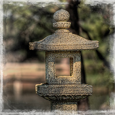
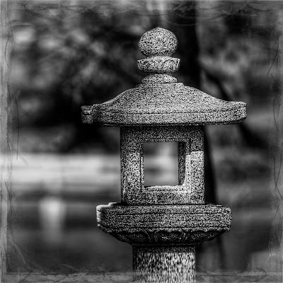
Last week while taking some photographs at the Japanese Garden, I saw this statue.  The lighting on it was very interesting, so I decided that it would make a good image.   When I downloaded the file to my computer, I was very disappointed.  It was not what I had anticipated.  The colors were somewhat flat and muted.  It had no real point of focus.  It really did not have any interest.

Now here is where I heard the devil say:  "You can fix it in Photoshop."  So, I started down the path of no return.  I tried this and then I tried that.  Finally, I converted it to black and white (I knew that would do it).   But, alas, nothing could really make this into much more than an average photograph.

This brings us to the lesson of the day, Little Cricket:  "You can waste a lot of time trying to make an average photograph into a great photograph by using Photoshop."  I must admit, I get some grief from some of my photo pals over my "search out and destroy" policy after I download.  My general philosophy is: "with average images, you will either spend tons of time trying to make them into good ones, or, you will never look at them again; so, why not get rid of them immediately."  

I will not give you anything camera settings or what I tried in Photoshop--it will just depress you knowing that I wasted that much time.

January 29, 2009

A Little Red


After visiting with a friend who was in a hospital, I was heading over to have dinner with another friend when I saw this old red telephone booth.  I have taken photograph at this small shopping area before, so I had an idea of what I wanted. The first thing that struck me was, of course, the red, but then I noticed how the light was flowing onto parts of the building.  I wanted to try to balance the big hung of red with the light on the building, which I knew would be difficult.  I felt that if I could do it, it would give the photograph a much greater appearance of depth. Enjoy.

Camera settings:   Nikon D3, 28-70mm f/2.8 at 28mm, f/16 at 1/15 of a second on a tripod.

Post processing:   Photoshop--set white and black points, increased mid-tone contrast, and then used multiply blend mode layer to darken most of the image and screen blend mode layer to lighten the area where the light was hitting the building.

January 28, 2009

An Abstracted Family

Last night, I attended our club's annual awards banquet.  At the banquet, we present our Photographer of the Year award.  For 2008, Steve Schuenke was our Photographer of the Year.  Steve is a really good photographer, a good guy and has done a lot of great work for Bay Area Photo Club.  However, I was disappointed a little in his acceptance speech.  I can overlook the fact that he did not say thanks to mom, his wife or his dog (which he does not have one, but I am sure that Cindi would let him borrow one of her dogs for the evening).  No, I was disappointed because he did not recognize what really set him apart this year--being my VAL at Renaissance and Dickens festivals.  I just do not understand how he could have overlooked his most important photographic learning experience of his life.  Oh, well, I guess this is just another one of the many things that I have learned to live with.

All kidding aside, Steve deserved the award.  He produced some outstanding photographs this year, as he does every year.  I enjoy looking at his work, shooting with him or drinking a cold one after an event. Congratulations Steve, well done!

Now the race is "on" for 2009 Photographer of the Year.  Good luck, everyone!  I do have application forms available to be my VAL at various shoots, if any of you might be interested.

Now to today's photograph.  Not much of a back story here.  

I was over at my grandson's school shooting the Children's Mass over the holidays.  While waiting for the rest of the family after the mass, I spotted this family.  The light was wonderful.  I took a few "normal" shots, but then wanted to do something that captured the essence of the moment--the father and the little girl being very calm and the little boy moving every-which-way.  I decided on a nine multiple exposure shot that I hoped would do the trick.    Here is the attempt that I liked best.

Camera settings:  Nikon D3, 70-200mm f/2.8 at 120, ISO 200, f/8 and 1/30 of a second.

Post processing in Lightroom:  set black and white points, added mid tone contrast, selectively brightened area around family, and cropped to 11x14 format.

January 27, 2009

Night Shooting

One of my friends and I went over to a local carnival on Sunday evening to try a little night shooting.  I went without any plan or idea of what I wanted to get; so, for about an hour, I got nothing.  

Finally, I started watching the people look at the lights.  I decided that the people's reaction to the lights was what I wanted to show.  I found this mother and daughter going from one ride to the next, looking at the lights and then oahing and awhing.  They were having lots of fun.

This is the shot of them that I liked best.

Camera settings:  Nikon D3, 28-70 f/2.8 at 28mm, shot at ISO 3,200, f/8 and 1/45 of a second.

Post Processing: 

Lightroom—set black and white point and added mid-tone contrast, clarity and vibrance.

January 26, 2009

Looking for Details

Friday, I took a portrait of a lady and her three dogs.  The session started at her house in the Museum District of Houston.  The dogs were just not cooperating and she was most apologetic.  She told me that she normally takes them for a walk about that time over in Herman Park, which is a few blocks from her house.  I suggested that we move the session over to the park.  After a little running around, the dogs settled down to their normal activity at the park—her and the dogs setting on a bench watching people walk by while she read her book.  I got some really good photographs of them.  They seems so natural and “looked right.”

After the session ended, I wondered over to the Japanese Garden.  The lighting was not too good, so I decided to zero-in on some details.  I found this graffiti on the trunk of a tree.  I found it interesting for some reason.  I wanted the photograph to show the depth of the three trees and the lighting that was falling on them.

Camera settings:  Nikon D3, 70-200 f/2.8 at 180mm, shot at ISO 200, f/5.6 and 1/125 of a second on a tripod.

Post Processing: 

Lightroom—Change the white balance to a warmer color, set white and black points.

Photoshop—Created mask that had closest tree being white, middle tree being 50% grey and back tree and background being black and used the mask to saturate colors a little and add sharpening using the high pass filter method with a hard light blending mode and created a border in onOne FotoFrame.

January 23, 2009

Same Old Building

This another shot of the building that I featured yesterday.  On this shot, I wanted a gritty look that showed primarily texture and lighting.  One aspect that I really wanted to showcase was the fire escape and its shadow.  I thought the fire escape was the central point of the building and brought a very strong compositional element to the photograph.  

Camera settings:  Nikon D700, 28-70 f/2.8 at 28mm, shot at ISO 200, f/16 and 1/125 of a second.

Post Processing: 

Lightroom—set white and black points, increased saturation of red.

Photoshop—used nik Silver Efex Pro to convert image to black and white, and increased mid-tone contrast using curves.


January 22, 2009

After the Houston Marathon

After many of the runners had finished, I wondered down to an area know as Alan’s Landing (where Houston started).  I had seen this old building many times but had never really checked it out.  While checking it out, I found these stairs.

Looking at the stairs I was not interested in the form of the stairs but rather the old, scrubby textures of the building and stairs.   I knew that I wanted it to be a black and white, but I needed to bring out the texture that I was seeing.   I used an ole Barry Armer's trick—hand-held HDR.  I took seven shots with the exposures being +3EV to -3EV.  The seven exposures were processed with Photomatix Pro. 

Camera settings:  Nikon D700, 28-70 f/2.8 at 28mm, shot at ISO 200, f/16 and 1/8, 1/15, 1/30, 1/60, 1/125, 1/250 and 1/500 of a second for the seven exposures with the camera resting.

Post Processing: 

Photomatrix Pro—processed the seven exposures with minimum processing during the tone mapping.

Photoshop—sharpened image using high pass filter in hard light blending mode and converted image to black and white using nik Silver Efex Pro.

January 21, 2009

Before the Start of the Houston Marathon

I was out scouting for a good place to shoot my abstract runner when I found this location.  I wanted to use a traditional landscape technique of making something in the foreground very prominent and in-focus.   The sun had not risen, so the sky was that deep blue that you normally see that time of the day.

The building in the background was what I really wanted to be showing in my abstract runner, but I could not find any place where the runners were passing with this background.


Camera settings:  Nikon D700, 28-70 f/2.8 at 28mm, shot at ISO 1,600, f/11 and 1 second with the camera resting on a park bench.

Post Processing: 

Lightroom—set white and black point, and added mid-tone contrast, added clarity and vibrance.

Photoshop—sharpened foreground using high pass filter on hard light blending mode.

January 20, 2009

Houston Marathon #2

Today’s post is another from my trip to the Houston Marathon, but it will not include any technical data. Why?  Because of what I wrote yesterday on Brian Bastinelli’s blog.   As photographers, we too often think about this setting or that setting rather than our real purpose:  to make an image (it does not matter how we get there).

Today, we will have a little humor, a lesson from a outstanding image-maker and finally another attempt to get my abstract runners.


When you attend an event like the Houston Marathon, you must realize that there are some things that you will not have control over.  An example:  BIG HAIR.  Now, I am a Texas; I love Texas ladies; and, I like their BIG HAIR.  But, even big hair has it’s place.  Here I am having a little trouble with getting my shot around another viewer of the race.  Realize that you will be faced with situations like this and just deal with it.


Amy is 3½ years old.  She is a true artist.  She is the photographer that I aspire to be.  Here, she is photographing her mother and aunt.   She is constantly directing them—“a little closer”, “bigger smiles”, "keep your eyes open”, etc.   After each shot, she looks at the back of her camera to see what she has.  No fretting over camera setting, just total concentration on the results, and then the barking of new instructions to her models.  I did not see any of her images, but I bet her images captured the moment better than most of mine.


Finally, here is another attempt I made at capturing my abstract runners.  Enjoy.

January 19, 2009

Houston Marathon

Sunday, I went to the Houston Marathon.  I do not consider myself to be a very good sports photographer.  Why?  Because I do not take very many good sports photographs.   I must admit, it is not something that I really enjoy, so I do not do it very often.

So, why did I go to the Houston Marathon with my cameras in hand?  Well, I had an idea--I know this is risky for me!   I was over at a friend’s house a few weeks ago and I started looking at a couple of his Leroy Neiman paintings.  I really like the way the painter had abstracted the athlete and since I have decided to try more abstracts in 2009, I thought that would try abstracting some runners at the Houston Marathon.

My idea was to place my camera at street level, use a wide lens and a slow shutter speed.  I thought that I would get blurred runners and a sharp background (the buildings of the Houston skyline).  I did not get exactly what I thought, but I though a couple of them were interesting.  Here is one of my abstract runners.  Hope you enjoy.

Camera settings:  Nikon D700, 28-70 f/2.8 at 28mm, shot at ISO 1,600, f/8 and 1.5 a second with the camera resting on the street.

Post Processing:  Lightroom—set white and black point, and added mid-tone contrast, added clarity and vibrance, increased saturation of reds, yellows and blues, cropped the photo to be a more panoramic crop

January 16, 2009

Another Punishment Shot

This is another shot from my afternoon of torture and punishment (see January 15th post). 

In one of the stores, I spotted this old time bulk grain section that had these really cool handles to dispense the grain.  I really like the chrome and how it dispersed the light here and there.   I also like how they formed a great pattern.

This photograph was actually shot using the Nikon D3's built-in 4x5 format--the camera takes an image in the 4x5 format rather than the normal 2x3 format.   I had never used this feature, however, I knew that I would have to crop the image in post processing if I took it in the normal 2x3 format, so why not do a little in-camera cropping?


Camera Settings:  Nikon D3, 105mm Macro f/2.8, ISO 400, f/3.3, 1/60 second.

Post Processing:  Lightroom--cropped a little more from the right side, set white and black points, changed the white balance to get a different feel, increased midtone contrast.


January 15, 2009

Breaking the Rules

A few days ago, I was out with JD while she was shopping for something (?).   I am still not sure what I did to warrant this terrible punishment, but . . .  

We were going in and out of all these little shops when I spotted these bowls of candies.   I was immediately attracted to the colors and shapes, so naturally I thought "PHOTOGRAPH."   

But, I was not sure what I wanted to do with the shapes and colors.  For some reason, an assignment of our photo club late in the year came to mind:  Breaking Photographic Rules.   I looked hard at the bowls and tried to think of the rules that I wanted to break.  

Now, here I must admit, I often break rules (all sorts of them) without even thinking about it.  I was now having trouble coming-up with the rule(s) I wanted to break.  I finally settled on centering my subject--the multi-colored bowl.  After taking a few shots, I knew that I needed to open my lens up to get a really shallow depth-of-field that I thought was needed to clearly show what my subject was.  In doing this, I broke another one of those sacred rules, do not have anything in your foreground that is out of focus. 


Is this a great photograph?  No.  However, it was a learning exercise.  It reinforced the idea of using depth of field to make your subject stand out.   It also shows how a little extra care could have produced a much better photograph by moving the bowl in the upper right hand corner down so that the pattern formed by the bowls was even more obvious.

"Old and over the hill, but still learning" --I think I might put that saying on a bumper sticker. 


Camera Settings:  Nikon D3, 105mm Macro f/2.8, ISO 200, f/3.3, 1/60 of a second

Post Processing:  Lightroom--set white and black points, corrected white balance, added midtone contrast, and increased vibrance and clarity.

January 14, 2009

Another Leaf


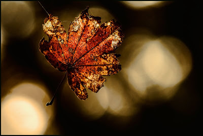
What's the old saying,  "when you find a good subject, milk it."  Ok, I made that up, but it does describe my basic approach to photography.  I probably spent 45 minutes to an hour taking photographs of five different leaves that were suspended by spider web threads.  I considered only two of the leaves interesting after I down loaded my files. This is the second one.

This photograph posed a different problem from the first one--I had to think about how to do this one and as many of you know, that is generally not my strong suit.  It was brightly backlit, which gave the leaf a translucent appearance.  I wanted to retain this, but I also wanted to make sure that the background did not blow-out and I got some detail of the front side of the leaf.  What to do?  FLASH! No, that is not what happened to my brain, it is the piece of equipment that I  needed to use.

Since I was romping through the woods, I did not have a lot gear with me--camera, 105mm, 28-70mm and 70-200mm lenses, cable release, a flash,  a synch cord and a tripod--seems like a lot of stuff when you list it out this way.  I set everything the way I wanted and then took various shots while dialing the flash down.  I finally settled on a flash set at 1/32 power and held off to the left of the leave.  Unfortunately, the fill flash was a little harsh.   I had no diffuser with me.  So, I made my own diffuser.   I found a branch and attached a sheet of kleenex to it and I had my instant diffuser.  It softened the light just the way I wanted. 

Now, the real trick with this set-up was holding it all.  I had the camera on the tripod with cable release attached, flash in my left hand and branch with my very expensive diffuser  and cable release in my right hand. After a few shots, I got the hang of it.

OK, Little Cricket, what is the lesson here?  Right.  If you are going to photograph in the woods do not leave home without an adequate supply of kleenex.  Very good.

Camera settings:  Nikon D3, 105mm Macro f/2.8, ISO 200, f/16, 1/250 of a second, on a tripod with Nikon SB800 attached by SC-29 cord and special home made diffuser used

Post Processing:  Lightroom--set white and place points and added mid tone contrast.

January 13, 2009

Mr. Determination

I was over at one of the local parks the other day to scout for possible portrait locations when I spotted this little guy.  He was determined to get himself a Pepsi.  He kept pulling on the side of the vending machine, but, alas, NOTHING.

I like this one the best because you can see most of his face. After his dad picked him up to go, he conked-out.  The little guy was tired.  Come to think of it, I was a little tired just watching him.

Camera settings:  Nikon D3, 70-200mm f/2.8 at 200mm, shot at ISO 200, f/2.8 and 1/500 of a second

Post Processing:   Lightroom—set white and black point, and added mid-tone contrast, added clarity and cloned-out a few dust spots on my sensor (time to clean it!).

January 12, 2009

A Forest Find


Bet you cannot understand why I took this photograph?

Let’s see striking red leaf suspended by a spider web against a nice blue background.  Nope, I just don’t see it.

Yesterday, I was out walking in the woods looking for something interesting to photograph when I stumbled (yes, stumbled is the correct word here) into some leaves that were held above the ground by spider webs.  There must have been at least twenty of them.  I started studying the pros and cons of each leaf and finally settled on this one.

The actual shot was very difficult one to obtain:  point camera at leaf and push shutter.  The leaf is a very small, thus my macro lens was only about six inches from it.  Everything in the photograph is pretty much as I saw it.

Camera settings:  Nikon D3, 105mm Macro f/2.8, shot at ISO 200, f/25 and 1/20 of a second on a tripod

Post Processing:   Lightroom—set white and black point, and added mid-tone contrast, added clarity and vibrance.

January 9, 2009

Tin Man #2

No, Tin Man is not a rock ‘n roll or country or blues singer.  At least, not professionally.  I was really disappointed with you out there (assuming that any of you are really out there), because I did not get too many guesses as to what Tin Man is noted for.

Tin Man loves his Harley, his beer, his ice house, his dancing and his occasional singing with the band.  But, what Tin Man is most known for is his work for and with homes for battered women in the Pearland area.  I was told that he is one of the chief organizers for a couple of fund raisers for homes for battered women and regularly donates his time to help maintain the homes.

Although he will not talk, at all, about himself or any work that he does, he is a lot of fun to be around; and, a pretty good singer to boot!

This photo was taken at Scooter's Ice House in Pearland during a wrap-up party for one of the fund raisers.  As you can see, these folks know how to raise more than money!

Camera settings:  Nikon D3, 70-200 f/2.8 at 100mm, shot at ISO 800, f/5.6 and 1/125 of a second.

Post Processing:  

Lightroom—set white and black point, and added mid-tone contrast, added clarity.

Photoshop—converted to black and white using nik Silver Efex Pro.

January 8, 2009

Spillway

This is a shot or should I say two shots that I took a few weeks ago.  One shot is of the water that I underexposed by about two f-stops and made sure that the background was completely out of focus.  I properly exposed the spillway and set the shutter speed so that I would get some movement within the water. I knew that I would need to crop the photo to eliminate some unwanted items on both the left and right side of the portion presented.

Camera settings:  Nikon D3, 70-200 f/2.8 at 200mm, shot at ISO 200, f/8 and 1/15 of a second on a tripod.

Post Processing:  

Lightroom—set white and black point, and added mid-tone contrast, added clarity and vibrance.

Photoshop—combined the two layers and added a curve to darken the water and hue saturation layer to de-saturate the colors, sharpened the spillway layer and added some mid-tone contrast

January 7, 2009

Abstract Wednesday

Why is today “Abstract Wednesday”?  Because today is Wednesday and I am presenting an abstract photograph today. 

Reason enough for me.

This photograph is a nine multiple-exposure shot.  With many of the Nikon, you can select multiple exposures in the menu, dial the number of exposures you want and select exposure compensation and start firing.   All your exposures are then recorded on a single image.  I usually set my shutter release to high-speed release because I want the exposures to be in a rapid burst.  I also change my focus to manual mode (I do not want the camera to be searching between exposures).  The multiple exposure mode allows you to create some unusual effects in camera without a lot of technical knowledge.

In this photograph, I set one of focus points over a particular flower and rotated the camera around that point.  I wanted to capture the colors and also create a feel of movement.   Even though you get a feeling of color and movement, if you look closely at some of the flowers you can see a lot of their details.

Camera settings:  Nikon D3, 70-200 f/2.8 at 120mm, shot at ISO 200, f/8 and 1/30 of a second

Post Processing:   Lightroom—set white and black point, and added mid-tone contrast, added clarity and vibrance, increased saturation of greens, blues and magentas.