No theme this week. Just thought that I would show a few photos that have been hanging around my “Possible Blog Photos” collection in Lightroom.
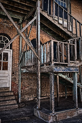
I had seen these stairs on an old building in the Heights many times, but never really taken the time to photograph them. I was very early to a photo shoot one day and decided to really see if I could get a good photo out of them. I tried various angles and framing and finally settled on this one. I wanted this photo to be as much about the textures and colors as the architecture of the stairs and the buildings.
Enjoy.
Camera settings: Nikon D3, Nikon 28-70mm f/2.8 at 32mm, shot at ISO 200, f/9.5 and 1/60th of a second.
Post Processing:
Lightroom—Set white and black points, added mid-tone contrast, clarity and increased saturation of red, blue and cyan.
Photoshop—used nik Color Efex Pro tonal contrast to add contrast to highlights, mid-tones and shadows and added a slight vignette using a multiple layer.
I can see what drew you to this building. I am surprised that you did not have someone standing on stairs. The colors are great. Glad to see you back posting images rather than showing processes.
ReplyDeleteDebbie
I do like the colors and textures in this photo. Would it make any difference if the perspective was corrected or do you think it would take away from the whole feel of the photo?
ReplyDeleteDHaass
Great textures, detail, and colors. Nice shot.
ReplyDeleteI like the way you often find photos where I do not find them. The textures and colors are great. Glad you are back to photos.
ReplyDeleteMel
There seems to be enough of the building, window and door in the frame for the image to be more than just about the stairs.
ReplyDeleteI do not understand Wayne's or DHaass' comments. You did not say this just a photo of stairs and does every photo with a building in it need to have all the lines straight. To me, you wanted this to be about textures and colors. It is.
ReplyDeleteAnne
My comment was I liked the colors and textures. My question was whether correcting the perspective made any difference or not.
ReplyDeleteWhat's not to understand? Do you stop looking at a photo after seeing only the colors and tectures, and not looking at the composition or perspective? His own comment was he wanted it to be about textures and color as much the architecture of the stairs and buildings. Would that not make those items part of the comments?
Please do not misconstrue this as argumentative or harsh in reply. I'm merely pointing out the original subject of the photographer was the architecture and stairs, with the expectation that colors and textures were just as important. My question "would correcting the perspective make a difference in the photo" was intended to generate discussion about that part of the photo.
DHaass
Great rich colors and textures Patrick!
ReplyDeleteNice post-processing as well!
I'm not sure I would have ever noticed the perspective was distorted if Doug hadn't mentioned it but even having it pointed out to me I still don't mind. I think because this shot is a crop and doesn't try to represent the entire building or staircase in a literal way it just doesn't seem important to me to have a corrected perspective.
Well done!
Barry