August 31, 2009

Not a Wedding Photographer—Part 1

I am not a wedding photographer. I do not want to be a wedding photographer. And, after you see this week’s photos, you will probably say: “It’s a good thing that you do not want to be a wedding photographer, because if you did, you have a lot of work to do!”

I know what you are thinking. If you are not a wedding photographer and do not want to be one, how in the world is it that you are presenting wedding photographs on your blog? Well, it is a long story, so let’s just say that I agree to be the second shooter at a wedding during a moment of temporary insanity.

What was my job at the wedding? I was to shoot the groom and groomsmen before the ceremony, the bride outside the church, the ceremony from the balcony and some candid shots after the ceremony. A little advice here for anyone thinking about being the second shooter at a wedding: photographing a bunch of guys is no picnic, especially not at a wedding. Why? Because guys do not like having their photos taken and they really do not want to be the guy who messes-up anyone woman’s wedding by being “the dork in the bad photograph.”
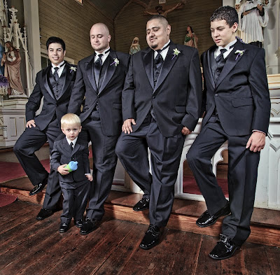
All the groomsmen at the wedding were great guys, but they were guys. So, getting a great GQ shot at the wedding was not really in the cards. Today’s shot is of my groomsmen and Master Hunter. Why is almost everyone watching Hunter? Well, it might have something to do with the fact that at the rehearsal he did a few drop kicks of the ring pillow.

Enjoy.

Camera settings: Nikon D3, Nikon 17-35mm f/2.8 at 20mm, shot at ISO 200, f/9.5 and 1/90th of a second with Nikon SB-800s shot through a translucent umbrella at camera left and right and triggered by Nikon SU-800 using CLS.

Post Processing:

Lightroom—Set white and black points, added mid-tone contrast, clarity.

Photoshop—Cloned a few hot spots out of the photograph and used nik Color Efex Pro tonal contrast filter to add contrast to shadows, mid-tones and highlights.

August 28, 2009

Hummingbird

I know this is not a great hummingbird photo, but I think hummingbirds are one of the coolest animals and anytime I can get a photo of one of them, I am going to do it. I wanted to show the colors and the nice bokeh.

Enjoy.

Camera settings: Nikon D3, Nikon 300mm f/4, shot at ISO 200, f/5.6 and 1/125th.

Post Processing:

Lightroom— Set white and black point, added mid-tone contrast and clarity and increased saturation of green.

August 27, 2009

Unusual Perspective

September’s assignment at Bay Area Photo Club is “unusual perspective” and I must admit that was on my mind when I took this photo. When I saw this statue on Main Street, I immediately thought that the statue could produce something different.

I think the photo has two unusual perspectives: one achieved by shooting the statue at the angle and low to high; and, a second one of the skyline being positioned under the woman’s chin.

Enjoy.

Camera settings: Nikon D3, Nikon 17-35mm f/2.8 macro at 20mm, shot at ISO 200, f/22 and 1/90th.

Post Processing:

Lightroom—Set white and black points, added mid-tone contrast, clarity.

Photoshop—sharpened skyline using high pass filter method and converted to B&W using nik Silver Efex Pro.

August 26, 2009

Big Eyes

I was taking very close-up shots of these flowers. I was using my Nikon 105mm macro lens with 36mm extension tube attached. I had to adjust the power settings on my Speedlight and when I looked back through the viewfinder, I saw this guy in the upper left corner of the frame. I immediately refocused and started firing at Mr. Big Eyes.

I must admit there was not a lot of time to compose this image. I was afraid this guy would fly away.

Enjoy.

Camera settings: Nikon D3, Nikon 105mm f/2.8 macro with 36mm extension tube, shot at ISO 200, f/32 and 1/60th of a second on a tripod with a Nikon SB-800 (set in manual mode) with a softbox attached and triggered by radio triggers at camera left

Post Processing:

Lightroom—Set white and black points, added mid-tone contrast, clarity.

Photoshop—used nik Color Efex Pro tonal contrast filter to add contrast to shadows, mid-tones and highlights of the dragonfly and the flower.

August 25, 2009

Another Around Houston Photo

Today’s image is one that I took while doing my around Houston series. I really liked the image both when I took it and then when I processed it in Lightroom. Why didn’t I use? I decided that I wanted all the photos to be “outdoor” photos rather than indoor ones.

The photo is from St. Basil Chapel on the University of St. Thomas campus. As I was about to leave the chapel, I noticed the reflection of the Madonna and Child above the holly water dispenser. The photo was relatively straight-forward exposure, however, the composition was the problem. Because of the distance between the reflection and the holly water dispenser, the composition either had to include a lot of dark negative space to the right of the holly water dispenser or be a long, but thin image. I decided on the latter.

Any suggestions to my composition dilemma?

Enjoy.

Camera settings: Nikon D3, Nikon 28-70mm f/2.8 at 42mm, shot at ISO 200, f/9.5 and 3 seconds on a tripod.

Post Processing:

Lightroom—Set white and black points, added mid-tone contrast, clarity.

Photoshop—Cloned a few highlights in the granite wall and used nik Color Efex Pro tonal contrast on the holly water dispenser to add contrast to the shadows, mid-tones and highlights.

August 24, 2009

Simple Colors and Simple Composition

I hope that everyone had a good weekend. We had a great one here at the Patrick household. We spent time with some old friends over some really fine food and some even better wine.

This week is clean-out week. I have various photos in my blog possible photos collection in Lightroom that I will be publishing this week. There is not a lot of connection between the photos that I will be posting this week except that I find them interesting.

Today’s photo is from JD’s garden. What struck me first about this flower is how simple the color combination is—red and green. As I studied the flower, I noticed the simple background. I must admit that I did change the background by moving the flower to the left so that the leaves behind the flower would be on a nice diagonal to the flower. I felt that added to the overall composition.

Enjoy.

Camera settings: Nikon D3, Nikon 105mm f/2.8 macro, shot at ISO 200, f/36 and 1/250th of a second on a tripod with a Nikon SB-800 pointed at the flower and a Nikon SB-800 pointed at the background (at -2 EV); both flashes were shot through a worn white sheet to make the light softer on the subjects.

Post Processing: Lightroom—Set white and black points, added mid-tone contrast, clarity and cropped top portion of image.

August 21, 2009

What I Did on My Vacation—Part 15


My final shot from my vacation comes from Garden of the Gods in Colorado Springs, Colorado, which is one of JD’s and my favorite places to visit. The Garden of the Gods is not the most spectacular park in the world but the park has so many good walking trails and is so peaceful early in the morning.

JD and I got up early and went for an early morning walk in the park. While on our walk, I spotted this sunflower and immediately knew that I wanted to use the rock formation as the background. I thought that the color combination of red, green, blue and yellow as a great combination.

Hope everyone enjoyed my vacation with my family as much as I do. Now, I have got to figure out what I am going to post come Monday!

Enjoy.

Camera settings: Nikon D3, Nikon 28-70mm f/2.8 at 52mm, shot at ISO 200, f/9.5 and 1/90th of a second with a polarizing filter attached.

Post Processing:

Lightroom—Set white and black points, added mid-tone contrast, clarity.

August 20, 2009

What I Did on My Vacation—Part 14

A little advice: if you ever go to Badlands National Park, plan on photographing it either early in the morning or late in the evening. During these periods, you see great colors and the light gives the hills some wonderful texture. Yet, during the middle of the day, the hills have no color and virtually seem to meld into each other. What a difference a little light makes.

Here I wanted to bring out the great colors before me—the yellows and magentas in the hills and the greens in the valleys. The sky was really secondary to the hills of the badlands.

I had about six f-stops difference between the sky and the hills, so I used a three stop graduated neutral density filter to bring the two exposures more in line with each other.

Just so I do not get any notes about it, I want everyone to know that I did level my camera before I made the photograph. The hills run from the high on the right to the low on the left. I decided to leave the horizon as it was rather than “correcting” it. What do you think is the right answer?

Enjoy.

Camera settings: Nikon D3, Nikon 28-70mm f/2.8 at 60mm, shot at ISO 200, f/16 and 1/30th of a second with a three stop graduated neutral density filter attached.

Post Processing:

Lightroom—Set white and black points, added mid-tone contrast, clarity.

Photoshop—used nik Color Efex Pro tonal contrast to add contrast to highlights, mid-tones and shadows of the hills.

August 19, 2009

What I Did on My Vacation—Part 13

How do you photograph an American? That’s not a rhetorical question. Rather, it was running through my mind as I stood there and looked at the bust on Mount Rushmore. I cannot think of how many different photos that I have seen of Mount Rushmore.

I must admit, I tried everything—I shot early in the morning, I shot late in the evening, I shot at night, I tried HDR shots, I tried wide angle lenses, I tried telephoto lenses and I tried shots from many different angles. I probably took over 100 photos of Mont Rushmore. I liked several of them, but finally settled on this one.

What was it about this photo that I liked?

First, it is a very simple composition that really shows-off the four bust on the mountain. There is the warm colors of the busts which brings the busts forward, while the cool colors of the sky pushes the sky to the background.

Second, the color pallet is very simple and very complementary to each other. In addition, there is just enough gold in the sky to tie the sky back to the mountain.

Finally, I really like the contrast in texture—the hard texture of the mountain against the softness of the clouds.

Enjoy.

Camera settings: Nikon D3, Nikon 28-70mm f/2.8 at 50mm, shot at ISO 200, f/16 and 1/250th of a second on a tripod.

Post Processing:

Lightroom—Set white and black points, added mid-tone contrast, clarity.

Photoshop—used nik Color Efex Pro to add contrast to highlights, mid-tones and shadows of mountain and added additional mid-tone to the sky.

August 18, 2009

What I Did on My Vacation—Part 12


Looking at a guitar case like this one makes you think that you about to meet a real special character, and when you finally meet Steve, you are definitely not disappointed—he is a real special character!
Steve is a writer of short stories, songs and poems. He also composes most of the music he performs. His songs are really stories put to music.

Steve is a good friend of my brother (also Steve). They have known each other for many years and have performed together. My brother invited Steve over to eat dinner with us and then share some of his favorite songs. The stage was long chairs arranged around a fire in the back yard of the cabin.

Each song would take about 20 minutes. With each song, you got a story about how he wrote it and a detailed explanation of his life when he was writing it. Between songs, you also got his views of everything from friendship to religion to the state of the world. I did not always agree with Steve's views (surprise, surprise, surprise), but I did find the telling of them was done with a unique style that you had to admire.

I wanted the portrait to be totally about Steve’s weathered face with a little hint as to what he is. I wanted his character to be front and center. I feathered the light by pointing the Speedlight head to camera left which helped keep the light off the background while still properly illuminating his face.

I felt that the color version was too busy so I converted it to black and white using nik Silver Pro Efex and used the high pass filter method to sharpen Steve, his clothes and his guitar.

Enjoy.

Camera settings: Nikon D3, Nikon 28-70mm f/2.8 at 70mm, shot at ISO 800, f/8 and 1/30th of a second with a Nikon SB-800 Speedlight attached to a Really Right flash bracket.

Post Processing:

Lightroom—Set white and black points, added mid-tone contrast, clarity.

Photoshop—used nik Silver Efex Pro convert image to black and white and used high pass filter method to sharpen Steve and his clothes and guitar and used onOne PhotoFrame to add a boarder.

August 17, 2009

What I Did on My Vacation—Part 11


As JD and I were leaving the park, I noticed these kids beside the stream. Except for the flip-flops, the scene could have been taken any time over the past 100 years. No matter the era, all kids love playing in the water, especially one with fast moving water and lots of rocks to throw.

Enjoy.

August 14, 2009

What I Did on My Vacation—Part 10


As I was heading to the car and JD was trying desperately to “jump start” the economy with a little consumer spending, I saw this sign. I thought: “WOW!” A little philosophy of life on a caution sign—assess the possible outcome before you decide to jump. Not bad, not bad at all.

JD graciously stopped at every artist’s booth so that I could watch people and take some last minute photos. This artist is Max, a Native-American woodcarver from Montana. He does really fine carvings, one of which, I am now the proud owner, or should I say co-owner. Max and I talked for some time, but being the good capitalist that he is, he was always ready and willing to interrupt our conversation to answer any question from the lady who was waving “green backs” in front of his eyes.


His somewhat perplexed look might have been the result of someone, not sure who, saying that JD had been passing counterfeit $20 bills at all the stands. It is a shame that I did not get a photo of HER look at the same time.

Here I am presenting both a color and black and white version for your consideration. I am really not sure which one I like best. In the color version, there is a fine combination of complementary colors, however, in the black and white version, his expression seems to be even more evident. I also flipped the black and white version to show how the tone of an image changes simply based upon its orientation.


Enjoy.

August 13, 2009

What I Did on My Vacation—Part 9

Not far from the stage, there was very serious debate taking place. As near as I could tell, the debaters were: a local politician, a doctor, a student and a retiree. The combatants were split evenly over the pro and con position now in Washington, D.C. I will let you guess who represented the pro and con views. As the debate continued, more and more spectators stopped and listened to the points being discussed.

Normally, I would dive head-long into something as juicy as a debate over our health our care system, but, I had my camera in hand and there were lots of subject “demanding” my attention. At some point, my eyes and ears started communicating with each other. Suddenly, I saw lots of people within 50 feet of the debate who, based upon their sizes and shapes, seemed to have made many “unhealthy” choices; and, I heard how the costs of healthcare was bankrupting families and the nation. I then realized that the whole debate in Congress, in the media and among individuals was not about making people healthier, but who would be responsible for paying the bills.


As I reviewed my photographs in Lightroom, I thought two of my photos might help illustrate a disconnect in the current debate over healthcare. I wanted the first photo to show an action that could easily lead to poor health. In the second photo, I wanted to somehow demonstrate the results (a “from this to that” comparison) of our unhealthy choices.

Enjoy.

August 12, 2009

What I Did on My Vacation—Part 8

I love to watch people. No matter where JD and I go, I find it very interesting to sit someplace and watch the world pass-by. I believe that if you want to do street photography, there is no better training than just setting and watching how people act.

I notice this couple very early during the performances. I thought that they truly looked the part of a happy, married couple. As I was talking to Sandy, I suddenly noticed that they seemed to always be in synch with each other. Naturally, this made me watch the couple a little more carefully. After watching for a few minutes longer, I decided that their synchronization would make for an interesting photo. But, how do I show it? The solution was simple—more than one shot. I took about six shots in total and had good synchronization in all of them. I originally selected three photos to post, but after studying them, I decided using three would be a little overkill. These two photos seemed to be the ones that best illustrated my theme.

Earlier in the week, I said that all the photos would be finished only using Lightroom. I lied. After seeing this one, I thought that it needed to be a good black and white (thus nik Silver Efex) and also needed a little dating (thus onOne Photoframe to put a boarder on it). Sorry about the lie, but the quality of the image counts more than me trying to improve on what is left of my tattered character.

Enjoy.

August 11, 2009

What I Did on My Vacation—Part 7


Meet George. That’s George of the Jungle, if you please. Many people think she is Jammie, including her mother, but her real name is George, or at least that is what I called her. George was very interested in what I was doing, but, did not want me to take her picture. So, we played this little game—she would hide and I would try to take her photo when she popped-up. This photo is totally about the moment and her expression. I wished that I had a little more fill light on her right side, but, I would not give-up that expression or the dynamic pose for a little better lighting. I believe that the pink of her skin and her blouse play beautifully against the green of the grass.


I can tell you from personally observation, Nick got all those scratches the honest way—by throwing his body every which way without regard to the possible consequences! Nick is totally boy. I could never get him to say a word and I could not get him to blink. This photo is about the intensity of his stare. In the future, if you see Nick at the World Texas Hold’em Championship, bet him; it will be a sure thing! Would you want to play poking with him?

Enjoy.

August 10, 2009

What I Did on My Vacation—Part 6

All the photographs this week will be shots of people at the Spearfish art festival. Most of them were taken while the students from Steve’s guitar classes set-up for their performance.

The technical aspects of these photographs are not really very interesting. All were taken hand-holding my Nikon D3 using my Nikon 70-300mm f/4.5-5.6. Post processing was limited to what I could do in Lightroom (Camera RAW for those not using Lightroom).

A few members of Bay Area Photo Club have asked me what I look for when doing street photography. The simple answer is something that is interesting. Interesting can be the person’s general facial features, their expression or what they are doing. But, the bottom line is the subject must have something in which I am interested in. Secondly, I look for subjects that I can isolate, so that what drew me to the subject can readily be seen in the image. As to equipment, I tend to use either my Nikon 70-200mm f/2.8 VR or my Nikon 70-300 f/4.5-5.6 VR. I prefer the 70-200, because it is extremely sharpe and I really like the bokeh it achieves at f/2.8. But, the 70-300 is an excellent lens and is the lens I usually take on trips because it is compact and much lighter than the 70-200. With these lenses I am able to keep my distance and not disturb what is going-on.

As to the “ask” or “don’t ask question” regarding street photography. I usually ask. I always asked when it comes to minors. However, the asking sometimes is after the fact. If the person objects to a photograph that I have taken, I erase it while they are watching and thank them for their time. Many people have heard me say this, many times, “the vast majority of people will agree to having their photograph taken if you ask them nicely.”

In Texas, we have signs that say: “Don’t Mess with Texas.” A sign above this boy might read: “Don’t Mess with My Popcorn.” What drew me to this young man was two things: the position of the hands, one on the straw ready for a little liquid refreshment, and the other in the popcorn bag; and that look which is the reason for the photo’s title. I took properly ten shots of this guy and his hands never moved and he never blinked. When I showed the photos to his dad (golf shirt backdrop), I got: “That’s my boy. Could I get a copy?”

Who needs fancy toys with batteries? This young man not only entertained himself, but also me. He would take the bottle in his mouth and then flip it into the air and count the number of revolutions it would did before he caught it near the ground—the record was 8. Just for the record: he did not catch it every time, but it was ok for him to put it back into his mouth because it never exceeded the “five second rule.”

Enjoy.

August 9, 2009

What I Did on My Vacation—Part 5 Revisited

Friday’s photograph drew a couple of comments—there was no way to tell the individual was a drummer without my comments and there were distractive elements in the photograph. I agree.

But, I would like to point a few things out. The photo was processed only in Lightroom (Camera RAW) and I do not have the skills to make the same type of localized corrections that I am capable of making in Photoshop. I have recently started reviewing Jack Davis’ “Lighroom: A Creative Approach” at Kelby’s Online Training. Who knows, after studying this course, I might never use Photoshop again—yea, right!

Second, in street photography, you get what you get. You cannot manage the background or the subject. I found photographing the bands at the Spearfish Art Festival to be very difficult because of all the equipment around the subject and the fact that I was often shooting up at the performers.

Tonight, I have taken the photograph into Photoshop and made some of your suggestions. I wanted the photo to be about his expression. So, I tried to eliminate as many distractions as possible and used a boarder to focus the viewer's attention to his face. Without a doubt it is a stronger image without all the junk growing out of the drummer’s head. I also did a better crop and used the high pass filter method to sharpen the drummer.

Lightroom is an outstanding product, but, I do not see me abandoning Photoshop anytime soon.

Enjoy.

August 7, 2009

What I Did on My Vacation—Part 5

After visiting Devil’s Tower, we ate a quick lunch at the cabin and then headed to Spearfish’s “Art in the Park” festival—great festival with a lots of interesting people, good entertainment, tons of food and many art vendors.

Interesting people means: Street Photography, which most of you who follow my blog know, is probably my favorite type of photography. Why do I like street photography? Because I have no idea what I will get! Plus, the subjects and conditions are constantly changing which means I must constantly adapt.

Students from Steve’s shop were schedule to perform starting at 3:00 PM, so we arrived a little before then. I promised Steve that I would take photos of his students.

When we arrived, a jazz band was playing. They were very good. I immediately noticed the drummer, who was a friend of my brother. He has such an interesting face and he was definitely into the music. I wanted the photo to be about him, but his colorful shirt and background would mean that the photo had to be black and white.

Unlike most black and white or toned photos that I do, this one was done totally in Lightroom. I did not intend this, but, as I was playing around with different presets, I liked what I was seeing in the preview window. I tried a lot of different things but finally settled on a sepia toned image—it just seemed to fit the scene.

Enjoy.

Camera settings: Nikon D3, Nikon 70-300mm f/4.5-5.6 at 300mm, shot at ISO 200, f/8 and 1/125th of a second.

Post Processing:

Lightroom—Set white and black points, added mid-tone contrast, clarity, converted to black and white, added sepia toning