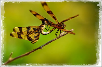
Unless something amazing happens this week, I plan to post additional photographs from my visit to Brazos Bend State Park. Before I describe today’s photo, let me do a little free advertising for our parks—local, state and national. We are very fortunate in America to have a great parks system. No matter how many times I go to any given park, I always find something new about it. My advice (for what it is worth): Go and support our parks!
I tried to take Cindi’s advice and look-up the names of what I am posting, but do you realize how many different dragonflies there are? I think there are billions; many of which, I cannot really see the difference between. So, it’s back to: “This is a dragonfly . . .”

Today's photo is all about the colors—earth tones throughout the image. I tried to get both dragonflies in focus, but even at f/29 I could not get them both in focus. After looking at all the images that I shot, I felt that f/16 was the sharpest so that is the one that I selected.
Since I could not get both dragonflies in focus, I decided to add a vignette to make the viewer’s eye go to the dragonfly that is in focus.
Enjoy.
Camera settings: Nikon D700, Nikon 300mm f/4 with a 1.7x Nikon Teleconverter and polarizing filter attached, shot at ISO 200, f/16 and 1/180th of a second on a tripod.
Post Processing:
Lightroom—Set white and black points, added mid-tone contrast, clarity and vibrance and increased saturation of green background.
Photoshop—sharpened dragonfly and branch using the high pass method in the overlay mode and added a vignette to the image.
Pretty amazing photo. The colors blend nicely and the dragonflies are putting on a nice show for your camera. Nice shot.
ReplyDeleteDebbie
I like simple pictures; they often have an elegance that you don't find in more complicated images. And you also have a diagonal using the branch, two of my favorite approaches. I doubt that the dragonflies were still long enough to get two pictures which varied by just different focus points so that the layers could be blended in PhotoShop. This is a chocolate versus vanilla point but I like brighter prints. I know that most people are taught that darker prints are for museums and are more artistic; but, I like to see the details. Did you purposefully crop part of the wing?
ReplyDeleteI agree with Wayne. The composition of this one is very simple as is the colors. This is a good wildlife photo that shows all the details that most of us just do not see too often.
ReplyDeleteTed
Good work. I just like this one.
ReplyDeleteAnne