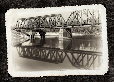
I thought Tom had a pretty interesting idea, but I was not sure how we would do it. We talked about how we would do it for a while and then settled on our approach which was:
- Increase our canvas size.
- Insert a new layer, move it below our background layer and filled it with a dark color selected from our photograph.
- Opened PhotoFrame and used Texture-paper_02 to give the paper background that old look.
After we finished, Tom again began to study, but this time he kept looking at the monitor and then at one pages of my old family album. He then said: “Look at these pages. All the photographs are not straight and they are not laying flat on the page. We need to make ours look like this.”
So, back to Photoshop to:
- Combined the photo of the bridge with its edge treatment, scratches and faded layers into a new layer
- Used Edit>Transform>Rotate to adjust photograph’s orientation
- Used Edit>Transform>Warp to make the photograph look like it was not setting flat on the page.
Well, this is the final image that Tom and I settled upon. I think it does a good job of making the subject and presentation look like they belong together.
Tom and I hope you enjoyed our little post processing adventure.

Good job on documenting the journey and on the final photo. The bridge has a lot more interest to me now. It looks like the kind of peaceful place Ray Miller would have wanted to take the "Eyes of Texas" cameras to.
ReplyDeleteI like Tom's final product. He did a really good job guiding you through this one.
ReplyDeleteIf you wanted to complete this like my grandmother did in her albums, you would have made the paper background bigger and you would have written in white script under the photos something like: "Railroad Bridge, Liberty, Texas 1928".
Good job. Enjoyed the journey.
Are you going to answer my question from a few days ago?
Debbie
Nice final touches. I agree with Debbie's comments about bigger and caption. I could very easily see this in an antique album.
ReplyDeleteAnne
Wonderful! The treatment you and Tom have done has definitely made the shot much more interesting than the original color image.
ReplyDeleteCindi