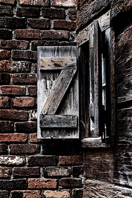
Camera settings: Nikon D3, 70-200mm f/2.8 at 105, at ISO 560, f/11 and 1/60 on a tripod.
Post Processing: Lightroom—set white and black point, and added mid-tone contrast,
Photoshop—used nik Color Efex Pro tonal filter to bring out the details in the various parts of the image, then I reduced the color saturation on the bricks, then blended a black & white image at a 25% opacity and then added a very sharp tonal curve, dodged the edges and finally added a pretty strong curves adjustment to add more contrast in the image.
Overall, I am relatively pleased with the image, but I think I still have not got the exact look at wanted when I original took the photo.
Any suggestions?
Great photo and post-processing Patrick!
ReplyDeleteI like it just like it is but since you asked for suggestions it made me think of one possibility; you have wood meeting brick and the textures are strickingly different but the color is very similiar. Can you move the bricks and wood toward different tonalities to create a little more contrast between the two walls? It might be an improvement or maybe not but might be something to play with!
Again though, I like it a lot just as it is!
Cheers!
Barry
I think the photo looks great as is too. I love the edgey feel and extra sharpness. My only suggestion might be in composition. You get the idea that the centerpiece of the image is a window, but you want to see what's on the other side. That plus the one shutter coming straight out at the viewer creates sort of a visual block ... at least for me. Do you have something more into the opening of the window?
ReplyDeleteSteve Schuenke