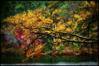
While in Fort Smith, Arkansas last week, I wondered over to a small lake not far from the farm. I knew that the lake generally had lots of color around it this time of year and that’s what I wanted to get (I was tired of recording another unsuccessful light-paining). I was not disappointed.

I came across this scene as soon as I arrived. The scene had great colors and the ambient light that was illuminating part of the lake and the far shoreline. I clicked-off a few shots and determined that I needed some light on the leaves. I attached my Nikon SU800 to my camera and placed a Nikon SB800 about ten (10) feet on both sides of my camera. I dialed in the fill flash that I wanted. It took me about six to eight clicks to get what I wanted.
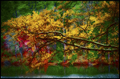
It was not until I had all my gear packed away in my car that I thought about making the scene more abstract. I hurried back and tried to duplicate my shot, but the ambient light was not the same, so alas no abstract. I was forced to turn to Photoshop!
As I said in an earlier post, I like abstracts. I am not very good at them, but I want to get better. So, for 2009, I make a resolution to shoot and post at least one abstract every two weeks. I want the abstracts to be “in-camera” abstracts. Hopefully, I will do more, but that at least is my goal.

Today, I post two shots. The first is how it basically came out of the camera (and adjusted in Lightroom 2.0), and the second is my attempt to make it into an abstract through the magic of Photoshop filters. I wanted the abstract to be more a splash of colors rather than a sharp photo of leaves and a lake.
Camera settings: Nikon D3 with Nikon SU800 attached and on tripod, 105mm f/2.8 Macro, shot at ISO 200, f/11 and 1/180 of a second, two Nikon SB800 (1/32th power) on each side of the camera
Post Processing:
Lightroom— (for both photos) set white and black point, and added mid-tone contrast, increased color saturation of red, yellow, orange and green, changed hue of green (slightly).
Photoshop—(abstract image only) used Filter>Brush>Splatter at a radius of 10 and a smoothness of 5.
Beautiful scene with terrific colors! My favorite is the "straight out of the camera" version! The second one looks to me more like a painting but not necessarily more abstract.
ReplyDeleteWell done!
Barry
I like the abstract, or as Barry said, the one that looks more like a painting. It makes you look at, and think about, the colors more. I think this photo is totally about colors. I wish you would have done an abstract when you were there.
ReplyDeleteKathy
I am not sure I know what to look at. The colors are nice, but I cannot get into the image. Sorry.
ReplyDeleteAnne
The yellows in the leaves and the red in the background are competing too much. Your idea is good, but you needed to shift your locations somewhat.
ReplyDeleteThe Professor
Beautiful images, thanks for sharing!
ReplyDelete