December 31, 2008

Old Sewing Machine


I had taken several photos before Cole and Chloe came over and was heading up to process the images when I noticed the light on JD’s sewing machine.  I really like the way the lighting was falling on the various parts of the scene; so, out came the tripod and down went the camera on it.   I immediately decided that I would process the photo as a black and white and wanted the overall tone of the image to be low-key photograph.

I think that the overall treatment complements the subject matter.

Camera settings:   Nikon D3, 17-35mm at 17mm, f/2.8, shot at ISO 200, f/22 and 3 seconds on a tripod

Post Processing: 

Lightroom—set white and black point, and added mid-tone contrast.

Photoshop—used nik Silver Efex Pro with antique preset to convert image to B&W.

December 30, 2008

Light Painting


This one is hot of the press.   I had completely forgot about posting my image today until I finally sat down at my computer to check a few things.   Then, oh my gosh, I have not posted my blog for today.  Oh, my gosh, I have not taken my photo for today.

From my computer, I decided it was going to be a light painting; so I can show everyone that I am no David Black. So out to the back porch to photograph some fish that JD has laying on an antique bench.   After too many tries, I finally got one that was not too bad.

Hope everyone enjoy this one.

Camera Settings:   Nikon D3 with Nikon 105mm Macro f/2.8, set at f/32 and 25 second shutter speed.

Post Porcessing:

Lightroom--set white and black point.

Photoshop--duplicated layer and ran nik Silver Efex Pro to convert to B&W and then reduced opacity of layer to 38%

December 29, 2008

Winter Haul

I do not own any plants or flowers; yet, winter for me means haul plants into the greenhouse, haul plants out of the greenhouse, repeat as necessary.   Not sure how I got this gig, but it seems like I do not have to worry about the recession taking my job.

While hauling this plant out, I noticed the bud and thought it would make an interesting photo.  I placed the plant on a table with our waterfall in the background.  I wanted only the bud to be in focus and properly exposed so I underexposed the ambient light by about a f-stop and used a wide aperture to limit the depth of filed.   To light the bud, I used a snooted strobe and feathered the light so that it barely hit the bud.   The photo was about what I wanted, however, I wished that I had given myself more room at the top.  I find myself too often composing my shots very tight--a hangover from my old slide days.  Oh, well, one more thing to work on.

One “around-the-house” photo down, four to go!

Camera settings:   Nikon D3, 105mm  Macro, f/2.8, shot at ISO 200, f/3.5 and 1/125 of a second with snooted flash

Post Processing: 

Lightroom—set white and black point, and added mid-tone contrast, adjusted white balance, increased saturation of magenta and purple.

Photoshop—added a boarder with onOne Frame.

This Week

This mornings post will not have a photograph attached.  Why?  Because I have not taken it yet.

On December 24th, Barry had a post about some photographs that he took at his office.  He told me that he got the idea from a post I made about a trip to Naches that I had taken earlier in the year.  This got me thinking--a rare moment for me!  Since I do not have any scheduled shoots this week and intend to stay around the house as much as possible, I decided to give myself an assignment:  Take an interesting photograph from around the house each day for my blog.

That's it for now!


December 26, 2008

Abstract Leaves


While waiting for JD on Christmas Eve before heading to our son’s house, I spotted these leaves with lots of color.  I made a few “normal” shots but what I wanted was colors and shapes.  I then started playing with trying different abstracting techniques.   This is the one that I thought showed-off the colors and forms the best.  Hope you enjoy.


Camera settings:   Nikon D3, 70-300 f/4.5-5.6 at 200mm, shot at ISO 200, f/38 and 1.5 seconds while slowly zooming the lens

Post Processing: 

Lightroom—set white and black point, and added mid-tone contrast, increased saturation of red, orange and yellow.

Photoshop—added a frame and paper texture using onOne Photoframe.

December 25, 2008

Chloe’s Favorite Christmas Decoration

My granddaughter, Chloe, who is three (almost four), has always loved this mouse.  She tells us every year that it is her favorite Christmas decoration in the whole year.  All we get out of our six year old grandson is “it’s really girly.”

I am not allowed to post any photographs of the grandkids on the internet—orders from grandma and “special daughter.”   I really got some good ones during the holidays.  I used David Hobby’s method—a strobe in each corner of a room set to manual and another on a flash bracket to give a little fill light (set at -2.3 EV).  I like the results and would love to share them with you, but, I would have to kill myself if I did.

Hope everyone has had a Merry Christmas!

Camera settings:   Nikon D3, 50mm f/1.4, shot at ISO 200, f/1.4 and 1/125 of a second with flash and softbox

Post Processing:  Lightroom—set white and black point, and added mid-tone contrast, adjusted white balance and added a vignette.

December 24, 2008

Family Feud


The grandparents of one of my very close friends, Jerry, owned this farmhouse.  The house was a wonderful place to be, especially during Christmas—the smells, the decorations, the spirit were just plain wonderful.  Jerry’s grandparents made everyone feel like they were truly special.  They died shortly after I left for college in 1962.  The family has been fighting over their will ever since. 

The house tells the rest of the story.

Have a Merry Christmas and remember to hug everyone in your family during the holidays! 

Camera settings:   Nikon D3, 28-70mm f/2.8 at 28mm, shot at ISO 200, f/5.6 and 1/180 of a second (about 1½ stop under-exposed) on a tripod with two Nikon SB800 strobes on each side of the house set to ¼ power to light only the house

Post Processing: 

Lightroom—set white and black point, and added mid-tone contrast. 

Photoshop—de-saturated colors of sky using hue-saturation layer, used nik Color Efex Pro tonal contrast filter to add significant contrast to highlights, mid-tones and shadows (masked sky off so it would not get the added contrast), used nik color Efex Pro old photo filter on house to provide it a little washed out look on a layer at 20% opacity, added vignette layer in hard light mode and painted with brush set at 5% opacity until I got the look I wanted.

December 23, 2008

Old Petroleum Jelly on the Lens Trick

Yesterday’s post reminded me of a photograph that I took in the spring and had never shown.  On the way back from Savannah, Georgia where I attended the Next Step Workshop (cannot say enough about this workshop—it will make you go to the next step with your photography), Janice and I stopped at Callaway Gardens.  The place is really beautiful.

I took a photograph of this bridge and the flowers behind it one evening, but as I looked at the image on my laptop, I was not really happy with it.   The shots lacked focus.  I tried a few quick and dirties in Photoshop, but was not really happy with the results.  I finally decided that I needed to make parts of it more out-of-focus, and since Janice will not let me buy a tilt-shift lens (something about having food on the table and roof over our heads—don’t really understand these things), I decided to use the old petroleum jelly trick.  I smeared a little petroleum jelly on my filter.  I made several shots, adjusting the spread and amount of the petroleum jelly on each shot.  This is the one that seemed best to me.

Camera settings:   Nikon D3, 70-200mm f/2.8 at 135mm, shot at ISO 200, f/9.5 and 1/180 of a second on a tripod with petroleum jelly smeared on parts of my UV filter

Post Processing:  Lightroom—set white and black point, and added mid-tone contrast, increased saturation of red, orange and green and changed hue (slightly) of green, added vignette, and cropped image more into a panorama view.

PS—if you use this trick, be prepared to spend a little time cleaning the filter on which you spread the petroleum jelly.

December 22, 2008

Color and Light

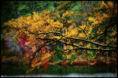
While in Fort Smith, Arkansas last week, I wondered over to a small lake not far from the farm.  I knew that the lake generally had lots of color around it this time of year and that’s what I wanted to get (I was tired of recording another unsuccessful light-paining).   I was not disappointed. 

I came across this scene as soon as I arrived.  The scene had great colors and the ambient light that was illuminating part of the lake and the far shoreline.  I clicked-off a few shots and determined that I needed some light on the leaves.  I attached my Nikon SU800 to my camera and placed a Nikon SB800 about ten (10) feet on both sides of my camera.  I dialed in the fill flash that I wanted.  It took me about six to eight clicks to get what I wanted.

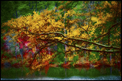
It was not until I had all my gear packed away in my car that I thought about making the scene more abstract.   I hurried back and tried to duplicate my shot, but the ambient light was not the same, so alas no abstract.  I was forced to turn to Photoshop!

As I said in an earlier post, I like abstracts.  I am not very good at them, but I want to get better.  So, for 2009, I make a resolution to shoot and post at least one abstract every two weeks.  I want the abstracts to be “in-camera” abstracts.  Hopefully, I will do more, but that at least is my goal.

Today, I post two shots.  The first is how it basically came out of the camera (and adjusted in Lightroom 2.0), and the second is my attempt to make it into an abstract through the magic of Photoshop filters.  I wanted the abstract to be more a splash of colors rather than a sharp photo of leaves and a lake.

Camera settings:   Nikon D3 with Nikon SU800 attached and on tripod, 105mm f/2.8 Macro, shot at ISO 200, f/11 and 1/180 of a second, two Nikon SB800 (1/32th power) on each side of the camera

Post Processing: 

Lightroom— (for both photos) set white and black point, and added mid-tone contrast, increased color saturation of red, yellow, orange and green, changed hue of green (slightly).

Photoshop—(abstract image only) used Filter>Brush>Splatter at a radius of 10 and a smoothness of 5.

December 19, 2008

Set-Up for Festival Shooting

Today, over at Steve Schuenke’s blog, you can see the lighting set-up and our method of taking photos at a festival.  Steve is using his Nikon 70-200mm f/2.8 and based upon the photo that he posted, I think he probably has his lens at 150-200 and f/2.8 to 5.6.  He has good working distance from the subject.   I am holding the softbox about four feet from the subject and since Steve is taking a head shot, I have the softbox pointed at the level of her face so that the light will not be affected by the brim of her hat.  The softbox produces a relatively soft light and it does a great job of separating her from the background.   You will notice that she is about 15-20 feet from the store front, but since the light is set at probably 1/8th power, there is no light from the softbox falling on the background.   By using the long lens (probably at 150-200mm), Steve has compressed the whole scene (her and the background). Very good portrait taken by a good photographer and a so-so VAL!  

Steve, thanks for the post.  Does this qualify as my "how I shoot post"?

Fireman—3rd Generation

Last week, I got a call from a couple of our local firemen who wanted me to do their portraits for Christmas—nothing like waiting to the last minute!  I consider firemen and policemen to be real heroes.  They give so much to the community, and too often get too little back.   So, naturally, I agreed to do it.  The portraits were for their family, i.e.,  mom.

I called my good friend, Cindi, and asked if she wanted to go with me.  She agreed, and so we met at the fire station.

I would like to say a little about shooting with another person—do it as often as you can, especially if the other person is the opposite sex.  It is amazing how men and women see things differently.  Cindi has a very good eye.   She is more of an artist than I am.    Cindi noticed many details that flew right past me.   She was invaluable in getting the shot that I wanted, or, at least, the shot that I think I wanted.   Cindi, thanks for all your help. 

I do need to make a disclaimer here: you would not believe how particular and demanding Cindi is.  I do not think anyone (and especially Cindi) has ever produced a photograph that she is 100% happy with.  I was lucky to produce a few that passed her minimum level of acceptance—barely!

The portraits that I printed for the firemen looked nothing like this one, after all, they were for mom.  Mom got the G-rated portraits.

For some reason, I find that many firemen have eyes that seem to penetrate you.  They do not seem to just look at things; they completely study their subjects.  I wanted this photo to do two things:  first, immediately draw the viewer to his eyes; and second, have an edgy look to help communicate the nature of a fireman’s job (rugged and dangerous).

Camera settings:   Nikon D3, 70-200mm f/2.8 at 190mm, shot at ISO 200, f/2.8 and 1/90 of a second, with the main light being a softbox with a Nikon SB800 (at 1/8th power) above and to camera left and a fill light being a softbox with a Nikon SB800 (at 1/32th power) to camera right

Post Processing: 

Lightroom—set white and black point, and added mid-tone contrast, added clarity and vibrance. 

Photoshop—used nik Color Efex Pro tonal contrast filter (masked face) to push the overall contrast in everything but his face, used nik Silver Efex to convert layer to B&W and then blended with previous layers at 35% to reduce overall color saturation, added hue/saturation layer in saturation mode and increased red and yellow of everything except his face, added a curves layer in luminosity mode and increased mid-tones, and added blank layer in soft light mode and then painted (with 5% opacity) with black below and to right of his face to add a slight vignette. 

December 18, 2008

My Only Good Bird Photo


OK.  So it’s not a Steve, Steve, Steve or Tim bird shot (four guys in Bay Area Photo Club who take outstanding bird photographs).   Why is this my only good bird photo?   Because it is not a photograph of the wrong end!   Every bird in North America knows that one millisecond before I hit the shutter, they are required to turn around and show me their “leaving view.”   It does not make for a good photograph.

Camera settings:   Nikon D200, 70-200mm f/2.8 with a 1.7 teleconverter at 340mm, shot at ISO 200, f/8 and 1/250 of a second on a tripod

Post Processing:   Lightroom—set white and black point, added mid-tone contrast, changed hue of green background, and increased saturation of reds. 

December 17, 2008

Another Plant Place

In over 40 years, Janice has drug me to so many plant places that I could not even begin to count them.   When we visit these places today, we have a system—she starts studying all the plants and I look for something to photograph.   It works pretty good, until the sun goes down and one of us still wants to do some more studying while the other wants:  FREEDOM!

A couple weeks ago, I spotted this tree at a nursery.   I really liked the textures and colors of the bark.   My job was to find one with the best light and background so that I could bring both texture and color out in my photo.   This is my attempt.

Camera settings:   Nikon D3, 105mm macro f/2.8, shot at ISO 200, f/19 and 1/60 of a second on a tripod

Post Processing:   Lightroom—set white and black point, added mid-tone contrast and increased the color saturation and luminosity for yellow, red and blue. 

December 16, 2008

Abstracting Simple Scenes

My friend Steve has been doing a great job showing some simple subjects in an abstracted form (check him out here).   I like this type of image.   I am generally not very good at creating abstract.  I think my left-brain (accountant/engineer type) takes over every time I pick-up my camera; and, since there is no “abstract” shooting mode on Nikons, I generally end up with photos that look like what was in front of my lens.  I really have to work hard to get my abstract mode engaged.

With that said, a few weeks ago I was at Surf Side beach near Freeport, Texas.  I was there to take a portrait of a surfer at sunrise.   Before he got there, I started playing with blurring the waves and skyline by moving the camera from left to right as I held the shutter open.  This is my favorite shot from my playtime.   I had enough fun doing this that future playtime abstract sessions are on my schedule.

Camera settings:   Nikon D3 (set to vivid color), 70-200mm f/2.8 at 200mm, shot at ISO 200, f/2.8 and 1/4 of a second on a tripod.

Post Processing:  Lightroom—set white and black point, added mid-tone contrast and increased the saturation and luminosity to red, orange, blue and cyan. 

December 15, 2008

Different Interpretations

I am always amazed at how I can do a little tweaking here and there in Photoshop and come-up with a totally different look in a photograph. Today’s photos come from my visit to Dickens on the Strand. Many people dress-up in Dickens-period costumes which means there are many opportunities to do different interpretations in your final print.

In the first image, I wanted to isolate on the two subjects. I wanted to emphasize their face and just give a hint of their settings.

Camera settings: Nikon D3, 28-70mm f/2.8 at 60mm, shot at ISO 200, f/6.7 and 1/180 of a second

Post Processing:

Lightroom—set white and black point, and added mid-tone contrast.

Photoshop—used nik Color Efex Pro tonal contrast filter to add detail to the clothing of the ladies; used nik Color Efex Pro soft skin filter to even out the ladies’ faces; added some local contrast to their eyes.


In the second image, I wanted to get a “real” Dickens look—edgy, off beat, and rough. I need to have a lot of depth of field so I selected an f-stop of 11 and adjusted the power of my strobe accordingly.

Camera settings: Nikon D3, 28-70mm f/2.8 at 45mm, shot at ISO 200, f/11 and 1/125 of a second

Post Processing:

Lightroom—set white and black point, and added mid-tone contrast, de-saturated the colors.

Photoshop—used nik Color Efex Pro tonal contrast filter to add detail to the entire image and set opacity of the layer to 60%; used nik Color Efex Pro bleached bypass filter to give the image an overall edgy feeling.

December 12, 2008

Breaking the Rules

A couple of weeks ago, I was over at a friend’s house in the Heights (an old neighborhood near downtown Houston).  While in his backyard, I noticed this very interesting wall.  It is made of all sorts of material—old bricks, stone and cement.  It has a lot of character; so, naturally, I grabbed my camera bag.

I decided that I wanted to do two things:  break some photographic “rules” and use a little flash to add interest to a flat wall.  

I think that some people get all tied-up with this photographic rule or that one.  I think it is fun to just go out and break the rules.  I also think that it is one of the best ways to learn what really works, and why it works.  I centered the subject and tried to make sure everything in the photo was in focus and sharp.   I set my camera to record at vivid color.

I wanted just a splash of light across the walI, so I used a snot on my flash and set the flash at 1/64th power.

Before my blog, this would have been one of those photos that I took only for me.  It would be a learning shot—did it work, why did it not work, how can I change it, etc., etc. etc.  Now I share it with everyone in cyberspace and let all of you out there decide.

Camera settings:  Nikon D3, 105mm Macro f/2.8, at ISO 200, f/11 and 1/30 on a tripod.

Post Processing:  Lightroom—set white and black point, and added mid-tone contrast and increased color saturation of various colors to add depth to the image.


December 11, 2008

Difficult Lighting Conditions at Dickens on the Strand


Last Saturday, a group of us from the Bay Area Photo Club went down to Galveston for the Dickens on the Strand. I had not been down to Galveston since Ike decided to remodel it, and to be honest, I was very surprised at how well the Strand had recovered. It was an area that was very hard-hit by the hurricane, yet, a lot of good solid work has been done to restore the area. I hope everyone who owns property on the Strand has enough energy and money to completely restore it.

Steve and I used the same set-up that we used at the Renaissance Festival. I think that I got to Steve (who was once again my VAL)—I kept looking for situations that would be very difficult to get a good exposure.

Both of the photographs that I am posting today come from our Galveston outing. In each of these photographs, I had very bright backlighting. I used the same method on both of photos. I got a meter reading on the background, dialed my exposure down about 1 ½ stops and then set my flash to properly light my subject at my selected f-stop. Overall, it worked pretty well.

Post processing was done entirely in Lightroom. I did my normal setting of white and black points and increasing the mid-tone contrast.

I generally like the results that I got; however, I am not comfortable enough with the process yet. I am still using too many brain cells thinking about technical stuff rather than the image I want. I need to pay more attention to the background and make sure I have nothing that I really do not want in the photograph. I am constantly amazed at how cooperative people are when I want to take their photograph on the street. They are willing to move to a different location, change expressions, just work with you get a good photo. So I have no excuse as to why I am not completely satisfied with all the shots I take using this technique. I guess I need a lot more practice using it.

Now if I can just get Steve to go along!

December 10, 2008

Edgy Photo Update

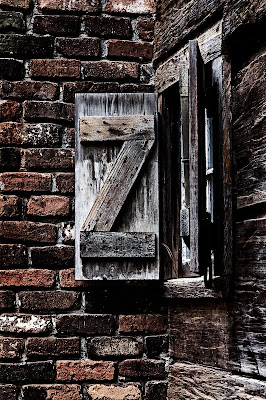
After reading Barry’s and Steve’s comments, I decided that they had some very good points, so I went to the drawing board and re-worked the image in Lightroom.   I started with the image I original posted and cropped it.   I wanted the crop to be just below and just to the right of the window.   I then boasted the saturation of red, orange, blue and cyan.   Finally, I increased the warmth of the highlight areas and cooled the shadow areas using split toning.   Although I have seen some very interesting effects using the split toning area of Lightroom, I have never used this section of Lightroom.   I think the overall effects make for a stronger image.  

Thanks Barry and Steve.

Edgy Photo

Recently, I was down in Alvin, Texas trying to do a little light painting of an old barn before sunrise.   I came away with NOTHING!   I saw this window on an old house and decided that it would make an interesting scene if I could figure out how to process it.   I knew that I wanted it to have an edgy feel to it, but I did not want that bleached out look that you get with various filters.   So, after doing my normal processing in Lightroom, I was off to experiment with various things in Photoshop.


Camera settings:  Nikon D3, 70-200mm f/2.8 at 105, at ISO 560, f/11 and 1/60 on a tripod.

Post Processing:  Lightroom—set white and black point, and added mid-tone contrast,

Photoshop—used nik Color Efex Pro tonal filter to bring out the details in the various parts of the image, then I reduced the color saturation on the bricks, then blended a black & white image at a 25% opacity and then added a very sharp tonal curve, dodged the edges and finally added a pretty strong curves adjustment to add more contrast in the image.

Overall, I am relatively pleased with the image, but I think I still have not got the exact look at wanted when I original took the photo.

Any suggestions?

December 9, 2008

Tony Sweet Revisited


Today’s photograph is again based upon Tony Sweet’s technique of taking multiple exposures.   This time, I took nine photographs while moving the camera from high right to low left.   I wanted to try to create a look like an impressionism painting, so I had to have a lot of shutter releases over a very short period.   I set my camera to continuous high speed shutter release which produces nine frames per second.  I have no idea of how many times I tried to get this image—but, it was a lot.   This is the best I have to offer.


Camera settings:  Nikon D3, 17-35mm f/2.8 at 24, at ISO 200, f/11 and 1/500 of a second for each individual release of the shutter

Post Processing:  Lightroom—set white and black point, and added mid-tone contrast and increased color saturation of reds and greens.

December 8, 2008

A Tony Sweet Replica


Today, I present a photograph that I tock out in my wife’s garden using a method described by Tony Sweet in his book “Fine Art Flower Photography.”   The effect is completely done in camera.   You take three multiple shots on the same image.  All the shots are taken with the lens wide-open (f/2.8)—first one, with one flower in focus, the second one, with another flower in focus, and the third shot, with everything out-of-focus.   These there exposures give your image a glow around the flowers.  This is a fun and different way to photograph flowers.  Hope you enjoy.

Camera settings:   Nikon D3, 105mm micro f/2.8, shot at ISO 200, f/2.8 and 1/8 of a second

Post Processing:  Lightroom—set white and black point, and added mid-tone contrast. 

December 5, 2008

“Whatsthat?”

When our grandson was but one year old, his grandmother would carry him all over and he would point to something and utter:  “whatsthat?”   He is still very curious about everything, but, he no longer asked his question in such a unique manner—he now uses the Queen’s English to asked his questions, after all, he is SIX!

This summer we were visiting the mother of a life-long friend, when our grandson spotted the telephone and asked: “whatsthat?”  At first, I did not know what he was asking about; he then went over and pointed directly at the telephone and repeated his question.   I had grown-up with this type of telephone (and party lines), so I was quite dumb-founded that he did not know what it was.  I told him that it was a telephone; he was not sure of my answer and gave me a very skeptical look.   I pulled out my cell phone (a real phone!) and called the number.  It rang and we got him to answer it.  He was shocked that it really was a telephone.

As we drove home, I discovered that my son did not know what a “party line” was.  It is easy to forget about how much has changed in our lifetimes.  I wanted the photo to look like it is from an era long ago—like me!


Camera settings:  Nikon D3, 28-70 f/2.8 at 45mm, shot at ISO 720, f/2.8 and 1/30 of a second

Post Processing: 

Lightroom—set white and black point, and added mid-tone contrast. 

Photoshop—converted to black and white using nik Silver Efex Pro and antique preset with a few minor changes to the preset.