November 30, 2009

Candid Photos from India #1

Janice and I spent Thanksgiving 2007 in India. I was recently reminded of that fact by several people. We spent 27 days in India, and, even though I have visited over 80 countries in my lifetime, I had never seen anything like India. When asked about India, JD and I usually respond about the same: “It was probably the most amazing place I have ever visited, but, I am not sure I would ever want to go back.”

While in India, I took over 5,000 photos. Most are really bad; and, as is my practice, most have moved on to the big trashcan in my computer. However, I still have about 700 shots of our trip. Many of the photos are, of course, vacation shots.

I believe that only three photos from my trip have been seen by anyone other than my family and closest friends. I thought it was about time to share some of my people shots with everyone.

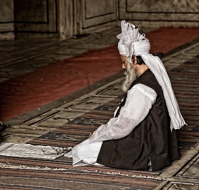
The first photo comes from a mosque in New Delhi. I found this man totally isolated from everyone and totally absorbed in his prayers. I wanted the photo to reflect his devotion and the natural light flowing into the prayer area.

Enjoy.

Camera settings: Nikon D200, Nikon 28-70mm f/2.8 at 70mm with shot at ISO 400, f/4.8 and 1/125th of a second.

Post Processing:

Lightroom—Set white and black points, added mid-tone contrast and cropped image.

November 25, 2009

Just a Great Day!

Today’s photo comes from one of my favorite days of the year—Grandparents Day at my grandchildren’s school. The day starts with a mass with the grandparents and grandchildren setting together. After mass, each of the grades make a presentation. Great show by all the classes. JD and I really enjoyed ourselves.

The photo is from the mass. I was interested in the contrast between the cool light falling on the cross and the warm light falling on the priest and alter boys.

I do not intend to make any more posting this week. I hope everyone has a good holiday.

Enjoy.

Camera settings: Nikon D3, Nikon 70-200mm f/2.8 at 70mm with shot at ISO 1,600, f/2.8 and 1/125th of a second.

Post Processing:

Lightroom—Set white and black points, added mid-tone contrast.

November 24, 2009

How Do You Show Action with Just One Frame?

Yesterday’s post reminded me of this set of photos that I combined last year. At the time I was pondering how you might show action. To be honest, I was tired of using blur to show action and was looking for something different.

Here I combined four photos at varying opacity of a skateboarder to try to show the sequence of events that led to the skateboarder crashing and burning.

Enjoy.

Camera settings: Nikon D3, Nikon 70-200mm f/2.8 at 100mm with shot at ISO 200, f/4 and 1/1,000th of a second.

Post Processing:

Lightroom—Set white and black points, added mid-tone contrast.

Photoshop—combined four photos and used auto align feature and then mask off everything but the skateboarder and his skateboarder in each of the early layers and reduced the opacity of the early layers to 50%, 65% and 80%.

November 23, 2009

Getting Unstuck

I think that anyone who tries to produce something that might, on a good day, resemble art gets stuck, or as writers might label it, get writer’s block. I just might be getting photographer’s block!

Over the past six weeks, I have devoted most of my photographic energies to portraits and environmental portraits for hire. Although some of the engagements have had an element of “creativity” to them, most of have not been pushing the envelop. I wonder what someone like Joe McNally does to keep his creative juices flowing. At the McNally seminar that I attended a couple weeks ago, Joe indicated that he tried to “keep pushing at edge of his abilities.” That sounds great, but how do you do that when a client wants you to produce an acceptable product. I do not have an answer to that one.

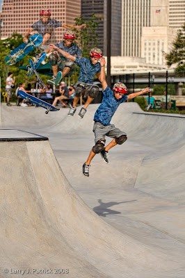
I do know that when I get in one of these “funks” I will head over to someplace like Jamail Skate Park. Why? Because I do not consider myself a very good photographer of “action” and Jamail Skate Park is all about action.

I recently went by the park and decided to experiment with high-speed synch flash. After watching this young man for about 15 minutes, I introduced myself and told him what I wanted to do. He was game. I got one of his friends to be my VAL. I positioned my VAL to camera right and determined that I wanted to use a shutter speed of 1/1,000 of a second and a f-stop of 5.6. I felt that these setting would give me adequate depth of field and also stop the action. I placed my VAL about six feet from where the subject would be and set my Nikon SU-800 to fire my Nikon SB-800 at 1/4th power.

The photo is not really very special, but, it did push me in a direction that I normally don’t go, so I guess it is a successful photograph. But, I am not sure that all my play got me “unstuck.”

Enjoy.

Camera settings: Nikon D3, Nikon 70-200mm f/2.8 at 100mm with shot at ISO 200, f/5.6 and 1/1,000th of a second with a Nikon SB-800 in manual mode and set to 1/4th power at camera right and triggered using Nikon SU-800

Post Processing:

Lightroom—Set white and black points, added mid-tone contrast and cropped image/

Photoshop—used Topaz Adjust Pop present to bring out details within the image.

November 20, 2009

Fireman—Contemporary and Edgy?

I was recently asked by a few of our local firemen whether was going to do portraits of them again this year for Christmas. Most of our local firemen are volunteers, so how could I say no?

Last night I started looking over a few of the photos that I took last year and ran across this photo. For some reason, I wondered if I could take what I considered a nice portrait of a really cool young man and turn it into some edgy. So, here it is.

I used Topaz Adjust vibrance filter to start and then I think I moved every lever back and forth at least ten times before settling on the final image.

Enjoy.

Camera settings: Nikon D3, Nikon 70-200mm f/2.8 at 120mm with shot at ISO 200, f/4.8 and 1/250th of a second with three Nikon SB-800 shot through a translucent umbrella and triggered by AlienBee radio triggers.

Post Processing:

Lightroom—Set white and black points, added mid-tone contrast.

Photoshop—used Topaz Adjust to give photo a slightly edgy look and then added a dodging and burning layer to lighten and darken various areas of the photograph.

November 19, 2009

Contemporary and Edgy?

Tuesday night, a representative from The Arts Alliance Center of Clear Lake discussed at the Bay Area Photo Club’s officers meeting an upcoming art show that they will be presenting in the near future. I am not really sure what the theme of the show is, but, I think it has something to do with contemporary and edgy photographs.

For some reason, I started searching my Lightroom catalog for something that I might submit. While searching, I came across this photo. I took this one at Dickens on the Strand last December. I thought the masks were really cool, but I never seemed to get the light and the framing of the image quite right.

This morning, I decided to “push” it towards that edgy look that I think TAACCL is seeking.

Enjoy.

Camera settings: Nikon D3, Nikon 28-70mm f/2.8 at 43mm with shot at ISO 200, f/5.6 and 1/125th of second.

Post Processing:

Lightroom—Set white and black points, added mid-tone contrast.

Photoshop—used nik Silver Efex Pro tonal contrast filter to add contrast to shadows, mid-tones and highlights of the mask.

November 18, 2009

Her Eye Never Left the Viewfinder


To make all my Canon friends happy, I thought that I would include this photo as a complement to yesterdays. I should have shot a full length photo because it offered a nice contrast with yesterday’s photo.

This young lady was sitting on a comfortable folding chair, had a coffee thermos and, I think, her house slippers on. Quite a contrast to our Nikon shooter who was down in the gutter trying to get what he wanted.

I think these two shots reminded me of the difference between two photographers who, I think everyone will agree, are great photographers—Joe McNally and David Ziser. In Joe, you have the street kid—pullover top and blue jeans; in David, you have a sharply dressed wedding photographer who never seems to get his jacket wrinkled or dirty. Both produce great photos and both know how to use flash to its full advantage.

What’s the moral of the story? Well, I guess it is: if you want to get down and dirty in photography, buy Nikon; and if you want to have tea and crumpets while you photograph, buy Canon.

I guess that is why so many of my friends have photographs of me laying on the ground trying to get the shot—well, that’s my story and I’m sticking to it!

Enjoy.

Camera settings: Nikon D3, Nikon 70-200mm f/2.8 at 130mm with shot at ISO 200, f/2.8 and 1/1,000th of second with Nikon SB-800 attached to camera by SC-29 cord and fired in high-synch mode.

Post Processing:

Lightroom—Set white and black points, added mid-tone contrast.

November 17, 2009

Getting the Shot

I happened to be downtown Houston a few weeks ago during one of the many charity runs. I started to photograph some of the runners, but for some reason I became board very quickly. I switched over to my street photography mode.

I came across this EXCELLENT photographer. How do I know he is an excellent photographer? Look at his equipment. How could he not be?

I took about ten shots of this young man, and to be honest, I do not think he ever knew I was there. I wanted this shot to be totally about his concentration on getting the shot.

Enjoy.

Camera settings: Nikon D3, Nikon 70-200mm f/2.8 at 70mm with shot at ISO 200, f/5.6 and 1/180th.

Post Processing:

Lightroom—Set white and black points, added mid-tone contrast.

Photoshop—used nik Silver Efex Pro to convert to black and white.

November 16, 2009

A Little Different Look at the Air Show

Many of my fellow Bay Area Photo Club members have posted some outstanding photos from this year’s Houston Air Show. I am not sure that I could ever post anything that would be as good as most of the shots that I have seen posted.

I went to the air show, but, thanks to a certain seven year old boy and four year old girl, I did not photograph too many of the airplanes. But, if you want some photos of two little ones riding the bucking mechanical bull or climbing a rock wall, then I am your photographer. Although I have been to the air show many times, I never noticed these two concessions. I also never noticed the Lego Land booth. Live and learn!

In this photo, I tried to combine two elements of the air show—the Blue Angles performing one of their precision moves and a youngster watching the action. I must admit this photo involved a little luck. I heard what the announcer said the Blue Angles were going to perform and then noticed this young girl sitting on her father’s shoulders. I immediately positioned myself behind them and hoped I would get a shot of a couple of the planes pulling-up into the sky. I got lucky to get all six of them.

Enjoy.

Camera settings: Nikon D3, Nikon 70-200mm f/2.8 at 70mm with polarizing filter attached, shot at ISO 200, f/8 and 1/180th.

Post Processing:

Lightroom—Set white and black points, added mid-tone contrast.

November 13, 2009

At the End of a Long Hike

One day while in Torres del Paine national park, I went on a long hike with a group of guys (while the ladies treated themselves to a day at the spa). The hike had many interesting views, but the end of the hike was a view of this mountain. Although this photo may not be as spectacular as the previous ones I posted, I felt that I had to include it here—after all, how else would I prove that I was there.

I wanted this photo to show how the whole scene looked so hostel to a wimp from Texas.

Enjoy.

Camera settings: Nikon D200, Nikon 70-200mm f/2.8 at 200mm with polarizing filter attached, shot at ISO 400, f/8 and 1/180th of a second on a tripod.

Post Processing:

Lightroom—Set white and black points, added mid-tone contrast.

November 12, 2009

November 12, 2009

While in Torres del Paine national park, JD went for hikes everyday. One of the most unusual aspects of hiking in the park was watching the storms roll in over the mountains. The storms would completely engulf the mountains but would generally not settle over the foothills in which we were hiking. Late in the afternoon, the sun would present a warm, soft light on the foothills, while the mountains would be very icy blue.

In this photo, I wanted to capture as much of the contrast as I could—the warm colors versus the cool colors and the rough terrain versus the softness of the storm clouds.

Enjoy.

Camera settings: Nikon D200, Nikon 70-200mm f/2.8 at 70mm with polarizing filter attached, shot at ISO 400, f/11 and 1/400th of a second on a tripod.

Post Processing:

Lightroom—Set white and black points, added mid-tone contrast.

Photoshop—used two Topaz Adjust layers to bring out more details in the in the foreground and in the mountains and clouds.

November 10, 2009

A Southern Hemisphere Sunset

Over the past few months, I have been cleaning-up some of my old photos that I plan to make into a book or two for my wife. She has always wanted books of some of our travels and I thought that this would be a pretty good time to do some of them.

This photo comes from one of our favorite places in the world—Port Natales, Chile which is just outside a great national park, Torres del Paine. Port Natales is a very interesting small town with great views of the fjords of the area.

I had set and watched this type of scene unfold before our eyes for three days before I said: "Da, why haven't you been taking photos of this wonderful scene." The clouds generally rolled into the area around two or three in the afternoon and then cleared by about 7 or 8 in the evening. Great sunsets every evening. This photo was taken from our hotel balcony while we sipped on some very nice Chilean red wine.

Enjoy.

Camera settings: Nikon D200, Nikon 28-70mm f/2.8 at 28mm with polarizing filter attached, shot at ISO 200, f/11 and 1/125th of a second on a tripod.

Post Processing:

Lightroom—Set white and black points, added mid-tone contrast, added clarity.

Photoshop—used Topaz Adjust to bring out more details in the sky.

November 9, 2009

Near Sunset


While on our way to South Dakota this summer, we stopped near this mountain range one evening. I really like the way there seemed to be three areas of the photo: the blue sky, the golden light hitting the rocks and finally the shadow area.

I just tired to keep the whole thing simple.

Enjoy.

Camera settings: Nikon D3, Nikon 28-70mm f/2.8 at 28mm shot at ISO 200, f/13 and 1/15th of a second on a tripod.

Post Processing:

Lightroom—Set white and black points, added mid-tone contrast, added clarity.

November 6, 2009

2009 Renaissance Festival #8

Yes, the color did attracted me. Yes, the face painting attracted me. But, what really got my attention was how this young lady looked me straight in the eye and didn’t even bat an eye.

When someone, especially a very young person, looks straight into the camera lens, you have immediate connection within your portrait. I believe that I got the connection here. I had to do nothing special with the exposure or the flash. I just had to make sure that I stayed out of my own way.

Enjoy.

Camera settings: Nikon D3, Nikon 70-200mm f/2.8 at 70mm shot at ISO 200, f/8 and 1/90th of a second with a SB-800 flash in a softbox at camera left.

Post Processing:

Lightroom—Set white and black points, added mid-tone contrast, added clarity.

Photoshop—used nik Color Efex Pro tonal contrast to add contrast to highlights, mid-tones and shadows of her dress and the wagon.

November 5, 2009

2009 Renaissance Festival #7

I first noticed this lady before we entered the park. The thing that I first noticed about her was how gracefully she seemed to carry herself. She looked like a ballerina—she moved with very little effort and with such grace.

When I saw her setting on this bench, I thought that she would make a really nice portrait. I wanted this one to be very simple. I framed her so some of the bench formed a nice line and there was enough light and dark parts of the ground to form an interesting pattern.

Enjoy.

Camera settings: Nikon D3, Nikon 70-200mm f/2.8 at 120mm shot at ISO 200, f/6.7 and 1/90th of a second with a SB-800 flash in a softbox at camera right.

Post Processing:

Lightroom—Set white and black points, added mid-tone contrast, added clarity.

November 4, 2009

2009 Renaissance Festival #6

As I was walking around the Renaissance Festival, I am constantly looking for people who, to me, have interesting faces. When I saw this young lady, I really thought that she would make a great photo.

But, I must admit, I was not really sure how I wanted to photograph her. As Bob will attest, I moved her around from one background to another, and to be honest, I never really saw what I wanted. I finally settled on a relatively simple background that had more texture than color to it.

When I saw the image on the screen, I immediately thought black and white—which really simplified the overall image and made the young lady come forward.

Enjoy.

Camera settings: Nikon D3, Nikon 70-200mm f/2.8 at 135mm shot at ISO 200, f/5.6 and 1/90th of a second with a SB-800 flash in a softbox at camera right.

Post Processing:

Lightroom—Set white and black points, added mid-tone contrast, added clarity.

Photoshop—used nik Color Silver Efex to convert the image to black and white.