Before discussing today’s photograph, I want to put something on the table that bothers me about how photographers talk about “blown-out” highlights. I often hear photographers and critics of photos say something like this: “Good photograph, but I am troubled by the blown-out highlights” when they mean the lack of details in something that the naked eye could not discern any details in it. To me a blown-out highlight is a highlight that the naked eye could see detail however the photograph shows no detail (total white in the area). I do not consider showing pure white area for lights or specular highlights to be “blown-out” highlights. Wikipedia defines specular as: “light is perfectly reflected (100%) in a mirror-like way from the light source to the viewer” thus it is as if you were looking directly at the light (which has no details).
I do agree that showing lights or specular highlights within a photo can be distracting; however, I also believe that these elements can also set the tone of the image or add-to the overall image. Think about the “catch light” in eyes or the catch of light on drop of water. Both are generally a totally white area—a specular highlight without detail. Yet, if not included, the eyes or the water drop look flat, uninteresting and not life-like.
That’s just my thoughts on the matter.
Today’s photo is a more traditional look at a ferris wheel. The only real twist to this photograph is that I wanted to include some detail of the people in the foreground. At first, I thought about using HDR however, I soon realized that would not work because the people and the ferris wheel were moving. I thought that I need at least +2 EV to get the light that I wanted on the lower half of the photo—show some details but still keep most of the scene in shadows. I set the auto-bracketing on my camera (in aperture priority mode) to take three photos at shutters speeds of 1/180th (for the ferris wheel), 1/90th (not used) and 1/45th (for the foreground). I then blended the two photos to get the exposure I wanted.

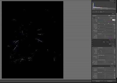
By blending the two photos, I was better able to control the overall exposure of the lights on the ferris wheel, as you can see by the screen grab of the photo that I used of the ferris wheel.
Enjoy.
Camera settings: Nikon D3, Nikon 28-70mm f/2.8 at 35mm shot at ISO 200, f/4 and 1/180th and 1/45th of a second.
Post Processing:
Lightroom—Set black and white points on both images used.
Photoshop—used Topaz Adjust Photo Pop preset on combined image.
I like the colors throughout the photo. I especially like the shadows in the foreground where the people are walking. This photo makes me feel like I'm there. I don't see any noise in the photo either.
ReplyDeleteBeautiful shot Patrick! I love everything about it (except of course for the blown-out highlight on that one light :-).
ReplyDeleteI wish I had taken this one!
Cheers!
Barry
Do not understand exactly how you created this one however I like it. Again, it makes me feel like I am sitting on a bench and watching people pass by.
ReplyDeleteDebbie
I sometimes wonder if you make things more complicated than they need to be. Could you just as easily used levels adjustment on the bottom of the photograph to bring out the details there? Your result is nice but do you need to go through all of that to get?
ReplyDeleteMel
The photo has lots of depth with the people in the foreground and the ferris wheel in the background. Like how you controlled all the lights.
ReplyDeleteTed
Cool photo. The ferris wheel complements the people nicely.
ReplyDeleteSya