March 30, 2010

Spring Flowers #3

Not a lot to say about today’s photo—I liked the shape, the colors and overall composition. The bud was in some shade so I needed a little flash in order to use an f-stop of f/8, which I need to give me the depth of field that I wanted.

Enjoy.

Camera settings: Nikon D3, Nikon 105mm f/2.8 shot at ISO 200, f/11 and 1/350th of a second with Nikon SB800 at camera left.

Post Processing:

Lightroom—Set black and white points, added clarity and increased contrast, and adjusted hue and saturation of green, red, yellow and orange.

March 26, 2010

Spring Flowers #2

Today’s flower shot is a little different. There were two things I was trying to do: have two flowers as my main subject (which I do not like to do, because I find myself looking from one to the other, without ever landing on “the subject”); and, overexpose the background and just apply a little light to the main subjects in order to make it stand out from the background.

I used two Nikon SB-800s (triggered using Nikon’s CLS) to light the background flowers and then used a reflector to direct light on the two flowers that were my main subject. One of the Nikon SB800s was camera right and pointed towards the center of the flowers and the other Nikon SB800 was pointed towards the back of the two flowers in the front.

Generally, I was not happy with my results. I felt that there was just not enough separation between the subjects and background. As I have said many times, red/orange/yellow are hard colors to control but I did think this approach would achieve what I wanted.

After trying several different things (none of which were working), I finally settled on a black and white treatment. I used nik Silver Efex Pro with an orange filter (to brighten the red/oranges/yellows in the photo) to convert the photo to black and white. The final results has almost an infrared look to it.

Enjoy.

Camera settings: Nikon D3, Nikon 105mm f/2.8 shot at ISO 200, f/3 and 1/2000th of a second.

Post Processing:

Lightroom—Set black and white points.

Photoshop—used nik Silver Efex Pro to convert image to black and white using a orange filter.

March 23, 2010

Spring Flowers # 1

Before I discuss today's photo, I would like to make a comment about David A's comment last week about his comment: " I was invisioning you giving everyone marching orders as they were leading with their right foot." If I ever gave anyone out there in cyber land the impression that I had any control over anyone in my family, let me correct that now. A better take on the scene would be that I was walking respectively 10 feet behind the powers. OK, I hope I cleared that up.

To me one of the sure signs that spring has begun is all the color that suddenly appears all around the Houston area. I am always amazed at how one day all the trees are bear and everything seems to be a “tired” brown, and, then the next day, there is color everywhere.

There is a lady in Friendswood who plants Tulips every year. She plants only one type of Tulip each year and changes the colors from year to year. This year, she planted red/orange/yellow Tulips. Knowing that she does this every year, I stopped at her house a few weeks ago and asked if she would allow me to photograph her Tulips when they started blooming. She agreed to my request.

I went over to her house on cloudy morning so that would have nice defused light, however, the clouds did not last long and I was forced to go to plan B—use a defuser to block the direct sunlight and some flash to bring-out color and contrast in the main subject of the photo.

Steve Schuenke has done some beautiful work abstracting flowers by taking very close photos of the flowers. Cindi Baker has recently shown some very nice spring flowers on her blog.

I wanted my flowers to be a combination of Steve’s and Cindi’s work—some details within the main subject but backgrounds that appeared to be little more than abstract colors. In today’s photo, I wanted the flower to have a glowing effect, so I positioned a snooted Nikon SB-800 directly above the flower and pointed it directly into the middle of the flower. After taking a few shots, I noticed that I need some additional light on the front of the flower so I pointed a second Nikon SB-800 towards the front of the flower (at 1/64th power) .

Enjoy.

Camera settings: Nikon D3, Nikon 105mm f/2.8 shot at ISO 200, f/5.6 and 1/2000th of a second with two Nikon SB-800s (triggered using Nikon CLS).

Post Processing:

Lightroom—Set black and white points and adjusted the color balance of green, yellow, red and orange.

Photoshop—sharpened the main subject using the high pass filter method.

March 19, 2010

Almost a Patrick Family Portrait

I am not allowed to show the faces of any of my family members—that is the law from the highest authority in the land. So, this is as close as a Patrick Family Portrait that you will see on my blog.

From top left, we have Miss Chloe (one in pink), Monte, Ana, who is being led by our new team leader Cameron (not shown), Cole (who is probably telling his grandmother about this or that) and finally my bride of 40+ years, Janice.

In this photo, I wanted to show the family and the lights of the rodeo carnival. We spent more than five hours at the carnival chasing Miss Chloe and Master Cole from ride to ride. At the end of the evening, we had four very tired adults and two “still-going-strong children.” Final score for the evening: Children 100, Adults 0.

Enjoy.

Camera settings: Nikon D3, Nikon 28-70mm f/2.8 at 32mm shot at ISO 1,600, f/4 and 1/90th of a second.

Post Processing:

Lightroom—Set black and white points.

Photoshop—used Topaz Adjust pop preset to enhance details.

March 16, 2010

A More Traditional Ferris-Wheel Photo


Before discussing today’s photograph, I want to put something on the table that bothers me about how photographers talk about “blown-out” highlights. I often hear photographers and critics of photos say something like this: “Good photograph, but I am troubled by the blown-out highlights” when they mean the lack of details in something that the naked eye could not discern any details in it. To me a blown-out highlight is a highlight that the naked eye could see detail however the photograph shows no detail (total white in the area). I do not consider showing pure white area for lights or specular highlights to be “blown-out” highlights. Wikipedia defines specular as: “light is perfectly reflected (100%) in a mirror-like way from the light source to the viewer” thus it is as if you were looking directly at the light (which has no details).

I do agree that showing lights or specular highlights within a photo can be distracting; however, I also believe that these elements can also set the tone of the image or add-to the overall image. Think about the “catch light” in eyes or the catch of light on drop of water. Both are generally a totally white area—a specular highlight without detail. Yet, if not included, the eyes or the water drop look flat, uninteresting and not life-like.

That’s just my thoughts on the matter.

Today’s photo is a more traditional look at a ferris wheel. The only real twist to this photograph is that I wanted to include some detail of the people in the foreground. At first, I thought about using HDR however, I soon realized that would not work because the people and the ferris wheel were moving. I thought that I need at least +2 EV to get the light that I wanted on the lower half of the photo—show some details but still keep most of the scene in shadows. I set the auto-bracketing on my camera (in aperture priority mode) to take three photos at shutters speeds of 1/180th (for the ferris wheel), 1/90th (not used) and 1/45th (for the foreground). I then blended the two photos to get the exposure I wanted.

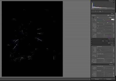
By blending the two photos, I was better able to control the overall exposure of the lights on the ferris wheel, as you can see by the screen grab of the photo that I used of the ferris wheel.

Enjoy.

Camera settings: Nikon D3, Nikon 28-70mm f/2.8 at 35mm shot at ISO 200, f/4 and 1/180th and 1/45th of a second.

Post Processing:

Lightroom—Set black and white points on both images used.

Photoshop—used Topaz Adjust Photo Pop preset on combined image.

March 12, 2010

An Unsuccessful Image

Last Tuesday, I submitted two photos in our monthly Honor’s Night at Bay Area Photo Club. The monthly assignment was “Rhythm.” I must admit, I never really thought that I understood what rhythm meant in photography and the photo that I submitted was, at least to me, more a pattern photo, not a rhythm photo. My submission was, more-or-less, a throw down photo—a case where I wanted to submit something, but really did not think I had achieved what the assignment required.

The second photo I submitted was to our “Open” category. Again, I did not consider this photo to be “portfolio” material, but I was reasonably pleased with it. The judge that spoke about my photo had some very nice things to say about the photo as did most of the members with whom I spoke after the meeting. But, to me, the photo was a completely unsuccessful image.

Why? Because no one seemed to grasp what I was seeing and intended to convey in the photograph. What I saw was a father and daughter waiting for “mommy” while the rest of the world moved pass them. I carefully composed the image so that the lines on the payment pointed to my two subjects and used a shutter speed that blurred most of the other people walking in the photo. I purposely waited until the ferris wheel was stopped and I had people entering and leaving the area.

What most people saw was a striking image of a ferris wheel and other carnival rides against a dramatic sky.

I will admit that there are several elements of the photo that I wished I had a “do over” on. I should have shot the photo a little wider so that I got all of the lines painted on the payment in the frame (I wanted them to direct the viewer's eyes to the subjects) and I should have shot several frames so that I had an options on where the moving people were. Finally, I should have taken a photo in which the father and daughter were a little better exposed (they are too dark in the photo as presented to make sure they stand out) in order to combine it with the original photo.

I wanted the image to have a 1950’s post card look so my post processing used two of Topaz Adjust presents—Photo Pop and Sketch—Dark Charcoal.

Enjoy.

Camera settings: Nikon D3, Nikon 28-70mm f/2.8 at 40mm shot at ISO 200, f/9.5 and 1/15th of a second.

Post Processing:

Lightroom—Set black and white points.

Photoshop—used Topaz Adjust Photo Pop present to bring out details in the scene and then added layer in which I used Topaz Adjust Sketch—Dark Charcoal present at 35% opacity to reduce the saturation of the colors and give the image a aged-look.

March 9, 2010

Midway Lights

After finishing up my final assignment, I spent a little time wondering around midway of the rodeo fair. The lights of the midway are always fun to photograph.

In this photo, I wanted to really bring out the bright lights and color of the booth versus the somewhat subdued background. I sat on the ground so that I would have an upward view of the booth. I did not do a very good job framing the photo. I should have left more room to left of the couple in the red coats walking towards me.

Topaz Adjust has just released a free upgrade—Topaz Adjust 4. I downloaded the upgrade last week and this photo provided me an excellent opportunity to try a few of the new presets that are included in the plug-in.

Enjoy.

Camera settings: Nikon D3, Nikon 28-70mm f/2.8 at 35mm shot at ISO 200, f/6.7 and 1/30th of a second.

Post Processing:

Lightroom—Set black and white points.

Photoshop—used Topaz Adjust Specify preset.

March 5, 2010

Just Two Guys Cooking

I would have loved to hear the conversation between these two guys before they arrived. I think it went something like this:

Bubba #1: I think we should go over to the Houston Rodeo Bar-B-Que cook-off and show everyone our stuff. Sound good?

Bubba #2: Yep.

Bubba #1: I got these really cool Texas aprons. I think it would be great to wear them while we fixed our special BBQ chicken. Sound good?

Bubba #2: Yep.

Bubba #1: I also got these chicken hats that we could wear.

Bubba #2: Chicken hats?

Bubba #1: Yep.

I do not want to make fun of these two guys because they were having a fine time, but more importantly they were making everyone around them have just as much fun. Between their hats and their “all guy” smack, they brought many a smile to everyone's face. Good job Bubba #1 and Bubba #2!

Enjoy.

Camera settings: Nikon D3, Nikon 28-70mm f/2.8 at 60mm shot at ISO 200, f/13 and 1/60th of a second.

Post Processing:

Lightroom—Set black and white points.

Photoshop—used nik Color Efex Pro tonal contrast filter to add a little contrast to everything in the photo except their faces.

March 2, 2010

Getting the Shot I Saw


Last Friday, I had a couple assignments to photograph some of the Houston Rodeo Bar-B-Que cooking teams. I had not been to the cook-off for some time and was not really sure what I was getting myself into. The photographing was hard because of the tight quarters and a lot of smoke around my subjects. But, the people were great and having some bar-b-que in one hand and a beer in the other is what every Texan lives for.

Today, I present two photo of a scene that I tried to photograph—one a complete mistake and the other a partial success. The problem that I was presented was getting some light on the US and Texas flags while keeping all the color and intensity in the sky.

The first photo was taken straight-up with matrix metering and very little adjustments. It definitely was not what I was seeing or wanted.


In the second photo, I changed my white balance to tungsten to bring out the blue in the sky. I used my flash (actually attached to my camera). I tried several shots using the flash in TTL mode, but was not very happy with what I was I was getting. I finally changed my camera to manual mode and shot the ambient light about 1½ stops underexposed. I then set my flash in manual mode and keep adjusting it until I got the light I wanted on the flags. The final flash was set at ½ power.

Not my normal use of flash, but an effective one.

Enjoy.

Camera settings: Nikon D3, Nikon 70-200mm f/2.8 at 200mm shot at ISO 200, f/5.6 and 1/250th of a second with flash in manual mode and set at ½ power.

Post Processing:

Lightroom—Set black and white points.

Photoshop—used Topaz Adjust to add details to the flags and the building.