February 28, 2012

Patience and Working the Scene


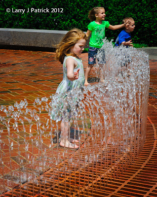
The three children in the scene are cousins.  While watching the children play in the water, I talked to their parents about taking a photo of them playing.
What drew me to this scene, of course, was the children playing; but I quickly noticed that the curvature of the water spray was matched by the curvature of the wall in the background.  I thought this implied circle would make a great composition.
Now, what did I do wrong.  First, I was not patience.  The real photo was the little girl in the foreground and how she was studying the water.  I should have waited until the two cousins moved out the scene—which was right after this photo was taken.  Second, this photo should have been taken at f/8 (very sharp portion of this lens) which would have resulted in a shutter speed of 1/750th of a second.  The f/8 aperture would have better isolated her by making the foreground and background slightly out-focus and the 1/750th of second would have frozen the water better—basically, a win, win situation.
Enjoy. 
Camera settings:  Nikon D3, ISO 200, Nikon 24-70mm f/2.8 at 70mm, f/19 and 1/125th of a second.
Post Processing:
Lightroom 3:  Set black and white points, added contrast with a mild curve and added a little vignetting.
February 24, 2012

Gesture Is King!


Another photo from 2011 and another question about what was I thinking.
Here, I saw this frog character approach this boy and knew that there was about to be a good photo.  I asked the boy’s parents if I could take a photo and they agreed.
Looking over the metadata, I can see that I shot the photo at 38mm rather than 70mm.  Why?  The photo is about the gesture, not getting all of the boy and the frog into the photo.  Next, I see that I used f/11, which I can accept but that forced me to shoot the scene at 1/125th of a second—too slow to stop the boys hand from blurring.
Thanks to Jay Maisel workshop and a little (very little) knowledge on my part, today I would have had my camera set at ISO 1600 which in turn would have resulted in a shutter speed of 1/1000th of a second—fast enough shutter speed to stop the boy’s hand.
Lessons learned:  street photography means using ISO of 1,600 or higher unless blur is an important element of the photo and make what drew you to the scene the most important element within your frame.
Enjoy. 
Camera settings:  Nikon D3, ISO 200, Nikon 24-70mm f/2.8 at 38mm, f/11 and 1/125th of a second.
Post Processing:
Lightroom 3:  Set black and white points, added contrast with a mild curve and cropped second image to simulate lens at 70mm (guess on my part!).

February 21, 2012

Why Did I Do That?


Again, working through photos from 2011, I ran across this one.  I cannot remember a lot about the shot except that I tried various apertures to get the background blur that I wanted.  I also remember moving around so that I could get the out-focus flower in the background.
Looking at the photo now, I cannot help but wonder does it look better with the flower in the background or without it?
Which one do you like best?
Enjoy.
Camera settings:  Nikon D3, ISO 200, Nikon 24-70mm f/2.8, f/4 and 1/500th of a second.
Post Processing:
Lightroom 3:  Set black and white points, added contrast with a mild curve.
Photoshop CS5:  Removed flower in background in the second image.

February 17, 2012

Sharpness—Revisited


I interrupt the scheduled post to bring you “Sharpness—Revisited”.
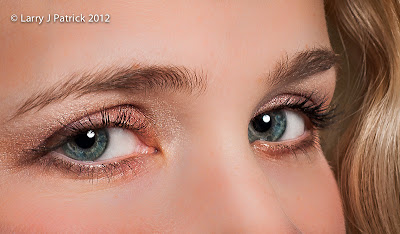
I had several comments regarding last Tuesday’s post that basically said what was I trying to do with this photo.  Well, I was not really trying to do much more than show the amount of sharpness that today’s DSLRs capture right out of the camera.  
I did forgot to mention one thing about the image that I showed—in Lightroom 3, I did use the adjustment brush to reduce the clarity and sharpness of Lauren’s skin (i.e., I had too much details in that area of the photograph to do Lauren justice—she has wonderful skin).
The comments did get me thinking about how people look at photographs and how photographers present photographs.  Tuesday’s post was presented to show only one aspect of digital capture—sharpness of today’s DSLRs.   To me, the difference between a snapshot and a photograph is the photographer putting his/her intent or interpretation into the image.  With that in mind, let’s assume that the image was going to be used by an eye make-up manufacture to promote their product.  What would I do?
I would want to draw even more attention to the eyes.  How?  I would sharpen the eyes, add a little saturation to the iris, add a highlight opposite the catch-light to add depth to the eyes, remove the redness in the whites of the eyes (note, I usually do not brighten the whites because it gives people that "devil-eye look") and finally burn the skin to darken it and thus lighten the eyes.  Not a lot of difference but I think you will agree the revised version draws your attention even more to the eyes and hopefully would help sell more product for the manufacturer.
It is my personal belief that successful photographs almost always have a little piece of the photographer within them.  They are not just a collection of pixels recorded by their camera.  Think about that and let me know what you think!
I have included both versions here so that it will be easier for you to compare them.  Hopefully you will be able to see the added details in the first photo.
Enjoy 

February 14, 2012

Sharpness


I have been looking over many of my photos of the past year just to try and get some perspective of where I am and possibly where I am going.  While doing this, I was amazed at how much detail that my camera can reveal, especially when using lenses at f/8 through f/13.
Here is a crop of Laura’s eye.  Could you get much sharper and reveal any more detail?
Enjoy 
Camera settings:  Nikon D3, ISO 200, Nikon 85mm f/1.4, f/9.5 and 1/250th of a second with Elinchrom Quadra with beauty dish attached
Post Processing:
Lightroom 3:  Set black and white points, added contrast with a mild curve.

February 10, 2012

Oilfield Worker


I am fascinated with ordinary working people.  I am currently working on a body of work of such people.  Based upon my start, this may be a very long venture.
In November, I was hired to photograph men working on a workover drilling rig for an oilfield equipment company.  After the shoot, I asked a few of the men to pose for me.
I was really impressed with this young man during the shoot.  When he was not working, his nose was in a school book.  I asked him about it and he said:  “I screwed up in school.  Didn’t work at it.  Didn’t learn much.  Don’t want to work like this the rest of my life, so, I got to learn what they were trying to teach me in school if I want to have a better life.”
Well said.
Enjoy 
Camera settings:  Nikon D3, ISO 200, Nikon 85mm f/1.4, f/8 and 1/125th of a second with Elinchrom Ranger Quadra head with 17” beauty dish attached.
Post Processing:
Lightroom 3: Set black point, and added contrast with a mild curve.
Photoshop CS5: Used nik Color Efex filters Detail Enhancer, Tonal Contrast and B&W to bring out details within subjects hair and clothing and dodged and burned various areas of photo.

February 7, 2012

Am I Misusing HDR?


Let me start by saying that I have been a fan of HDR for a long time.  However, I am not generally a fan of the over-the-top HDR look that some HDR photos have.  It’s just too surreal for me.
I believe that over the past few years I have misused HDR.  Instead of using it just to adequately capture a dynamic range outside the range of my camera, I have often used it to capture more details within a scene.  This point was recently driven home to me when after a portrait shoot, I shot a few urban scenes.  Without thinking, I composed the scene, set my tripod up and banged out seven shots with a range of +3 EVs to -3 EVs.  I processed the images in nik HDR Pro (my favorite HDR processing program) and upon first look, was reasonably happy with the results.
I then started studying the processed HDR image and, to my surprise, I saw that many of the details that I wanted in the photo were just not there.  I know that RC Concepcion in his book “The HDR Book” says that after you process the image in an HDR software, you then need to further process it in Photoshop to bring-out your artistic intent.
I would much rather shoot photos than process photos.  Sitting at the computer is not that much fun for me.  So, I thought “what sort of result could I get from processing just one of the images and using nik Color Efex Pro to enhance the details?”  For this processing I selected the exposure that had some highlights blown-out, but had details in the shadows.
The first photo is the one processed using nik HDR Pro and the seven exposures.  The second photo was processed only using nik Color Efex Pro’s Detail Enhancement and Tonal Control filters.  I was surprised at how well nik Color Efex  Pro 4 was able to recapture some of the blow-out highlights.
Conclusion:  if you do not like processing images but still want a lot of details use nik Color Efex Pro 4 or Topaz Adjust or Detail to bring them out, not HDR processing. 
Enjoy.

February 3, 2012

Blaze and Pepper Update


Thank you Cindi! 
I have been trying to get a decent updated photo of Da’ Girls for several weeks without ANY success.  Think about trying to do a portrait of two puppies together—Mission Impossible.  One goes one way and the other goes other way—that’s the play-by-play for such a shoot.   I must admit I was getting a little discouraged by the experience.  Then I read Cindi’s post and my life had meaning again. 
I shot each of the girls separately and then combined the shots in Photoshop CS5.  Since I did not have an assistant and was both cameraman and treat-distributor, I used Auto-Area AutoFocus, which automatically focused the camera to the closest subject in the viewfinder.  Overall, I think it did a good job in keeping Da'Girsl in focus.  Combining the two phots was very simple since both of the shots were shot on a white background and with consistent lighting and camera settings. 
Blaze (left) is currently about 5 pounds and Pepper (right) is about 5 pounds 9 ounces.  The only problem that I had with the images was that Pepper stood a little closer to the camera and therefore appeared even bigger than she is relative to her sister.  I adjusted Pepper’s position and size to more closely match Blaze’s. 
I was not happy with our hair stylist for the shoot.  I wanted an elegant, sophisticated look but I got more of a punk-rock look.  And, even though I paid handsomely in treats, I think that the Da' Girls gave me there “driver’s license” pose rather than the elegant, sophisticated look that I wanted.  I guess that I will need to give them better directions next outing—and yes, there will be a “next” outing. 
Enjoy  
Camera settings:  Nikon D3, ISO 200, Nikon 24-70mm f/2.8 at 48m, f/16 and 1/180th of a second with two Elinchrom 500BxRi Monolights at an angle to the subject (see lighting diagram). 
Post Processing: 
Lightroom 3:  Used white balance eye drop to make both backgrounds a consistent white, set black point, and added contrast with a mild curve. 
Photoshop CS5:  Combined two images, cleaned up background and used nik Color Efex filters Detail Enhancer and Tonal Contrast to bring out details within Blaze and Pepper.