March 27, 2012

Emili and Jordon Shoot #3


Before I write another word, let me say that the photos that I have previously presented of both Emili and Jordon are no better than the two that I now present.  To me, it is a matter of personal preference as to which one of the photos of them you prefer.   
I present these adjusted photos (as requested in several comments) to merely show how a low-key version of Emili’s and a high-key version of Jordon’s photo might look.  I do not think that you can get the same effect using Lightroom or Photoshop that you can be actually shooting with a given look in mind, but I do think that these are a relatively good representation of what the shots might look like.
It is totally up to you to decide which photo you prefer.
Enjoy.
Camera settings: as previously reported.
Lightroom 4—adjusted exposure and contrast to make changes to the respective photos.

March 23, 2012

Emili and Jordon Shoot #2


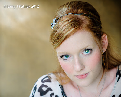
It’s Friday, so, it time to present my photo of Emili in the same location as the one that I showed earlier this week of Jordon.
As I said in Tuesday’s post, Emili has light completion and eyes so rather than photographing her with rich colors I wanted the colors in the photo to be light and airy.  I changed my f-stop from f/5.6 to f/4 and the shutter speed from 1/90th of second to 1/30th of a second—thus increasing both the ambient light and the effect of the strobe on Emili’s face.  I think that the changed produced an image that was more high-key and more in-tune with Emili. 
The ambient light was darker when I took the photo of Emili so I I think that the overall effect of my camera changes on the ambient light was about one f-stop—not the three that you would expect from the changes that I made to both the f-stop and the shutter speed.  The power changes on the strobe unit was the same so the change in f-stop had the effect of one f-stop on Emili's face.
When I shot the photo, I debated upon putting an additional light to Emili’s left to open-up the background but then after seeing the photo on my computer monitor, I was glad that I did not do it.  I think the additional light would have flattened the image.  The darker side helps add depth to the photo.
Enjoy.
Camera settings:  Nikon D3, Nikon 85mm f/1.4 at ISO 200, f/4 and with shutter speeds 1/30th of second with an Elinchrom Ranger Quadra flash with a 17” beauty dish attached to Emili’s right and about eye level.
Post Processing:  
Lightroom 4—set white and black points, added clarity and vibrance, used adjustment brush to add details to eyes and hair and soften skin and added vignette.

March 20, 2012

Emili and Jordon Shoot #1


Sunday, I had the privilege of shooting Emili and Jordon.  Both ladies are quite photogenic, but are quite different in their appearance.  Emili is a high-school senior with light completion and hair and blue-green eyes.  Jordon, on the other hand, is a young adult with dark eyes and completion.  For the most part, I photographed the two in same places, however, I did change how I approached the shots differently for each of them.
The first photo is just one that shows where the second photo was taken.   
The photo of Jordon was taken inside the statue using the gold inside as a background.  Because of Jordon’s coloring, I wanted the photo to have rich colors so I intentionally under-exposed the shot by about ½ f-stop.  The flash was positioned to the right at eye level and was about three feet from Jordon.  Overall, I like the soft, even lighting on Jordon and I think the backgrounds brings out her coloring.
On Friday, I will present a shot of Emili in the same location.
Enjoy.
Camera settings:  Nikon D3, Nikon 85mm f/1.4 at ISO 200, f/5.6 and with shutter speeds 1/90th of second with a Elinchrom Ranger Quadra flash with a 17” beauty dish attached.
Post Processing:  

Lightroom 4—set white and black points, added clarity and vibrance, used adjustment brush to add details to eyes and hair and soften the skin and added vignette.

March 16, 2012

Lady Liberty Revisited


This Tuesday, I went to Honor’s Night (members present their printed photos to be judged) at Bay Area Photo Club.  I did not present anything—mainly because I did not expect to be going because of Cole’s baseball games which none were scheduled due to spring break—however, I like to see what others are doing and I try to learn from what I see.
Bill Baker presented a black and white image of a castle in Spain.  The judges said that the print would be more successful if it had an established black and white point and more contrast.  I agreed with this assessment but still felt that it needed something else.  To me the castle need to separate from the sky.  But how?
I believe that the eye is naturally drawn to details within a photograph.  So, today I present two prints of Lady Liberty—one, as shot and the other and a second with added clarity, sharpness and contrast within the statue.  Does the second photo make Lady Liberty more significant?
Enjoy. 
Camera settings:  Nikon D3, Nikon 28-300mm f/3.5~5.6 at 300mm, ISO 200, f/11 and with shutter speeds 1/500th of second.
Post Processing:  
Lightroom 4—set white and black points, added clarity and vibrance to second photo.

March 13, 2012

Liberty


Last fall, I began rereading the works of Ayn Rand.  I really enjoyed her writing when I was in high school and for some reason, I thought that it might be time for me to revisit them.  I have finished The Fountainhead, Red Pawn, Night of January 16th and We the Living.  I am currently reading Atlas Shrugged.
The reason that I bring-up my current reading list is because of a conversation I overheard by two 6th graders at Cole’s baseball game last week.  The two boys were discussing an assignment that they had regarding the "state of America".  Both boys seemed to be alarmed by some things going-on in our country—the excessive spending by our government, the amount of debt that “they” would have to repay and the control that the government seemed to exert over everything.  I do believe that the boys were echoing some of the parent’s concern however I was impressed by the amount of factual information that the two boys seemed to have.  They definitely were not just parroting what they had been told by grown-ups and they were concerned.
In light of these two events, I thought this photo of the Statue of Liberty would be a good one for today’s blog.
Enjoy.
Camera settings:  Nikon D3, Nikon 70-300mm f/3.5~5.6 at 300mm with polorizing filter attached, ISO 200, f/8 and with shutter speeds 1/350th of second.
Post Processing:  
Lightroom 3—set white and black points, added clarity and vibrance.

March 9, 2012

Something New and Very Different Part 2


Today’s photo is another from my shoot last Sunday.  If I had to title this photo, I might call it “Portrait of Motorcyclists.”   As you can see, most of the motorcycle is not included in the frame.  This photo is all about Eric and Crystal and their relations to each other and the motorcycle.  Motion blur is present, but here I was not trying to make it a primary part of the story.  In this photo, I wanted Eric and Crystal to be tack sharp and provide only a hint that the motorcycle was moving.
Enjoy.
Camera settings:  Nikon D3X, Nikon 24-70mm f/2.8 at 70mm, ISO 200, f/13 and with shutter speeds 1/180th of second.
Post Processing:  
Lightroom 3—set white and black points, added clarity and vibrance, and adjusted hue and saturation of various colors.
Photoshop CS5—used nik Color Efex Pro Detail Extractor and Tonal Contrast to the bring-out details in the subject and did some basic dodging and burning.

March 6, 2012

Something New and Very Different


Sunday, I met up with four of my buddies from Bay Area Photo Club to photograph something totally different from anything that I have previous photographed—a moving motorcycle from a moving truck. My friend, Neal Kelsoe, invited his nephew and his girl friend to be our subjects for the photo shoot.
I had no idea what I was doing and it showed in about 98% of the photos that I took.  I knew that I wanted a blurred background and tack sharp subjects.  Little did I know that was going to be extremely hard to do.
The truck and motorcycle were generally moving at about the same speed—50 MPH.   However, the road did not cooperate and as a result, both the subjects and me were bouncing up and down.  Studying my bad frames I noticed that a most of the blur on my subjects was more up-and-down blur as opposed to side-to-side blur.  This of course presents my dilemma how do you eliminate the up-and-down blur while still shooting a slow enough shutter speed to get the desired motion blur.
Any and all suggestions regarding how I might improve on my hit rate would be most welcomed!
Thanks Neal for this humbling experience.
Enjoy.
Camera settings:  Nikon D3X, Nikon 24-70mm f/2.8 at 36mm, ISO 50, f/22 and with shutter speeds 1/30th of second.
Post Processing:  
Lightroom 3—set white and black points, added clarity and vibrance, and adjusted hue and saturation of various colors.
Photoshop CS5—used nik Color Efex Pro Detail Extractor and Tonal Contrast to the bring-out details in the subject, removed some telephone lines and pole and did some basic dodging and burning.