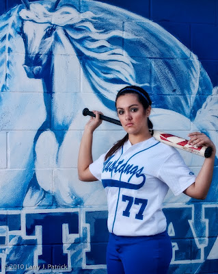
I meant to post this photo of Kelsi after I posted my doctored image of her a few weeks ago, but for some reason I just forgot about it.
In this photo, I wanted to give you a little more insight into Kelsi and her softball team—the fighting Lady Mustangs of Friendswood. I thought the mural added to the photo. I was concerned by the amount of blue in the photo, but after looking at it, I thought that the blue did a great job complementing her skin tones.
Enjoy.
Camera settings: Nikon D3x, Nikon 70-200mm f/9.5 shot at 95mm, ISO 200, f/9.5 and 1/180th with a Elinchrom Quadra softbox at camera left.
Post Processing:
Lightroom—Set white and black points increased vibrance.
Photoshop—used nik Color Efex Pro glamour glow filter and added a black and white layer created in nik Silver Efex Pro with an opacity of 12%.
I like the background that you used. It clearly is associated with the theme of the picture by subject and the color. The bat seem to connect the young lady to the mustang. If you planned all these features, you did very well.
ReplyDeleteI like this portrait a lot too. Kelsi's position in the frame makes my eye go back and forth from her eyes to the Mustang's eyes! I like the bat and how the angle of it echoes the curve of the mural above her. All that blue is fantastic --- it works so well for a sports portrait. Another thing I like is that this image makes her seem more feminine --- a little less tough than some of the other shots of her that portray her as pretty fierce! She certainly got a great variety of portraits from that shoot.
ReplyDeleteI take that you have entered your "blue period." This is a portrait that says a lot about the person-the bat and uniform says softball, the mustang on the jersey and the mural tell you the name, her expression tells you she has confidence. All the blue pushes the photo in an unexpected direction from most photos and really makes her face come forward in the photo. Good work.
ReplyDeleteThe Professor
This photo grabs your attention. You look at and start to study all the details. Fine work.
ReplyDeleteTed
Kelsi looks great in this one. She looks so relaxed. Your photo is nicely done.
ReplyDeleteDebbie
Cool photo. You are back.
ReplyDeleteMel
It all works and sends the message.
ReplyDeleteYour photo tells us a lot about the subject. Her manner and expression is great. Really, really nice work.
ReplyDeleteSteve
All the blue does bother me. It seems somewhat unnatural to me. You generally see portraits done on warm backgrounds rather than cold ones. Seems out of place.
ReplyDeleteDale