I think a few of you out there did not like the background of Terry’s photo that I posted last week. Well, I agree. The background was distracting. However, this was street photography. I am not of the school that says to do street photography you cannot let the subject know that you are photographing them. I generally let people know that I am photographing them, however, I generally do not change their environment. Consequently, when I look at Terry’s photo, I use a different criteria in judging it than I would a photograph which I call “street portraits.” I consider the photos that I take at the various festivals as street portraits. At the festivals, I often move people to better backgrounds, direct their pose and use flash. Here, I did none of that.
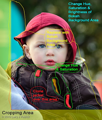
All that being said, it is very easy to push Terry’s photo into a much better portrait. When I look at the photo, I want to simplify it and bring Terry's face forward. Here are the changes that I think need to be made:

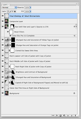
It took me about 20 minutes to “finish” Terry’s portrait. Here is a screen grab of the layers that I used to make the adjustments (please excuse the poorly worded labels, but I label for my benefit and was too lazy to change them for this post):

Enjoy

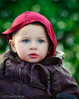
Mom is really going to like this one. Your eye now goes immediately to his face. Great separation from the background.
ReplyDeleteMel
Wonderful photo of Terry. Seems like you did a lot in only 20 minutes.
ReplyDeleteDebbie
Nice Photoshop work Patrick! You improved what was already a nice portrait!
ReplyDeleteWell done!
Barry
You have a valid point about the different type of images you want to use Photoshop on to change elements rather than edit the existing ones. As the photographer you have the right to decide how you want to present your shots. That said, your second edit on this image really keeps the viewer's eye on the child. By simplifiying the background and the boy's jacket, the whole image seems to have more impact. It almost seems more colorful to me, with the distracting colors removed. Really impressive! Each image has its own style and approach to editing and I don't think it can be said that one is better than the other --- it is up to the photographer to decide how to present his work. Definitely something to think about!
ReplyDeleteThe color pallet is so much better. Your new photo has green, red, blue and maroon, the three basic colors and one complementary color. As a result, your eye moves more easily throughout the photo and fall naturally on Terry's face. Nice Photoshop work.
ReplyDeleteTed
I thought the first one was a nice shot, however this one takes it to a totally different level. I immediately focus on his face, and especially on his eyes. Fine rework of the original photo.
ReplyDeleteMel
Looking at your layers I notice that you seem to do only one thing on each layer. Is that so that you can make each step very specific to what you want to do? Like the changes you made.
ReplyDeleteSya
Thank you for posting how you did this. It looks like you do your work in very small increments. The final image is nice.
ReplyDeleteAllie
Your original photo seems to be a more natural look at the subject. I would like to see one that has the same background as the original but the changes you made on his jacket. Good information and something to think about.
ReplyDeleteTerry
I like what you did.
ReplyDeleteCharles M
I think this is a much stronger image as a result of your work in PS. That said, I appreciate your comments about street photography versus street portraits. Anne had mentioned something about it in her comments on your original photo. Her comments made me think a little about what she had said, all this after I had posted my original comments.
ReplyDeleteYour treatment or thought process concerning the two types of photography places a different perspective on how you view photos. I've struggled when judging or critiquing images with distracting objects or colors such as this one. I always thought I had to apply standard thinking and rules of photography to those images and "grade down" so to speak.
Your explanation, and Anne's comments, serve to remind me that everything does not have to be perfect and fit into the same little box. Your original photo is a very good example of street photography. Your second version is an excellent example of a great street portrait.
Don't know if it is street photography or street portrait. I do know that I like your final image. Terry seems to jump right off the screen. I appreciate the time you took to explain how you got from last week's to this week's.
ReplyDeleteSam
I would never expect you could produce this photo in only 20 minutes. I would probably never changed the color on the jacket tags, however, it made a great difference. Liked your show and tell.
ReplyDeleteTim
Street photography versus street portraits - glad to read your comments. I think you did a bang up job on your converted Street Photography to Street Portrait. Now, if you had not had all the comments for change...would you have anyway?
ReplyDelete