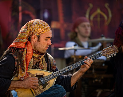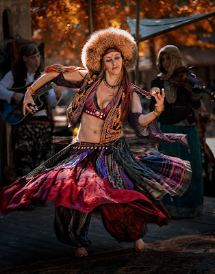
My approach on both of these photographs was about the same: set my camera to underexpose the background by about a 1½ stops and then properly expose the subject by varying the power of the flash. The ambient lighting was very tricky since it was filtered through trees, which required me to clone out a few “hot spots” on each photograph in post processing.
I really liked way that the the light seemed to be totally different on the guitar player and the background. I tried to keep the background as I saw it and bring the guitar player forward in the photograph by lighting only him. This is one time when the rapid fall-off of the flash’s light really worked for me.
Camera settings: Nikon D3, 70-210 f/2.8 at 200mm, shot at ISO 200, f/2.8 and 1/180.
Post Processing: Lightroom—tweak white balance, set white and black point, and added mid-tone contrast
Photoshop—sharpened guitar player using high pass filter at 2.8 pixels in overlay mode

I liked the dancer’s movement, but I did not want a blurred image. I thought that her dress and the static people in the background would provide sufficient information about her motion. The flash is pointed mostly to the top half of her; I wanted to keep light off the floor. The trees in the background were very troublesome when I first looked at the image. I “removed” them by using nik Color Efex Pro Indian Summer filter in Photoshop. The filter will generally turn yellow/green to fall colors, which I thought would really complement the colors in the rest of the photograph.
Camera settings: Nikon D3, 70-210 f/2.8 at 98mm, shot at ISO 200, f/2.8 and 1/180.
Post Processing:
Lightroom—tweak white balance, set white and black point, and added mid-tone contrast, added vignette
Photoshop—sharpened dancer using high pass filter at 4.0 pixels in soft light mode and saturated certain colors on her dress, nik Color Efex Pro Indian Summer filter
I do not know why, but the small versions of these images do not give you the separation of the subject and the background like the larger views. You really need that separation to make the photo pop. Suggest you make a not on your post to that effect. Nice shots.
ReplyDeleteAnne
Anne,
ReplyDeleteThanks for your suggestion. I may do that. I agree you really get a different feel for the photographs when you view the larger images.
Yesterday, I finally got all the photographs to upload in a way that I could get them to load a larger image by clicking on them.
Patrick