November 24, 2008

Texas Renaissance Festival #6—Shop Girls


I realize that everyone might be tired of looking at my Texas Renaissance Fesival images, but I find them interesting because of how simple, yet effective, the lighting with my small softbox was. A lot of them you could have improved significantly with a second light or even a reflector, but, overall I think the lighting is pretty good on most of them.

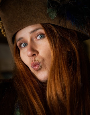
I saw this young lady taking a photo with a point-and-shoot camera of one of her pieces of pottery. I made a few suggestions of how she might get a better photo, and amazingly, she did. From there, Steve and I had two models for a few minutes. Both shots were taken from inside her shop.

In the first shot, Steve held the softbox very close and turned the power down to 1/32. You can see the catch light in her eye and reverse engineer where the softbox was in relation to the camera position. I really wanted to capture how her striking red hair framed her face. Needless to say, she was a lot of fun to photograph as you can see by her pose.

Camera settings: Nikon D3, 70-210 f/2.8 at 150mm, shot at ISO 200, f/6.7 and 1/125.

Post Processing: Lightroom—tweak white balance, set white and black point, and added mid-tone contrast, cloning some small hot spots out of image, cropped to 11x14 format.

Her assistant was younger and not nearly as out-going. I spotted this lace curtain hanging in the back of the store with some light streaming in from the back. I thought it might make for an interesting stage for her. Again, my VAL held the softbox about two feet from her face so that we would get very soft, wrap around lighting. You can easily see that the light was above her and to camera left by the shadow under her noise and the catch light in her eyes.


Camera settings: Nikon D3, 70-210 f/2.8 at 200mm, shot at ISO 200, f/6.7 and 1/125.

Post Processing:

Lightroom—tweak white balance, set white and black point, and added mid-tone contrast, cloning some small hot spots out of image, cropped to 11x14 format.

Photoshop—used nik Silve Efex Pro to convert to B&W using their platinum preset.

Both Steve and I shot about 10-12 shots of each of these ladies in probably less than 20 minutes, which shows that once you understand how your lights and camera work, you can get pretty good result with a few basic pieces of lighting and some knowledge.

You need to check-out the really nice photo that Steve posted yesterday from the Renaissance Festival. You can check out his blog by clicking here

Hope everyone has a nice day.

November 21, 2008

Texas Renaissance Festival #5—The Eyes of an Artist


This is one of my favorite photographs from the Texas Renaissance Festival. When I look at it, I think that I am part of a conversation among old friends. it seems that natural.

I took several shots in which she was looking directly at the camera, but then she and Steve (my Val, Voice Activated Light) began to talk about Hurricane Ike and all the damage it caused in Galveston. She became totally engaged in their conversation. Her eyes showed more intensity as she looked directly at Steve and talked about some of the problems after the storm.

The background was very dark, so I had to dial my shutter speed down to 1/30 so that I could get a little ambient light into the scene. I knew that I would have a few hot spots in the background, but because they would be totally out of focus, I was not overly concerned. The Speedlight and the softbox did a great job of providing soft, even lighting on her face that completely fell-off before it hit the background. The VAL was about two feet from her and had dialed the Speedlight down to 1/32 power.

Camera settings: Nikon D3, 70-210 f/2.8 at 90mm, shot at ISO 200, f/6.7 and 1/30.

Post Processing:

Lightroom—tweak white balance, set white and black point, and added mid-tone contrast, cloning some small hot spots out of image, cropped to 11x14 format.

Photoshop—sharpened her face and hat using high pass filter at 2.8 pixels in hard light mode.

November 20, 2008

Texas Renaissance Festival #4—Opportunity Squandered


Camera settings: Nikon D3, 70-210 f/2.8 at 90mm, shot at ISO 200, f/4.8 and 1/125.

Post Processing: Lightroom—tweak white balance, set white and black point, and added mid-tone contrast, cloned some small spots out of image, cropped to 11x14 format.

When this image appeared on my computer in Lightroom, I thought: nice photo. Then I started studying the image and thought: boy, did I make a mess of a wonderful opportunity to take a really good photograph. I was presented with: a subject who was willing to move in front of the background that I chose; a very warm person whose face was very easy to photograph; a colorful background that complemented the subject’s colors; and a spot that was ideal for lighting with one strobe.

What did I do with all of this? Not much.

What should I have done with all of this? First, I should have placed her further away from the background. I had probably 15 feet of shade in front of the flowers that I could have used. This would have turned the background into an array of colors rather than “somewhat out-of-focus flowers.” In addition, it would have separated her better from the background by giving better distinction between: properly exposed subject vs. under exposed background; and in-focus subject vs. out-of-focus background. You would have then seen a clear distinction between the flowers in her hair and the background flowers. Next, I should have composed the shot so that I had more room above her head. This would have made it easier to move around the photograph. She has nice eyes; yet, her hair is partly covering one of them. I think a little movement of the hair would have provided a more compelling look. Finally, with her being moved away from the background, I should have moved the light (which is positioned camera right and was feathered in front of her to make it soft and keep it off the background) to 60-degree angle from her face. This would have given a better lighting to the cape she was wearing and thus helped separated her better from the background.

I did press the right button to take the photograph!

Will I make a mistake like this again? Probably.

Can I have a “do over”?

November 19, 2008

Texas Renaissance Festival #3—A Fairy’s Wings

After taking the photograph of the lady selling drinks, I turned and saw this bright translucence of color—two ladies wearing some fairy wings. My immediate reaction was: “How would I photograph that much variation in light and still have a portrait of her?” The back lighting that made her wings so dynamic also put her face in deep shadows.

I wanted to push her fairy wings nearly to point of “blowing out” but still retain all the glow and colors. My approach was quite simple. I got an overall reading of the scene and took a test shot. I then dialed the exposure down 1 1/2 f-stop to an exposure of f/5.6 at 1/180 second so that I would make sure the wings did not blow-out. I then set my flash power to properly expose her face at my camera exposure setting. Since I wanted the light on her face to be very soft, Steve placed the flash about two feet and set it at 1/32 power.

Camera settings: Nikon D3, 70-210 f/2.8 at 150mm, shot at ISO 200, f/5.6 and 1/180.

Post Processing: Lightroom—tweak white balance, set white and black point, and added mid-tone contrast, cloning some small spots out of image, adjusting color saturation of her hat and cape


November 18, 2008

Texas Renaissance Festival #2—Gypsy Band


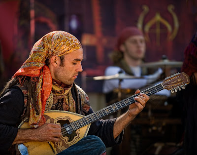
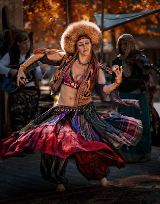
Steve and I stopped and watched this band that played Gypsy music. The main attraction seems to be a very large male belly dancer—I don’t think that Steve or I got into his act! Their music was very entertaining, but more importantly, their clothing and their faces were outstanding subject matter for a camera.

My approach on both of these photographs was about the same: set my camera to underexpose the background by about a 1½ stops and then properly expose the subject by varying the power of the flash. The ambient lighting was very tricky since it was filtered through trees, which required me to clone out a few “hot spots” on each photograph in post processing.

I really liked way that the the light seemed to be totally different on the guitar player and the background. I tried to keep the background as I saw it and bring the guitar player forward in the photograph by lighting only him. This is one time when the rapid fall-off of the flash’s light really worked for me.

Camera settings: Nikon D3, 70-210 f/2.8 at 200mm, shot at ISO 200, f/2.8 and 1/180.

Post Processing: Lightroom—tweak white balance, set white and black point, and added mid-tone contrast

Photoshop—sharpened guitar player using high pass filter at 2.8 pixels in overlay mode


I liked the dancer’s movement, but I did not want a blurred image. I thought that her dress and the static people in the background would provide sufficient information about her motion. The flash is pointed mostly to the top half of her; I wanted to keep light off the floor. The trees in the background were very troublesome when I first looked at the image. I “removed” them by using nik Color Efex Pro Indian Summer filter in Photoshop. The filter will generally turn yellow/green to fall colors, which I thought would really complement the colors in the rest of the photograph.

Camera settings: Nikon D3, 70-210 f/2.8 at 98mm, shot at ISO 200, f/2.8 and 1/180.

Post Processing:

Lightroom—tweak white balance, set white and black point, and added mid-tone contrast, added vignette

Photoshop—sharpened dancer using high pass filter at 4.0 pixels in soft light mode and saturated certain colors on her dress, nik Color Efex Pro Indian Summer filter


November 17, 2008

Texas Renaissance Festival—A Portrait Photographic Workshop

On Sunday, Barry, Cindi, Mike, Paul, Shirley, Steve and I (members of Bay Area Photo Club) went to the Texas Renaissance Festival. The festival is a wonderful opportunity to practice taking photographs of people. You have hundreds of models more than willing to help you take the best picture you can. Both people working at the festival and those visitors dressed in medieval attire are ready and willing to have their photograph taken. It is a photography workshop.

Overall, I was pleased with what I got. I took about 300 shots, have about 30-40 possible keepers and may have 8-12 worthy of showing. I should have done: a little better job of checking out my equipment before I went to the festival; got everyone’s name and email address so that I could forward them photographs; and, taken a little more time thinking through some of my shots. But, again, I was relatively pleased with what I got.

Steve and I paired up and helped each other through our shots. All my shots were with my Nikon D3 and my Nikon 70-200 f/2.8 VR and most included using single Nikon SB800 Speedlight with a Photoflex Q39 softbox attached to a monopod. Steve and I would hold it for each other and fire it using my AlienBee triggers. It worked great. We generally got nice soft light and were able to move it to where we wanted it.

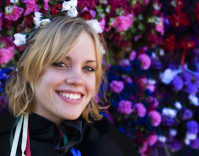
My first Renaissance Festival shot that I am presenting is probably Steve’s favorite. He can attest, this shot image is pretty much as it came out of the camera. I was walking up to a counter where this young lady was selling drinks. I asked her if I could take her photograph and she agreed. I leaned my camera on top of the lightbox, dialed my flash to 1/16 power and fired three shots. This is the one I like the best; her face is very evenly lighted, but there are shadows on the far side of her face where the light has fallen off which gives some depth to her face.

Camera settings: Nikon D3, 70-210 f/2.8 at 200mm, shot at ISO 200, f/2.8 and 1/180.

Post Processing: Lightroom—tweak white balance, set white and black point, and added mid-tone contrast.


November 14, 2008

Blaire, Carlos and It’s a Small World

In late July, Cindi, Steve, Paul and I (members of Bay Area Photo Club) went to Galveston, Texas for a Houston Strobist Meet-Up—according to the postings, there was going to be models for us to practice our use of strobes.  The reality was no models, and very few other Houston Strobists showed up.   After eating dinner, we shot some local skateboarders for a while and then decided to practice on each other and started to head to an ally.   I spotted this very attractive couple (Blaire and Carlos) sitting on a bench watching the skateboarders.   I asked them if they would like to be “super models” for the evening.  We agreed to send them our “best shots” if they would model for us.  They agreed and off everyone went.  

We had a wonderful time.   Blaire and Carlos were terrific.   They are extremely photogenic and great to work with.   I would love to have them model for me again (Blaire and Carlos, that is one of my really subtle hints—hope you got it!).  I think that all of us believed that it turned into an absolutely great shoot, until we discovered that no one had their email addresses.

Now, fast forward three months.   

I am in a tattoo parlor in Pasadena, Texas talking to some of the artist about taking some “environmental portraits” of them.   I am showing them  photos of people on my website when I hear:  “You know Carlos?”   Naturally, I tell them the story and they tell me that they will get their email address for me.   Yesterday, I received an email from Blaire.   This made me go back and visit some of the photos that I took of them.   I had not done anything with this one because, to be frank, I wasn’t sure how I wanted to present it.   Looking at it and looking at a few of Brian's, I finally got an idea about what I wanted.


I wanted the photograph to draw the viewers’ eyes to the overall strong structure of her face and her eyes, which are very expressive.   I also wanted it to be a very simple image, thus the sepia treatment.   Many will tell you that the viewer always goes first to the brightest spot of the photograph; personally, I agree with Craig Tanner and Joe McNally, I think they go to the area of greatest contrast, which is her eyes in this photograph.

Camera settings:  Nikon D3, 50mm f/1.4, shot at ISO 800, f/8 and 1/250 second with a SB800 at camera left being feathered in front of Blaire and a SB800 at camera left lighting the background.

Post Processing:

Lightroom—tweak white balance, set white and black point, and added mid-tone contrast.

Photoshop—cloned-out some very minor imperfections, ran nik Silver Efex Pro using Antique Plate II preset with minor tweaks of brightness, contrast and structure and used Agfa APX Pro 100 paper choice.

What do you think?


November 13, 2008

Brian Bastinelli Blogging Post of Children Portraits

Today’s post has nothing to do with my photography. 

Now, I might be breaking some blogging protocol by pointing to another blogger’s work, but, I look at my blog as a learning space, and I think all of us can learn a lot from Brian Bastinelli post of come portraits of children on November 10th, 12th and 13th (at  http://brianbastinelliphotography.blogspot.com/).

I do not know Brian, but, Barry Armer, a fellow member of Bay Area Photo Club, attended a Radiant Vista workshop in Savannah with Brian; Barry has nothing but good things to say about Brian, and that’s good enough for me.

In these post Brian does some wonderful portraits of two girls and a boy.   I think there is a lot to learn about really good informal portraits from these shots.   But, the most important thing is that “they just work.” 

First, he makes the subject comes forward by isolating them from the background through lighting, focus or contrast.  The backgrounds are interesting, but yet, simple and complementary to the subject.

Second, the dresses that the girls are wearing are very simply—thus, no competition with their faces and their gestures.  However, the “little girl” aspect of their dress is introduced through their somewhat outrageous accessories, stocking, neck ware and bows in their hair.

Third, Brian lights the girls very well.  Since he does not tell us about the shots and I cannot see any tell-tale signs of the use of strobes, I assume that most of these were naturally lighted and the contrasting lighting was added in post processing.   Nothing wrong with doing this, especially when you do it as well as Brian does it.

Fourth, he uses unusual angles and perspectives to help capture what being a kid is all about—fun!

Finally, Brian’s post processing adds to, but does not take over the image.   It really supports the basic feeling one gets viewing the image.   I generally like the way Brian pushes his post processing to give his photographs a little edge, but he does not push it over the edge!   I think this is very hard to consistently do.

Brian, really good work; everyone else, let’s learn a few things from Brian’s work. 

November 12, 2008

To Serve and To Protect


Before I set-up this blog, I asked myself:   “What do you want to accomplish with my blog?” 

Not sure I got a really good answer—I usually don’t when I talk to myself.   But, I think I want to share some photographs and my limited knowledge about photography with anyone and everyone who might be interested.   I do not want people to just look at them, but, I want to share what I’ve learned about photography, how I tried to accomplish something and what I am currently working-on.   Hopefully, I will have the courage to show you some of my total failure.   For some reason, I often learn more from my failures than I learn from my successes.

A little personal history before I launch into my first blog.   I am a reformed (retired) CPA who has been interested in photography for almost 40 years.   I am a Nikon guy; Canon, Sony, Olympus, et al make good equipment, but, I am a Nikon guy.    I got really dedicated to my photography after retiring and joining Bay Area Photo Club.   In early 2008, I attended my first formal photo workshop—The Next Step hoisted by Craig Tanner of Radiant Vista.   The workshop got me very interested in photographing people.   About the same time, I got hocked on Strobist and have been trying to master lighting by using my Nikon Speedlights.   If you are interested in some of my photographs and learning about the equipment I use, please visit my website at: http://www.larrypatrickphotography.com.


My first post comes from a photograph that I submitted as an environmental portrait (assignment at Bay Area Photo Club for November 2008).   The photograph was taken of one of our local volunteer firemen.   Since he has such an interesting face, I wanted the photograph to be primarily about his face and his position as a fireman.  I wanted to establish a somewhat somber mood with some indication of his surroundings, but not every detail.   The photograph was shot with:  Nikon D3, 70-200 f/2.8 at 150mm, f/5.6 and 1/60 second.   The camera setting produced an ambient light that was about two f-stops underexposed.  I used four Nikon Speedlights to put a limited amount of light on certain parts of the photograph (see diagram for details).    After taking several shots, I discovered that he was not separating from the background, and as a result, I added another Nikon Speedlight to put a little light on the fire truck behind him.   I think it did what I wanted it to do.   My goal was to have the light direct the viewer's eyes where I wanted them to go.    I followed Joe McNally on this one:  if you want something to appear important, don't light all of the frame.

Hope you enjoy the photograph and my write-up telling how it was done.

This photograph was featured on Craig Tanner’s Daily Critique on November 11, 2008; you can see the critique at http://www.tmelive.com/index.php/index.html.


 Post processing included;  setting white and black points, fine tuning the white balance and increasing the mid-tone contrast in Lightroom 2.0; removing two specular highlights, adding a Vignetting blur with Nik Color Efex Pro 3.0 (25% opacity), and sharpening face, hat and top of jacket using high pass filter in overlay mode at 2.4 pixels in Photoshop.