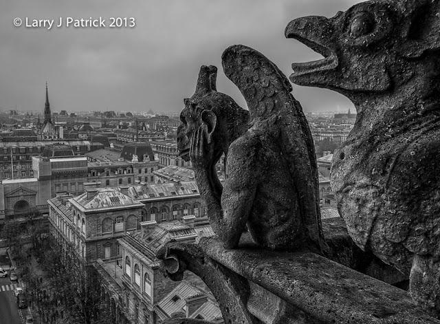
Notre Dame is probably my second
favorite cathedral in the world. I
have visited it every time I have been in Paris. There is just something about it that I find amazing. Yet, even though I have visited it so
many times, I had never taken the tour to the top. If you have never done this and are planning a trip to
Paris, I highly recommend it. But,
be prepared to do a little climbing!
One of my very favorite films of
all times is the Hunchback of Notre Dame (it’s the 193? Edition). The story is the same in all the
versions but the 193? version has some great scenes at the top of the cathedral
that show close-ups of the statues and the Paris cityscape in the
background. The film is in high-contrast,
back and white.
Here I tried to duplicate that
look. I wanted a lot of detail in
the statues, a little less in the cityscape and then virtually none in the sky.
After making basic adjustments in Lightroom 4, I used nik Detail Extractor and
Tonal Contrast filters on the image.
I then masked off the effect—50% grey on the cityscape portion and black
on the sky—thus, decreasing the effect on those two areas of the photo.
In the black and white version, I increased
the contrast and darkened the black point.
Naturally, I prefer the black and
white version, but which one do you prefer?
Enjoy.
Camera settings: Nikon D800, 28-300mm f/3.5~5.6 at 32mm, ISO 800, f/16 at
1/60th of a second.
Post Processing:
Lightroom 4—applied Vivid preset
during import, set white and black points, increased shadows and decreased
highlights and added vibrance and clarity.
Photoshop
CS5—see above.

I think I know the movie that you mentioned in your blog and I think you did it justice in the BW version. Cool shot.
ReplyDeleteAllan
I am amazed at how some of the distractions like the blue tarps and cars seem to blend into the scene in the BW version. The BW version also seems to make the statues and the cityscape match better in terms of time. Glad you posted both.
ReplyDeleteTeddy
Did you think about taking the cars out of the photo?
ReplyDeleteAlice
One of my favorite all time oldies made in 1939 (in monochrome) with Charles Laughton as Quasimodo and Maureen O'Hara as Esmeralda. I like the B&W version just because it fits in with the era better to me.
ReplyDeleteI liked that show and do prefer the B&W. Good job.
ReplyDeleteWelcome back. Where you been? Count me as a b&w gal.
ReplyDeleteDebbie
I am a professional photographer and I have never seen two photos that illustrate how B&W simplifies a scene as well as these two do. Like everyone else, I like the B&W version.
ReplyDeleteAllison
I guess I am a color gal. Count one vote for the color photo. The color seems to have more depth to it.
ReplyDeleteLloyd