October 29, 2010

Bird Photography by a Non-Bird Photographer 101—Lesson 3

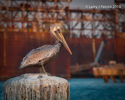
Today’s masterpiece of bird photography shows a pelican against a very simple background of blue water.  Here I wanted the pelican to stand-out against the water.  Unfortunately, I could not blur the background to the extent that I would have liked.
Enjoy.
Camera settings:  Nikon D3, Nikon 70-300mm f/4.5-5.6 shot at 300mm,  ISO 200, f/5.6 and 1/350th.
Post Processing:  
Lightroom 3—Adjusted white balance, mid tone contrast and saturation of various colors.

October 26, 2010

Bird Photography by a Non-Bird Photographer 101—Lesson 2


I hope this photo generates a few comments and possibly a little disagreement among the viewers since my last post seems to have fallen on blind eyes.
Many people maintain that a viewer’s eyes go immediately to the brightest point of a photo.  I do not think that is correct; and, I believe a lot of research supports my view.  The research states that the eye generally goes to what the mind most readily recognizes, then the portion with the highest contrast, then the sharpest, then most saturated colors and finally to the brightest portion.  They do indicated that bright distracting points of a photo can distract the eyes but if the main subject has sufficient impact and interest, then the eyes will return to the main subject.
My last post generated several comments about wanting more separation.  I agree that good separation of the subject and the background does make the subject stand-out from the background.  In today’s post, I tried to create separation by depth-of-field and contrast in brightness. 
I used spot metering on the bird to determine my exposure.  I knew that by doing this that the background would be considerably brighter than the gull.  I was not afraid of the eyes going to the background because of how sharp and recognizable the gull is in the photo.  I believe that all the details in the bird’s feathers will generally keep the viewer’s interest and focus.  I have included a second photo to make it easier to see the details of the bird and the effect of the limited depth-of-field to separate the bird from the background.
Enjoy.
Camera settings:  Nikon D3, Nikon 70-300mm f/3.5-5.6 shot at 180mm, ISO 200, f/5.6 and 1/250th of a second on a tripod.
Post Processing:  
Lightroom—Set black and white points, adjusted saturation of various colors, added mid-tone contrast and vignetting.

October 22, 2010

Bird Photography by a Non-Bird Photographer 101—Lesson 1


Why would a non-bird photographer give a bird photography class.  Good question.  I do not think I have reached my federally approved level of humiliation this week.
I know what you are asking:  “What disqualifies you from being a bird photographer?”
1.  I take bad bird photos.
2.  I do not have the patience to take good bird photos.
3. I do not know what I am doing when a bird is in front of my lens.
4. I do not have the equipment to be a “real” bird photographer—in general, “real” bird photographers must have a lens that allows you to see ants on the moon.
I know your next question:  “Why are you doing this?”  I lost a bet?  Really, it all started when I was down in Galveston after a portrait session and I remembered that “birds of a feather” was our club’s assignment for October.  So, with my mighty 70-300mm lens in hand, I set-out to capture the perfect bird photo.
Here I wanted to play with the compression created by my massive 300mm of thundering glass.  The bird was about 100 feet from me and the rigs in the background were about 600 yards.  Yet, because of the compression, the two look like they are right next to each other.  I think this effect adds interest to the photo.
The image that is shown here only represents about 40% of the frame that I captured—a nice 600mm lens would have made the photo to be pretty much full frame and think about the compression and bokeh that I could have achieved.   And just think, I could achieve this by merely forking over $10,300 for a Nikon 600 AF-S f/4G VR.  Cheap at twice the price.  I wonder how fast B&H can get it to me?
Enjoy.
Camera settings:  Nikon D3, Nikon 70-300mm f/3.5-5.6 at shot at 300mm ISO 200, f/5.6 and 1/750th of a second.
Post Processing:  
Lightroom 3—Set black and white points, added clarity and mid-tone contrast.
Photoshop CS5—removed a few distracting elements within the photo and balanced the colors within the image.

October 19, 2010

Oregon Trip #8—Bridge at Cascade Locks


I love old bridges.  They have such wonderful grace and style.  I wished that bridges built today had the same style.
I submitted this photo at our last Honor’s Night at Bay Area Photo Club.  Even though I like the photo a lot, I was surprised that it scored as high as it did.  Why?  Well, I was worried that our judges might get caught-up with bluish color-cast of the photo.  I had taken great care when I was taking the photo to set the white balance so that the blue color-cast (which was what I was seeing) would be reflected in my photo.  Second, HDR photos are not always well received by our judges.  I think that the judges see them has gimmicks or “photo-by-computer-program.”  I think that can be the case but overall I think most of the photographers at the club who utilize HDR do a pretty good job using the program.
I wanted this photo to show the subtle nature of the scene.
Enjoy.
Camera settings:  Nikon D3, Nikon 24-70mm f/2.8 shot at 28mm, ISO 200, f/13 and at nine different shutter speeds.
Post Processing:  
Lightroom 3—Set black and white points, cropped photos, and changed, added saturation of certain colors vignetting.
Photomatix Pro—combined six of the nine exposures and tone mapped the result
Photoshop CS5—removed minor distracting element, adjusted overall mid-tone contrast and sharpened the bridge using the high pass method.

October 12, 2010

Oregon Trip #7—Art on a Bridge

The bridge at Cascade Locks is a classical old bridge.  The bridge was about 50 yards from our hotel on the Columbia River.  So naturally, I wondered over early one morning to take some photos of the bridge and the fog over the river.  After trying various angles, I finally decided to take one of the bridge pilings with its Lewis and Clark mural on it.
While I was taking the photo, I kept thinking about a comment that many of our judges at Bay Area Photo Club make:  “It’s not your art if you are merely taking a photo of someone else’s art.”   So based upon that theory, only the far right side of my photo is my art.  But then again, the design of the bridge someone else’s art.  So, I guess that portion of my photo cannot be considered my art.  Then, again, the sky and the trees—they are God’s art so I guess that portion of the photo cannot be mine.
Well, it may not be much of the photo, but you must admit, the sidewalk represents truly fine art that is all mine. 
Enjoy.
Camera settings:  Nikon D3, Nikon 28-70mm f/2.8 at shot at 28mm, ISO 200, f/11 and 1/60th of a second.
Post Processing:  
Lightroom 3—Set black and white points, added clarity, vibrance and mid-tone contrast.
Photoshop CS5—removed a few distracting elements within the photo and use nik Color Efex Pro tonal contrast to bring out details.

October 8, 2010

Oregon Trip #6—What’s Under the Water


I showed this photo on First Tuesday at the Houston Center for Photography and some of the participants wanted to know more about it.  It is a pretty basic shot with one exception—the use of a high ISO.  I told everyone at the meeting that I thought that it was shot at an ISO of about 2,200.  Well, I was mistaken.  The photo was actually taken at ISO of 6,400.  Several people commented that there did not seem to be any noise in the photo.   The version that I showed at HCP did not have any noise reduction done to it in post processing, however the version that I am showing here has had some noise reduction applied to it in Lightroom 3.


I knew that I really wanted the blue of the water to come forward in the photos so I adjusted my white balance until I got the blue I wanted.  I did this by turning on the Live View setting and then changing the white balance until I was seeing what I wanted.  I have found this approach to be a very handy way to get your white balance where you want it when the lighting is something unusual.
The unusual white balance did affect the yellows and oranges in the scene so I had to adjust them in Lightroom 3.
There are two lessons to take from today’s post:  you can shoot at high ISO’s; and, the noise reduction in Lightroom 3 works. 
Enjoy.
Camera settings:  Nikon D3, Nikon 24-70mm f/2.8 shot at ISO 6400, f/5.6 and 1/90th of a second.
Post Processing:  Lightroom 3—Set black and white points, increased mid-tone contrast and changed saturation of yellow and orange, sharpened and reduced noise slightly.

October 5, 2010

Oregon Trip #5—Early Morning


Early morning along the Columbia River brings fog, low and high clouds and the colors of sunrise.  I really like how the whole scene appeared in three distinct layers—the fog, the low cloud, touch of color from the sunrise and the high clouds.   As I sat with my coffee and camera, I wanted to capture all these elements.  I tried various exposures however I could never get the fog along the river looking like I was seeing it.  This photo is the best of the lot.
Enjoy.
Camera settings:  Nikon D3 on a tripod, Nikon 24-70mm f/2.8 shot at 70mm, ISO 200, f/11 and 1/30th of a second.
Post Processing:  
Lightroom—Set black and white points, increased mid-tone contrast and changed saturation of various colors.

October 1, 2010

Oregon Trip #4—Colors


Sometimes I see something and I know exactly what I want the photo to be—other times, I see something and I have no idea what I want the photo to be.  I guess that is what being a photographer is all about.
When I saw this scene near some rocks by some tidal pools, I knew that I wanted the image to be totally about the colors and the form.
Enjoy.
Camera settings:  Nikon D3, Nikon 24-70mm f/2.8 at shot at 62mm ISO 800, f/11 and 1/30th of a second.
Post Processing:  
Lightroom 3—Set black and white points, added clarity and mid-tone contrast.