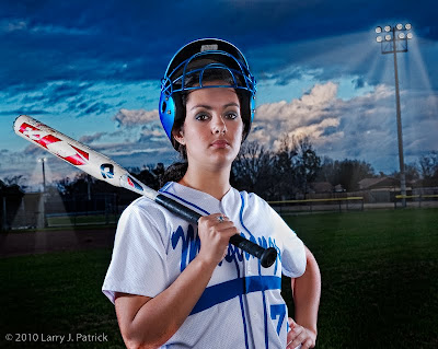
As Doug Haass indicated in his post on Tuesday, Doug, Steve Schuenke and I tried a little “edgy” lighting on some portraits of Kelsi on Monday. Steve and I have been discussing doing this for some time, but the opportunity to do it had not presented itself before our shoot with Kelsi.
Before I get to the particulars of today’s photograph, I would like to say something about Kelsi, her mother and brother: they were great! I really enjoyed seeing such a close-knit family.

I wanted to “push the envelop” with this portrait and a great subject like Kelsi made that very easy. I must admit, we were blessed with some great clouds that rolled into the areas just as we started setting-up the lighting for the edgy portraits.
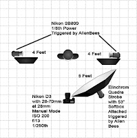
Both Steve and I was somewhat surprised with how easy the lighting was to set-up for the edge lighting that we wanted. We placed an Nikon SB-800 at about four feet on each side of Kelsi. We put a homemade gobo on each strobe and pointed the strobes at Kelsi’s ears. From past experience we knew that 1/8th power would be a good starting point for the strobes for properly exposing her at f/13.

Next, we placed the main light, a 53” octagonal softbox housing Elinchrom Quadra strobe. Ideally, the main light would have been directly over Kelsi on a boom, but since we did not have a boom, we placed it above and slightly to the right of the camera. I wanted the two Nikon SB-800s to be the primary source of light, so I dialed the Elinchrom strobe down to a power rating that underexposed her face and front of her uniform by about one to two stops. I wanted the edge lighting to be very pronounced in my versions of the portraits. Steve and Doug used higher power settings for the Elinchrom strobe, so the effects from the Nikon strobes is less.
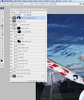
Not shown on the screen grab is some minor clean-up I did on the background and the layer in which I used Topaz filter (described below).
After seeing the image on my computer, I decided to make the portrait more surreal. I added more details to the background by using Topaz Adjust filter to increasing the contrast and color saturation. I also turned the field lights on and added some light beams. I used separate layers for each one of the beams so that I could adjust opacity of each beam independently. The beams were created by making a selection with a feathering of 25-40 pixels, filling the selection with white, adding noise to the selection and then blurring the noise. I used used a gradient at the group level to reduce the effect of the light beams from the source to the ground. I also added a glow around the lights to simulate how they look in real life.
Enjoy.

Camera settings: Nikon D3x, Nikon 28-70mm f/2.8 at 56mm shot at ISO 200, f/13 and 1/250th of a second.
Nice job on this one Larry. Well balanced exposure while still giving that edgy look we were looking to create. Maybe next time we can ask them to turn on the lights and save some PS work in the process. The lights do add to the photo and serve to give that extra pop to the shot. Kelsi, her mom and brother were very accommodating and fun to work with. I enjoyed working on this shoot with you guys.
ReplyDeleteAs you said it was extremely easy to set up for this, no small thanks to your Elinchrom Quadra. Another flash with softbox or umbrella on a boom could have been substituted for that Quadra if we had not had it available. The Quadra was really nice to work with though. It was sweet being able to dial in light output in tenths.
I forgot to add having the diagram for our setup and the layers used for your processing is a nice touch. It shows how simple the set up actually was and how involved the processing for the added spotlights was too.
ReplyDeleteGreat job with the lighting and post-processing. You can't argue with success and the final image looks great.
ReplyDeleteFantastic. You achieved your goal. I bet she is extremely happy with your efforts.
ReplyDeleteDebbie
Great shot. Cool lighting. The beams really add to the effect.
ReplyDeleteCharles M
Stunning portrait. Enjoyed your writeup immensely. Ready to try it.
ReplyDeleteTed
Great writeup. The portrait achieves your edgy look that you wanted. Enjoyed.
ReplyDeleteSya
Your writeup makes all of this sound very easy. Yet, I have tried to get this look several times and never got anything as cool as this portrait. You must be holding something back. Nice job.
ReplyDeleteSteve
Larry has told you everything we did. The only real work involved in his shot was creating the spotlights. Setup was as straight forward as he described it.
ReplyDeleteGo look at my shots here http://doughaassphotography.blogspot.com that are basically straight out of the camera from this shoot. I only cropped and set the camera profile to camera standard which only slightly darkened the shot versus the Adobe standard default in Lightroom 2.
The lighting and the effects are really nice, but to me, the pose and her expression is what makes this an outstanding portrait. She has the look of a confident athlete who is ready to conquer the world. A striking image.
ReplyDeleteAnne
Your photo seems to be the right approach for a girl softball player. It seems to have combined a hard lighting technique with a slight glamour look. Hard to pull it off, but I think you did it.
ReplyDeleteNeal
I do not know how to tell Doug this, but I went to his blog and his photos just do not have the impact that yours has. I realize that you did more, but, it is the final photo that counts. I find a lot of photographers saying "it's right out of the camera" to explain the lack of impact. Ansel Adams' photos were not right out of the camera. He did a lot in the dark room to get what he wanted. You did the same. It gave your photo a lot of impact that Doug's just does not have.
ReplyDeleteSid
I love this kind of lighting and this shot. And the praise for this image is well deserved, but I just want to add this. With all of Larry's great work both at the scene and in Photoshop, I only wish the image was rotated about 10 degrees clockwise. To me, the way the fence line moves in the background and the bat tilts over her shoulder, it seems a little off kilter. I think rotating it would also square up the lights. I'd love to see a rotated version to compare.
ReplyDeleteI get your point Sid, but I really was just showing Steve what the basic shot looked like.
ReplyDeleteLarry's processing is exceptional, as always. He explained how he did his and Steve thought he could not have gotten that posted shot based on what he said he did to it. I just gave him something to reference.
Don't mean to hijack the thread either. This is Larry's blog, not mine.
I guess that I am not photographer that Steve and Doug is because I just think this is a remarkable portraiture done in an usual style. Personally, I am not crazy about this hard light style, but it does bring a uniqueness to this photo, as does the slight tilt of the lights. For me, when I put mask around the photo to straighten the lights and fence up, it seems to take a little of the edgy feel to the photo. Larry, did you tilt your camera on purpose?
ReplyDeleteEllen
She should be very happen with this result. Enjoyed the write up on what, how and possibilities.
ReplyDeleteWOW! Great photo.
ReplyDeleteAllie
A lot of people seem to like this one, but, I wonder just how much of this reaction is because the subject happens to be very photogenic and looks good with this type of lighting and post processing. Just a thought!
ReplyDeleteMel
Pretty great post. I just stumbled upon your
ReplyDeleteweblog and wanted to mention that I've truly enjoyed browsing your blog posts. After all I'll be subscribing for your rss feed and I am hoping you write once more soon!
Feel free to visit my site debt counselling online
Remarkable issues here. I'm very happy to look your article. Thanks so much and I'm taking a
ReplyDeletelook forward to contact you. Will you please drop
me a mail?
my web-site; hair salon Boksburg
My webpage > hair salon Boksburg
I was able to find good advice from your blog articles.
ReplyDeleteHere is my homepage - event branding
It's very trouble-free to find out any topic on web as compared to books, as I found this paragraph at this website.
ReplyDeleteHere is my page; computer courses Pietermaritzburg
Heya i am for the first time here. I came across this board and I
ReplyDeletein finding It really useful & it helped me out a lot.
I'm hoping to provide one thing back and aid others like you helped me.
Here is my blog: halaal caterers Cape Town
My web site: halaal caterers Cape Town
When I originally commented I clicked the "Notify me when new comments are added" checkbox and now each time a
ReplyDeletecomment is added I get several emails with the same comment.
Is there any way you can remove me from that service?
Thanks!
my website; fibreglass slide Gauteng
Also see my web site: playgrounds gauteng
I need to to thank you for this excellent read!! I absolutely loved every bit
ReplyDeleteof it. I have you book-marked to look at new stuff you post…
Feel free to visit my web blog ... costing Gauteng
I every time emailed this webpage post page to all my friends,
ReplyDeleteas if like to read it after that my links will too.
Review my homepage: portrait studio Wolverhampton
Also see my webpage - pet photographer Shropshire
Thanks for finally talking about > "Portrait with Edgy Lighting" < Liked it!
ReplyDeleteReview my weblog; visit
link
Superb blog you have here but I was wanting to know if you
ReplyDeleteknew of any forums that cover the same topics discussed here?
I'd really love to be a part of community where I can get responses from other experienced individuals that share the same interest. If you have any recommendations, please let me know. Thanks!
My web blog - site
I like the valuable info you provide in your articles. I will bookmark your weblog and check again here regularly.
ReplyDeleteI'm quite sure I will learn lots of new stuff right here! Good luck for the next!
Feel free to visit my page More info
Hello there, just became alert to your blog through Google, and
ReplyDeletefound that it is really informative. I'm going to watch out for brussels. I will be grateful if you continue this in future. Many people will be benefited from your writing. Cheers!
My website - Visit Link
I am regular visitor, how are you everybody?
ReplyDeleteThis paragraph posted at this web site is really pleasant.
Look into my webpage; Know More
Hello it's me, I am also visiting this web site daily, this website is in fact pleasant and the visitors are actually sharing fastidious thoughts.
ReplyDeleteMy brother recommended I may like this blog. He used to be totally right.
ReplyDeleteThis post actually made my day. You can not consider just how a lot time I had spent for this info!
Thank you!
my homepage: know more
Hi! I've been reading your web site for a while now and finally got the courage to go ahead and give you a shout out from New Caney Texas! Just wanted to tell you keep up the excellent job!
ReplyDeleteHere is my web site; know more
I was wondering if you ever thought of changing the structure of your blog?
ReplyDeleteIts very well written; I love what youve got to say.
But maybe you could a little more in the way of content so people
could connect with it better. Youve got an awful
lot of text for only having 1 or two images.
Maybe you could space it out better?
My homepage: More Info
Finally I've found something which helped me. Thank you!
ReplyDeletehttp://www.prokr.net/2016/09/furniture-transfer-companies-50.html
http://www.prokr.net/2016/09/furniture-transfer-companies-49.html
http://www.prokr.net/2016/09/furniture-transfer-companies-48.html
http://www.prokr.net/2016/09/furniture-transfer-companies-47.html