Showing posts with label Frames and Textures. Show all posts

February 16, 2010

A Snapshot of the Moment

I was out doing a little street photography and trying some new things when I spotted this father and daughter. They were having such a wonderful time and enjoying each other’s company. I really like their expression and how her face was reflected in his sunglasses. I wanted my photo to be totally about the moment so I zoomed into their faces as close as I could. I added a frame to make the photo look more like a snapshot.

Enjoy.

Camera settings: Nikon D3, Nikon 70-210mm f/2.8 with 1.7x teleconverter at 340mm shot at ISO 200, f/5.6 and 1/500th of a second.

Post Processing:

Lightroom—Set white and black points.

Photoshop—used onOne Photoframe to add frame.

September 28, 2009

Posted Photos Revisited—Taking Your Comments to Heart

I decided to try something new. On Mondays, I intend to republish photographs that I have previously presented on this blog, but I want to include changes that viewers’ have suggested. I must admit, I may not agree with the posters’ comment, but I do think their suggestion warrants consideration.

This photo was presented on August 17, 2009.
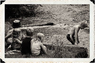
On that post, DHaass said: I'll make note of the cut off arm to the left and the boys head so close to the edge of the frame. If the little girl had that arm in her lap would it be better? Yes, but it's not a deal breaker. The boy is looking down more than out of the frame so I'm okay with that too.”

When I looked at the scene, I thought that this was a scene that could have occurred anytime during the past 100 years. I really did not think about the little details in the composition. If I had, I would have posted the photo more like this. There was a post just outside the girls hand on the left side, so I did exclude it from my original composition.

Out of laziness, I had slapped the frame on it. In the revised photo, I increased canvass sufficient to allow for the girls hands to be shown and also included more room to the right of the boy’s head. The photo presented here is more the one that I took except that I did clone-out the flip-flops—which did not seem to go with the scene.
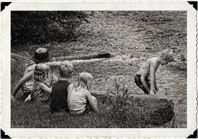
The reason, I selected this photo as my first to revisit is simple, I think it raises an interesting question: “When does bothersome details really distract from the essence of the photograph?"

I do not have an answer to the question, and would welcome your comments.

Enjoy.

June 10, 2009

Brazos Bend State Park #11

I was disappointed with two things in my visit to Brazos Bend State Park—no good alligator photos and not really that many wildflowers. I really expected a lot more wildflowers, but saw very few.

I ran across these Yellow Prairie Coneflowers as I was leaving the park. I find Coneflowers to have a great shape to photograph, even though I sometimes have trouble controlling their bright yellow color. They were definitely past their prime, but I really liked the overall arrangement. I wanted the image to be a high-key photo with limited depth-of-field—I only wanted a few of the closest flowers to be in focus.

I pushed the high-key aspect of the flowers by putting a light vignette in Lightroom.

Enjoy.

Camera settings: Nikon D700, Nikon 300mm f/4 with a 1.7x Nikon Teleconverter and polarizing filter attached, shot at ISO 200, f/8 and 1/350th of a second on a tripod.

Post Processing:

Lightroom—Set white and black points, reduced clarity and added a light vignette to edges.

May 6, 2009

Bluebonnets


I do not think there is a prettier sight than a field of bluebonnets.  Every year, I make a trek around Brenham to see and hopefully photograph some bluebonnets. Usually, I am not happy with my photos. For some reason, I find that bluebonnets look so much better to the naked eye than they do to the sensor in my camera.

I do like this shot. I find that the old farm house is framed nicely by the brooding sky and the field of bluebonnets. It just seems that the bluebonnets belong in the scene.

Enjoy.

Camera settings: Nikon D3, 28-70mm f/2.8 at 45mm, shot at ISO 200, f/13 and 1/20th of a second on a tripod.

Post Processing:

Lightroom—Set white and black points, added mid-tone contrast, clarity and vibrance, tweaked the hue and saturation of green and blue.

Photoshop—used nik Color Efex Pro Tonal Contrast filter to add local contrast to the bluebonnets and the house and used onOne Photoframe to add boarder.

January 3, 2009

Saturday Special: A Couple Twists


After I made my post yesterday, JD was looking at the image and decided that she would use it for something that she was doing, but it need an “antique-look.”   Not sure exactly what that meant, I went to onOne Frame to look around.   After playing around a little I settled on the following different effects:

   Texture>Scratched Film #4 at 70% opacity

   Texture>Paper #5 at 55% opacity

   Boarder>Tooth Brush #4 at 40%

I thought the addition of these textures and boarder did the trick, but . . .


JD liked the overall look but did not want the colors to be so vibrant.  So, back to the drawing board!   I started with the above image and used nik Silver Efex Pro to add a black and white layer at 40% opacity.   This seemed to tone-down the colors the way that JD wanted.


I am always amazed at how you can take the same photograph and make it look so many different ways by just adding various textures and boarders.   It is something that I fail to do try doing much of the time.   I guess it is my old film/slide days coming out again.

Hope you enjoy JD’s interruption of my photograph.