Showing posts with label Automobiles/Trucks. Show all posts

May 28, 2010

Imagine That, A Car at Car Parade Showing


This may sound silly, but getting a reasonably good photo of a car at the park was the most difficult task.  Lots of people meant little room to take the photos plus very crowded blackouts.  Both, made the photography more difficult than I expected before I went.
In this shot, I did not have to complete with all the people, since the owner did not let anyone set inside his car.  I consider the autos in the Art Car Parade to be more akin to cartoons than real automobiles, hence, my treatment of the photo.  I wanted the photo to remind the viewer of something that they might see in their favorite super hero cartoon.
Enjoy.
Camera settings:  Nikon D3, Nikon 50mm f/1.4 shot at  ISO 360, f/11 and 1/60th of a second.
Post Processing:  
Lightroom—Set black and white points, added clarity and increased contrast, and adjusted saturation of various colors.
Photoshop—Used Topaz Adjust to bring out details in the car’s interior (masked-off background portions of photo) and high-pass filter method to sharpen the automobiles interior.

September 11, 2009

Evolution of a Photograph—Part 5: Settling on How to Present

My final step in post-processing is settling on how to present the photo. What do I mean by that? Well, do I want to present it in color or black & white, include a boarder or not, add a vignette or not, etc. Presentation is totally about two things: your vision for the photograph and personal taste.

For this photo, black & white with a sepia tone seemed to be the ideal presentation because the black & white would emphasize the contours and the textures within the photograph and the sepia tone would fit with the age of the old rusty truck. I used nik Silver Efex Pro to convert my photo to the sepia toned black & white. I believe that Silver Efex does a really fine job converting RGB images to black & white, and does it very easily.

All the work done on this photo took about 16 minutes. So, not a lot of time was spent to arrive at the final photo. I can hear some of you say: Da, and it looks it! Of course, this image did not require any complicated or detailed selections and the cloning was pretty straight-forward.

The post-processing of all photos is dependent upon your starting photo and what you want to do with the photo. The better starting point, the easier it will be for you to develop the image that you want. I hope my posting help you understand my approach to photo post-processing.

Enjoy.

September 10, 2009

Evolution of a Photograph—Part 4: Dodging, Burning and Sharpening

A few years ago, I was in Chicago and visited one of the museums that was presenting a collection of Ansel Adam’s photographs. The collection included several images that Ansel had printed four or five different times over a twenty or thirty year period. As you looked at the various photos in a series, you quickly noted differences in the dodging and burning that Ansel had done. I studied the different photos within a series and then between the different series (trying to line-up the printings by when they were printed). Ansel took different directions with each of the series, but, after spending a lot of time studying the photos, I came to two conclusions about Ansel’s dodging and burning: it was an evolutionary process and the last print was almost always my favorite of the series.

I do some dodging and burning on almost every photograph that I print. In Photoshop, there are a number of ways to do dodging and burning: (1) use curves or levels adjusting layer with mask for areas to be affected; (2) use a blank layer in the soft light mode and paint in white to dodge and black to burn; or, (3) use copies with a mask for areas to be affected of the final image in screen mode to dodge and multiple mode too burn.

I generally use a screen and multiple-layer to do my dodging and burning. I find that this method seems to more evenly lighten or darken the area without shifting the colors. For this photo, I dodged the clouds and tops of plants in middle of photo and burned the edges of the frame, the dirt by the truck and parts of the near hills.

Enjoy and don’t forget to ask any questions you might have along the way. I will do my best to revise my next posting to accommodate the questions this week.

Post Processing in Photoshop—used a screen layer and a multiple layer of the final image to dodge and burn various parts of the photograph by using mask and then used high pass filter to slightly sharpen entire image.

September 9, 2009

Evolution of a Photograph—Part 3: Removing Distractions and Adding Detail


I often see photographs that I think are really good, except there is this or that distracting element in it. Since I am not a photojournalist, I try to remove distracting elements before I take the photograph, either by changing my camera angle or position or just physically removing the item. But sometimes that approach is just not possible.

In my crop, I wanted to keep the curvature of the truck cab and the truck’s back window, so I was forced also to keep the tank in the left corner and the piece of wire basket behind the truck cab. To me, both are distracting elements within the photo and, therefore, must be surgical removed. If the elements to be removed are small, I will use Lightroom’s clone or healing tool; but, in this case the items are large so I will use the cloning tools in Photoshop to remove them.

When I clone is Photoshop, I clone my changes onto a new layer. I usually use a new layer for each area that I am cloning so that if I make a mistake, it will not destroy any of the work I have already done. When you clone onto a new layer, you do need to make sure that you use “sample current & below layers”.

As I mentioned on Monday, I remembered a lot more detail in the scene. Details can be added a number of ways in Photoshop—sharpening, adding contrast, etc. Since I am lazy, I use two Photoshop plug-ins to accomplish this task—nik Color Efex Pro (tonal contrast or pro contrast filters) or Topaz Adjust. Barry Armer has been using Topaz Adjust for a long time and I have been impressed with the results that he has gotten using it. I recently purchased it and to date, I like it very much. Because the filters are very quick to run, I will usually run both of them on different layers and then select the result I like best.

For this image, I think the Topaz adjust did the better job so I used it.

In my layers pallet, you will notice layers titled “Composite.” These are layers that are combination of all the layers below it. In Photoshop, you can make composite layers by holding the ALT key down and then going to Layers>Merge Visible.

Enjoy and don’t forget to ask any questions you might have along the way. I will do my best to revise my next posting to accommodate the questions this week.

Post Processing in Photoshop—Cloned a few distracting elements and used nik Silver Efex Pro Tonal Contrast filter and Topaz Adjust to add contrast to highlights, mid-tones and shadows

September 8, 2009

Evolution of a Photograph—Part 2: Setting White Balance and White & Black Points


I believe that getting the white balance to reflect the color tone in the image that you want and setting a good white and black point (assuming the image has either or both) are the two most critical steps in post processing of a photo.

As you look at the tabs in Lightroom, they are the same as Camera RAW, except that Lightroom has a separate tab for Vignette whereas Camera RAW includes the vignette functions under the camera calibration tab.

I start by setting my white balance. Why? Because as you change the white balance, the white/mid-range/black points will shift somewhat. How do I select the white balance I want? Well, I usually look at the subject or a dominate aspect of the photo and move the Temp and Tint sliders until I think the color tone is correct. In this image, I used the sky to set my color tone.

In Vincent Versace’s Welcome to Oz, he prescribes at setting the white point to where the first pixel becomes white and the black point to where you start to “see meaningful black” or an area in which we actually see something that is important. How do you do that in Lightroom or Camera RAW? If you hold the ALT key while moving the exposure slider, any pixel that is not white at that exposure will turn black; then, as you move the slider to the right or left more or less pixels will become white. The black slider works the same (except the background turns white).

Although the histogram shows that I have clipped some shadows by using a black setting of 8, if you look at the screen shot of what is actually clipped (using the above described method), you can see that what was clipped is details that are not really needed—maingly shadows in the back bumper and in the wheel well. I could have pushed the slighter even further without losing any details that were essential to the photo.

Yesterday, I got a few questions about cropping that I answered on the blog. However, I got a question regarding a slight color shift between the two photos presented. Yes, I also noticed it. I think it has to do with how the photos were converted to JPEGs. The uncropped RAW photo was exported from Lightroom as JPEG to my blog folder while the cropped photo was saved from Photoshop as a JPEG to my blog folder. It goes to show you how different JPEGs can look.

Enjoy and don't forget to ask any questions you might have along the way. I will do my best to revise my next posting or answer the question in the current post to answer the question or comment.

Post Processing in Lightroom—Set white balance and white and black points, added mid-tone contrast, vibrance and clarity.


September 7, 2009

Evolution of a Photograph—Part 1: Assessment and Cropping


Over the past few months, I have received several questions regarding my image processing workflow. So, this week, I thought I might share with you what my normal workflow is. This is the workflow that I use when I intend to print an image. I often do less for photos that present on my blog—mainly because I am lazy and the extra work often does not show-up on photos posted on the internet.

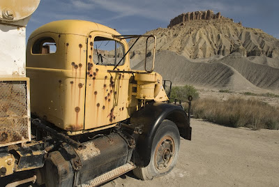
I have selected a photo that I took on drive between Capitol Reef National Park and Moab, Utah. The photo has been hanging around my hard drive for a few years, but I have not really done much with it. I have always liked the photograph, but in its RAW stage, the image just really did not do much for me.

Currently, as most of you know, I use Lightroom 2.4, which I believe is one great program that has enhanced my post processing workflow. If you do not use Lightroom, rest assured, you can do the same things that I do in Lightroom using Camera RAW.

My first post-processing task is to do an assessment of the photograph by asking myself a few questions. Why did I take the photo? What was my main interest in the scene when I decided to take the photo? What is the most important aspect of the photo? Are there any distracting-elements within the photo? Is the color correct?

As I look at the photo, I noticed that it just does not have the details than I remember. So, bringing back the details is definitely a priority in my post-processing. I also do not like my framing. The left side of the photo contains details that really do not add to the image. Consequently, cropping is definitely in order. Here, I need to say that I am not a fan of the 2x3 format that is native to DSLRs (due to the sensor size). As a result, I often look to crop my photos.
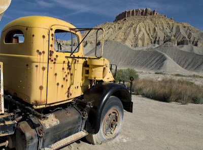
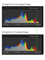
Most people do not crop their photos until late in the post-processing workflow. Cropping is one of my first steps and I usually do it in Lightroom because it is nondestructive process, which means I can redo it if I later decide that I do not like the crop. Why is cropping one of my first steps? Because I want to look only at the part of the photograph that I intend on using and the histogram will then show me only information about the “cropped image” not the entire image. This makes the histogram much more useful as I proceed in my post processing work. As you compare the uncropped and cropped histograms you will notice a portion of the uncropped bright areas are gone from the cropped histogram.

Enjoy and don’t forget to ask any questions you might have along the way. I will do my best to revise my next posting to accommodate the questions this week.

Camera settings: Nikon D200, Nikon 28-70mm f/2.8 at 17mm (effective 25mm), shot at ISO 100, f/13 and 1/100th of a second on a tripod.

Post Processing in Lightroom—Cropped image.

August 3, 2009

What I Did on My Vacation—Part 1

A couple weeks ago, JD and I traveled to Spearfish, South Dakota where my brother Steve and his lovely wife Kim live. All my brothers (Steve, Sandy and Tim) and all my sisters (Alice and Sue) invaded the North to spend some time together.

There are no non-stop between Houston, Texas and Spearfish, South Dakota. Looking at my various flying options, I discovered that travel time (drive to airport, going to “security”, waiting before flight, flight time to transfer airport, wait time between flights, flight to Rapid City, South Dakota and drive to Spearfish) would be about 9 to 11 hours depending on which airlines we picked. My gosh, I can fly to Paris, France in about the same time. So, we decided to drive.

The shortest route to Spearfish is straight north through Oklahoma, Kansas and Nebraska. We elected the scenic route to Spearfish through the Texas panhandle, New Mexico, Colorado and Wyoming. Total distance is about 1,523 miles (746 miles of which are in Texas).

The first day we drove about nine hours to Amarillo, Texas. The next morning, we got-up early for our drive to Douglas, Wyoming. On our way out of Amarillo, we passed the Eiffel Tower of Texas—the Cadillac Ranch. Naturally, I had to stop for a few shots.

Earlier this year, Larry Armer posted a few shots from the Cadillac Ranch that I thought were very good, so the pressure was on me to at least equal Larry’s shots. After trying various approaches, I decided that I need two photographs to properly show the essence of the Cadillac Ranch.

As you look at the shots, I want you to think about only one thing: WHY?

Enjoy.

May 20, 2009

Friendswood Car Show #5

Just as I was leaving the car show, a great storm rolled-in over the park.  The sky turned dark, except for flashes of lightning.  At that exact moment, a green Lamborghini rolled out of the park and headed towards the storm.  I quickly moved my camera to my eye and fired as many shots as I could before the Lamborghini roared off into the storm.

OK, that is the story that I wished was attached to this photo.  The real story is that I had a non-descript photo of a cool car.  I shot the photo low so that I could get the shapes of the Lamborghini.   I really did not care whether people would be able to determine that it was a car--I wanted the shapes.  

I replaced the background with one from my files and then ran a few filters on the car and the background to try to give the whole photo a surreal look.

Enjoy.

Camera settings:  Nikon D700, 28-70mm f/11 at 60mm, shot at ISO 200, f/11 and 1/180th of a second.

Post Processing:

Lightroom—Set white and black points, added mid-tone contrast, increased saturation of green.

Photoshop—Replaced background with the sky with lightning and then ran Kubuto’s Lord of Rings filter and increased the overall contrast on the car. 

May 19, 2009

Friendswood Car Show #4

Nothing says “classic car” better than a 1957 Chevy BelAir, especially a red one with a white top.

I wanted this photo to be slightly abstracted, so I selected f/2.8 as my f-stop and focused my lens as close to the Chevy symbol as I could.  I wanted only the Chevy symbol to be in focus.  I would have liked to had my 50mm f/1.4 to use on this one, but it was home resting.

Enjoy.

Camera settings:  Nikon D700, 28-70mm f/2.8 at 70mm, shot at ISO 200, f/2.8 and 1/1,000th of a second.

Post Processing:

Lightroom—Set white and black points, added mid-tone contrast, vibrance and darken the red in selective color.

May 18, 2009

Friendswood Car Show #3

Since I was looking for details to photograph, the dice were a natural subject.  As I was trying to get just the right composition, I noticed the reflection of the flags.  I really like the additional element that the flags added to the photo, but, it did complicate my composition somewhat.  I tried a lot of different looks, however, I settled on placing the dice on one of the power points and having the lines of the trunk move you towards them.

To make sure that I had really saturated colors, I set my exposure compensation to -1.0 EV.

Enjoy.

Camera settings:  Nikon D700, 28-70mm f/2.8 at 62mm, shot at ISO 200, f/13 and 1/180th of a second with exposure compensation of -1.0 EV.

Post Processing:

Lightroom—Set white and black points, added mid-tone contrast, clarity.

Photoshop—used onOne Photo Tools Kuboto Lord of Rings and Hollywood Intensity filters to add an edgy look to the photo.

May 15, 2009

Friendswood Car Show #2

This is not the photo I wanted of this hot rod.  The owner of the car was meticulously detailing the engine with a q-tip.  Yes, I said a q-tip.  I wanted the photo to be about his hand, the q-tip and the details of the car’s engine.  But, every time I started to take the photo, he would stop.  Finally, I asked him:  “Why?”   His response was to the point:  “Everyone already thinks I am a little crazy, a photo with me detailing my engine with a q-tip would only confirm that.”

The the photo I present today is not the one that I wanted.  You will just have to image a hand and a q-tip busy cleaning all the cracks in the engine.

Enjoy.

Camera settings:  Nikon D700, 28-70mm f/2.8 at 50mm, shot at ISO 200, f/13 and 1/125th of a second.

Post Processing:

Lightroom—Set white and black points, added mid-tone contrast, clarity and vibrance, increased saturation of yellow.

Photoshop—used nik Color Efex Pro Tonal Contrast filter to add local contrast to highlights, mid-tones and shadows and then applied sharpening using the high pass filter method in soft light mode.

May 14, 2009

Friendswood Car Show #1

I am just not a car guy.  I never have been, probably never will be.  I see cars as way to get from point A to point B.  Now, don’t get me wrong; I am not going to drive a Smart Car—in my opinion, that may be the greatest oxymoron ever!  I do like my comfort and I just do not see comfort and Smart Car being used in the same sentence very often.

I went to the Friendswood car show because I have a friend that loves cars and often shows a few of his restored cars in small car shows.  He decided to show a 1964 red and white Corvette in the show.  So, I agreed to tag along and take a few photos of his car and some of his friends.

Photographing the cars was very hard—poor backgrounds (buildings, trees, people, just lots of clutter everywhere), cars parked right next to each other, light being filtered through trees, thus casting shadows here and there.  In short, not a photographer’s dream set-up.

I decided that I would not try to photograph the whole car; rather, I would concentrate on the details.

What says Ferrari more than red?  In fact do you know of another car that has a color named after it like "Ferrari Red."  I wanted this photo to be all about all the details that are in the headlights.  As I looked at the headlight, I was somewhat amazed at how many different things were included in “just” a light.

Enjoy.

Camera settings:  Nikon D700, 28-70mm f/2.8 at 65mm, shot at ISO 200, f/13 and 1/180th of a second.

Post Processing:

Lightroom—Set white and black points, added mid-tone contrast.

Photoshop—used nik Color Efex Pro Tonal Contrast filter to add local contrast to highlights, mid-tone and shadow areas of just the light area and then sharpened image using the high pass filter method in soft light mode.

February 9, 2009

Old and Rusty


I found this old Ford pick-up near Alvin, Texas.   I really like the rust and the texture.   For some reason, like most photographers, I really think that old cars are great to photograph.  I wanted the age of the truck to show through in my final image.   Overall, I was pleased with the final image.   Enjoy. 

Camera settings:  Nikon D3, 17-35 f/2.8 at 24mm, shot at ISO 200, f/13 and 1/15 seconds on a tripod.

Post Processing: 

Lightroom—set white and black point, added mid-tone contrast.

Photoshop—converted photograph to black and white using nik Silver Efex Pro using high structure preset.