March 29, 2013

Using Flash Creatively—No. 9


Today’s photo is another one demonstrating repeating flash.
In my last post, I showed a photo of the how the master and remote flash was set however I did not explain the various settings.  Everything is controlled on the master flash.  On the master, I set Group A to RPT (repeating), Channel 3, the power setting at 1/8th, number of flashes 8 and the Hz (the number of flashes per second) at 8.  I then set the remote flash to be on Channel 3 and in Group A.
In today’s photo, I had a dancer moving across the stage with three remote flashes hanging from a rod above the dancer’s path.  Again, the hard part of the photo was timing and making sure that the camera did not pick-up too much of the light build-up on the floor.
Enjoy.
Camera settings:  Nikon D4 on a tripod, 24-70mm f/2.8 at 50mm, ISO 100, f/8 at two seconds on a tripod.
Post Processing:
Lightroom 4—applied Nikon Vivid preset during import, set white and black points and added vibrance.

Photoshop CS5—cloned-out some of the light build-up on the floor.

March 26, 2013

Using Flash Creatively—No. 6


I have been fascinated by stroboscopic or repeating flash ever since I saw Joe McNally demonstrate it on video.  You can see the video here.
Overall, sitting-up the flash is relatively easy.  In today’s photo, I used a Nikon SB 800 as the master and two SB 800s as the flashes that provided the light for the photo.
In doing this shot, I soon discovered that the difficult part of getting the shot was timing.  Trying to get the number of flashes over a specific time element was extremely difficult and required many tries before I got what I wanted.
Enjoy.
Camera settings:  Nikon D4 on a tripod, 24-70mm f/2.8 at 50mm, ISO 100, f/8 at one second on a tripod.
Post Processing:
Lightroom 4—applied Nikon Vivid preset during import, set white and black points and added vibrance.
Photoshop CS5—cloned-out a hand in the top left and one in the top right to make the photo more symmetric and cloned-out some places in the photo that showed some light build-up.


Photoshop CS5—cloned-out a hand in the top left and one in the top right to make the photo more symmetric and cloned-out some places in the photo that showed some light build-up.

March 19, 2013

Using Flash Creatively—No. 5


Last week, I ripped-off Joe McNally, so I thought it would only be fitting that I rip-off a lady this week.   It’s your turn, Lindsay Adler.  Lindsay is a very talented fashion photographer who does some outstanding how-to photography videos.  She recently took place in the GPP Shootout with John Keatley and Zack Arias.  You can watch a video of the shootout here.
Lindsay’s idea is to create flare by placing a plastic decoration very close to your lens and shoot through it.  You must set your lens to a relatively wide opening such as f/2.8 or wider.  This technique can produce some spectacular results, however, it is a hit-and-miss proposition because you are never really sure what you are going to get.
In this photo, I placed half of a clear Christmas ball in front of my lens.  I had a Nikon SB 800 behind and slightly to the side of Emili and an Elinchrom Quadra in front of her.
Enjoy.
Camera settings:  Nikon D4 on a tripod, 24-70mm f/2.8 at 50mm, ISO 100, f/2.8 at 1/180th of a second on a tripod with a Nikon SB 800 behind her and an Elinchrom Quadra in front of her.
Post Processing:

Lightroom 4—applied Nikon Portrait preset during import, set white and black points and added vibrance.

March 12, 2013

Using Flash Creatively—No. 4


I must admit two things right from the start:  (1) this is a rip-off of a Joe McNally idea; and, (2) Joe did it better.  You can see Joe’s photo on page 234 of his book “The Hot Shoe Diaries.”  Joe, if you read this, I hope that by me giving you credit for the idea and promotion of your book is sufficient payment for me ripping off your idea.
Why is Joe’s better?  First, he picked a better time of day (night) and a better location to shoot the photo.  Both added to creating a real “Greepy-Guy-in-the-Alley Shot.”  The lighting of Joe’s heron was to make her look “normal” while I wanted to tie the two elements of the shot together—heron and ax murder—by the introduction of a Steve King novel and eerie green light coming from the novel.
My photograph was taken at about 3:30 PM (before we went to day-light-saving time) so there was a lot of ambient light even in the shade of the building.  The ambient light reduced the greepy effect of the shadow.  It also reduced the effect of the light coming from the book.
I also made a mistake of where I placed my camera.  I purposely selected a Steven King book that had a scary cover, but then, I placed my camera on the side that would not show the scary cover.  Very rookie mistake.
Final score:  Joe 10, Larry 5.
Enjoy.
Camera settings:  Nikon D4 on a tripod, 24-70mm f/2.8 at 44mm, ISO 100, f/8 at 1/180th of a second on a tripod with a Nikon SB 800 with a green gel in Emili’s book and an Elinchrom Quadra with a green gel at 5.4 power setting and pointed at Ax Murder to create shadow on wall.
Post Processing:
Lightroom 4—applied Nikon Vivid preset during import, set white and black points, added vibrance and clarity and adjusted white balance.

March 6, 2013

Using Flash Creatively—No. 3


I wanted today’s photo to look like something out of a women’s clothing catalog—photo being a stylish woman in a rustic background at sunset.
This shot was taken later in the day when the overcast sky was darker.  Because I was using no light on her or the barn surrounding her, I had to increase my ISO to 1600 in order to get sufficient ambient light into the scene.
Again, I warmed my white balance so that I would have a more golden look on her.  I used a Nikon SB 800 with an orange gel on it and set at 1/8th power to simulate the sun setting behind her.
Again, I refer you to the image on last week’s post to show you how the overall scene appeared.
Enjoy.
Camera settings:  Nikon D4 on a tripod, 85mm f/1.4, ISO 1600, f/4 at 1/45th of a second.
Post Processing:
Lightroom 4—applied Nikon Portrait preset during import, set white and black points, and added vibrance and clarity.

Photoshop CS5—applied nik Color Efex Pro soft focus and pro contrast.

March 2, 2013

Using Flash Creatively—No. 2


Before I go into today’s photo, I would like to discuss what the blank pallet on which Steve and I were working.  This photo was taken by one of the other photographers at the meet-up.  In the photo, you can see that the sky has virtually no color in it.  You can also see where Christine was standing in relation to the barn.  You can see the gate that we positioned to create the shadow cast on the wall.  And, finally, you can see how dark it was within the barn.
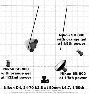
In today’s photo, I wanted to simulate a sunset shot.  The first thing I did was to select an aperture of f/6.7 which would make sure that I would have sufficient depth of field.  I then, dialed in my shutter speed so that the ambient light in the door at the rear of the barn would more-or-less match what the light would look like at sunset.  I then set the power settings on the flashes so that the light would simulate sunset.


In post processing, I did warm-up and decrease the intensity of the light in the door to better match the overall scene.
Enjoy.

Camera settings:  Nikon D4, 24-70mm f/2.8 at 44mm, ISO 100, f/6.7 at 1/60th of a second.
Post Processing:
Lightroom 4—applied Nikon Portrait preset during import, set white and black points, decreased shadows and increased highlights and added vibrance and clarity.
 Photoshop CS5—applied nik Color Efex Pro glamour glow and pro contrast to image and warmed and decreased intensity of light in door.