August 31, 2012

My Vacation—Part 4


On our vacation, almost every morning started the same.  I would roll out of bed about my normal time (4:30 to 5:30) and head out to do some shooting before JD graced the world, usually around 7:30.  Generally, I would head down to the dock area to photograph the lobster and fishing boats.  I liked the harbors because they seemed genuine and real.  As I looked at the harbors and the boats in them, I always got the same feeling—they seemed old, worn and tired, but still up to the task.
In today’s photo, the fog (which was a constant every morning) had lifted to the top of the roofs of the buildings.  As a result, you had this splash of worn colors of the buildings and boats framed by the defused colors of the trees and sky and the muted and abstracted colors and shapes of the reflections in the water.  I really liked this contrast and tried to capture it the best that I could.
Enjoy.
Camera settings:  Nikon D4, 28-300mm f/3.5~5.6 with polarizing filter attached at 78mm, ISO 100, f/8 at 1/8th of a seconds on a tripod.
Post Processing:  
Lightroom 4—applied Landscape preset during import, cropped the image, set white and black points, increased contrast, saturation and clarity of the boats and buildings with an adjustment brush.

August 28, 2012

My Vacation—Part 3


I read somewhere that Maine has more lighthouses than anywhere else in the United States.  Have no idea as to whether that is true or not, but, I do know that you will find many, many lighthouses up and down the Maine coastline. 
Many of them are small ones like this one.  Notice the size of the door in comparison with the size of the lighthouse.
In this photo, I like how the three rock outcrops mirrored each other and formed a nice repetitive lines to lead the eye to the lighthouse.   To lesser degree, I think the bank on the far side also helps carryout this idea.  
Enjoy.
Camera settings:  Nikon D4, 28-300mm f/3.5~5.6 with polarizing filter attached at 56mm, ISO 100, f/16 at 1/125th of a seconds on a tripod.
Post Processing:  
Lightroom 4—applied Landscape preset during import, set white and black points, increased contrast and tweaked the blues and aquas saturation and luminance.

August 24, 2012

My Vacation—Part 2


One of our hotels had a game room that seemed to be right out of the 1900’s.  In this photo, I tried to capture the old bowling alley.  The bowling balls were about 1/3rd the size of today’s bowling balls; the bowling pens were about the same.  The alley was well worn and quite uneven.  JD and I bowled several games and I do not think either one of us were able to bowl even a spare!  Despite our dismal scores, we had lots of fun!
The image is an HDR photo taken with three frames at -1 EV, 0 EV and +1 EV.  I used nik HDR Pro to combine the frames.  I wanted the image to have a gritty, aged look.
Enjoy.
Camera settings:  Nikon D4, 28-300mm f/3.5~5.6 at 120mm, ISO 200, f/22 at one, two and four seconds on a tripod.
Post Processing:  
Nik HDR Pro—applied filter.

August 22, 2012

My Vacation—Part 1


JD and I recently spent nine days in Maine.  We had never visited Maine and it looked like a great place to get away from Houston’s summer heat.  Our visit included only the coast of Maine.
For the trip, I packed light:  Nikon D4, Nikon 28-300mm, Nikon 50mm, two Nikon SB800s, tripod, Canon G12, Epson P6000, extra batteries and memory cards.  Everything easily fit into my ThinkTank StreetWalker backpack.


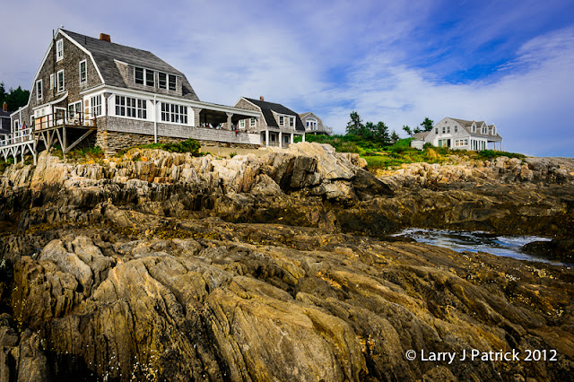
Today’s shot is of the Driftwood Inn, our hotel the second night of the trip.  The Driftwood Inn is located at the tip of Bailey Island and has a great view of the ocean.  Before the trip, I had told JD not to expect much of this “rustic” hotel however after arriving at the hotel, she parked herself on the porch and told me to cancel our dinner reservations because she had no intention of leaving the “view.”  She pretty much stayed there on the porch until bedtime—you can see her head at the far right side of the porch.
The photo was taken as the tide began to come-in.  I positioned my camera as low as I could to the rocks and used an aperture of f/16 to expand my depth of field.   I tried to frame the shot so that the rocks led you into the photo.
Enjoy.
Camera settings:  Nikon D4, 28-300mm f/3.5~5.6 at 28mm, ISO 100, f/16 at 1/60th of a second on a tripod.
Post Processing:  
Lightroom 4—applied landscape preset during import of photo, set white and black points, adjusted color balance, added vibrance and clarity.

August 17, 2012

My Workflow—Part 5


“To Photoshop or not to Photoshop, that is the question.”  If Shakespeare were here today, that would probably be a line in one of his plays.
On my last post, Allen asked:  “With this photo what would you do in Photoshop?”  Good question.
Let me start by saying that for every professional shoot I do, I use Photoshop on all the final images.  Why?  Because Photoshop has so many more tools that help me develop the specific look that I want in the final image.  Specially, Photoshop has much better selection tools, healing and cloning tools and many plug-ins that can help you achieve what you want.
Now, back to: what would I do on this image in Photoshop?   If I were going to present this image for a photographic show, I would push it more to a fine art image.  I start with the cropped Lightroom image and open it in Photoshop.  The first thing that I would do is, remove the distracting leave on the left side of the flower by cloning it out.  When clone something out, I do it on its own layer so that I can easily mask off errors I make with the cloning tool.  Next, I would tray to make the whole left side of the flower look more symmetrical.  I did this by copying the bottom leaf, moving it to its new position and then changing its shape using the warp tool under edit>transform>warp.  I do not want the two leaves looking like each other.  I then took the image into nik Color Efex Pro and used the Extract Detail and Tonal Contrast filters on the flower.  I believe these to filers really bring out detail and add punch to an image.  I usually dial down the overall effects of the filter both in nik Color Efex Pro and also using the layer opacity in Photoshop.  Finally, I would do my normal dodging and burning.   I do dodging and burning on a separate layer in the soft light mode.  I fill the layer with 50% grey and then paid at a low capacity (3-10%) with white to dodge an area and black to burn an area.  I continue to brush over the area until I get it the shade I want.
That’s it.
Enjoy.
Camera settings:  Nikon D4, 70-200mm f/2.8 at 90mm, ISO 1600, f/19 at 1/60th of a second on a tripod.
Post Processing:  
Lightroom 4—see above. 
Photoshop CS5—see above.

August 14, 2012

My Workflow—Part 4


Someone needs to teach me how to read a calendar.  I prepared this post before I went on vacation and thought that I had set it to appear on August 7th.  I did not notice that it had not appeared until I started looking at my blog this past weekend.  Sorry about not catching my mistake sooner.   I am sure many of you put your lives on hold until I posted again.
The final step of almost every photo that I take is to do some dodging and burning.  Here I burned (using the adjustment brush) the bokeh background and the leaves behind the flower.  In addition, I blurred a few of the leaves by reducing the sharpness and clarity with an adjustment brush.  The whole purpose of these adjustments is to make the flower and starburst to come forward and make the background sink further into the background.
I think that if you go back to the original photo you will see that my intended subject of the photo is definitely the subject that the viewers' eyes go to first and rest upon the most.
Enjoy.
Camera settings:  Nikon D4, 70-200mm f/2.8 at 90mm, ISO 1600, f/19 at 1/60th of a second on a tripod.
Post Processing:  
Lightroom 4—see above.

August 3, 2012

My Workflow—Part 3


As I said before the details is one of the subjects of this photo.  In fact, it is the main subject of the photo; so, I want to draw the viewers’ eyes towards the flower.
But, what draws a person’s view?  For many years, it was taught that a person’s eye always goes first to the brightest part of the image.  Recently, some researches have said that the human eye goes to the portion of an image that the human brain can most easily recognize.  Next, it goes to the area that is sharpest, has the most contrast and most colorful.
With this in mind, I next added: sharpness, contrast, saturation and clarity to the flower using the adjustment brush.  In addition, I warmed-up the color balance on the flower under the theory that warm tones are moved to the forefront and cooler tones are moved to the background by the brain.
Hopefully, the picture that I took is starting to look more like a real photograph.
Enjoy.


Camera settings:  Nikon D4, 70-200mm f/2.8 at 90mm, ISO 1600, f/19 at 1/60th of a second on a tripod.
Post Processing:  
Lightroom 4—see above.